General Topics >> Lord of the Rings/The Hobbit/The Silmarillion editions with raised ribs on the spine
Lord of the Rings/The Hobbit/The Silmarillion editions with raised ribs on the spine
24 Apr, 2021
2021-4-24 6:00:22 PM UTC
2021-4-24 6:00:22 PM UTC
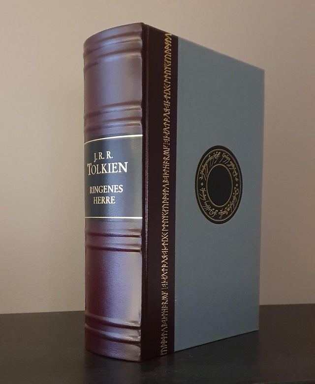
I recently saw on reddit this beautiful Norwegian edition of The Lord of the Rings with raised ribs on the spine. This made me think which other Lord of the Rings/The Hobbit/The Silmarillion editions (in English or any language) have raised ribs on the spine.
Seems the new deluxe red and black Lord of the Rings will have them, and Trotter and Ithildin posted some photos of some "super-deluxe" editions which also have the ribs.
So, does anyone know of any other editions (in any language) with raised ribs on the spine? I would absolutely love to have any (though I imagine they can be very expensive). Thanks!
Edit: I think I posted this in the incorrect Forum. Should've been in Books and other printed materials. Sorry.
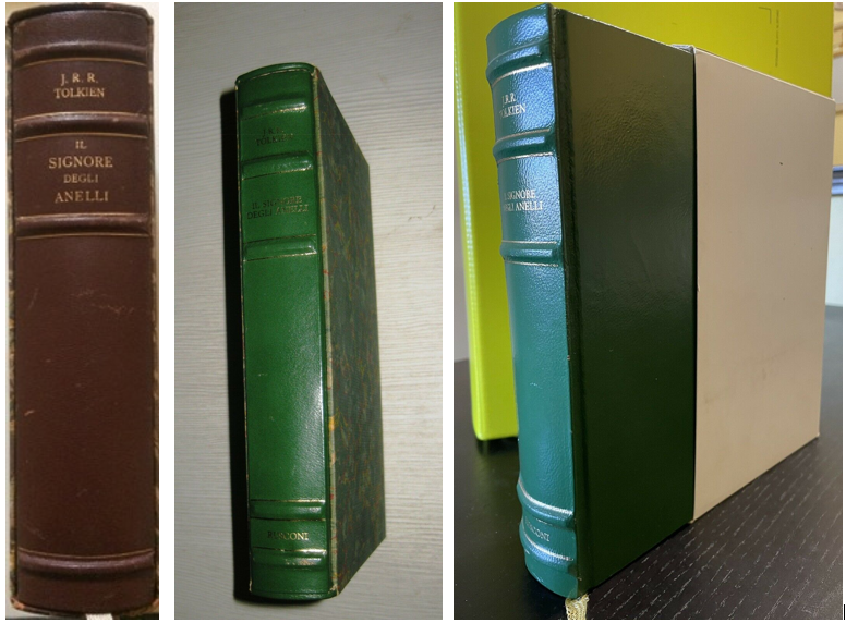
In Italy there are three slipcased editions of The Lord of the Rings ("Il Signore degli Anelli") with ribs on the spine. They are among the most attractive items for Italian collectors, given their scarcity. All were published by Rusconi.
- "Il Signore degli Anelli", 1970: only 300 copies printed, each of them numbered and inscribed with the name of the individual who was gifted with that copy ("ad personam").
- "Il Signore degli Anelli", 1984: 1000 numbered copies (+ other 13 copies with Roman numerals), printed by Rusconi on India paper to celebrate the first million copies sold in Italy.
- "Il Signore degli Anelli", 1997: not numbered.
I don't recall other Italian editions with ribs on the spine.
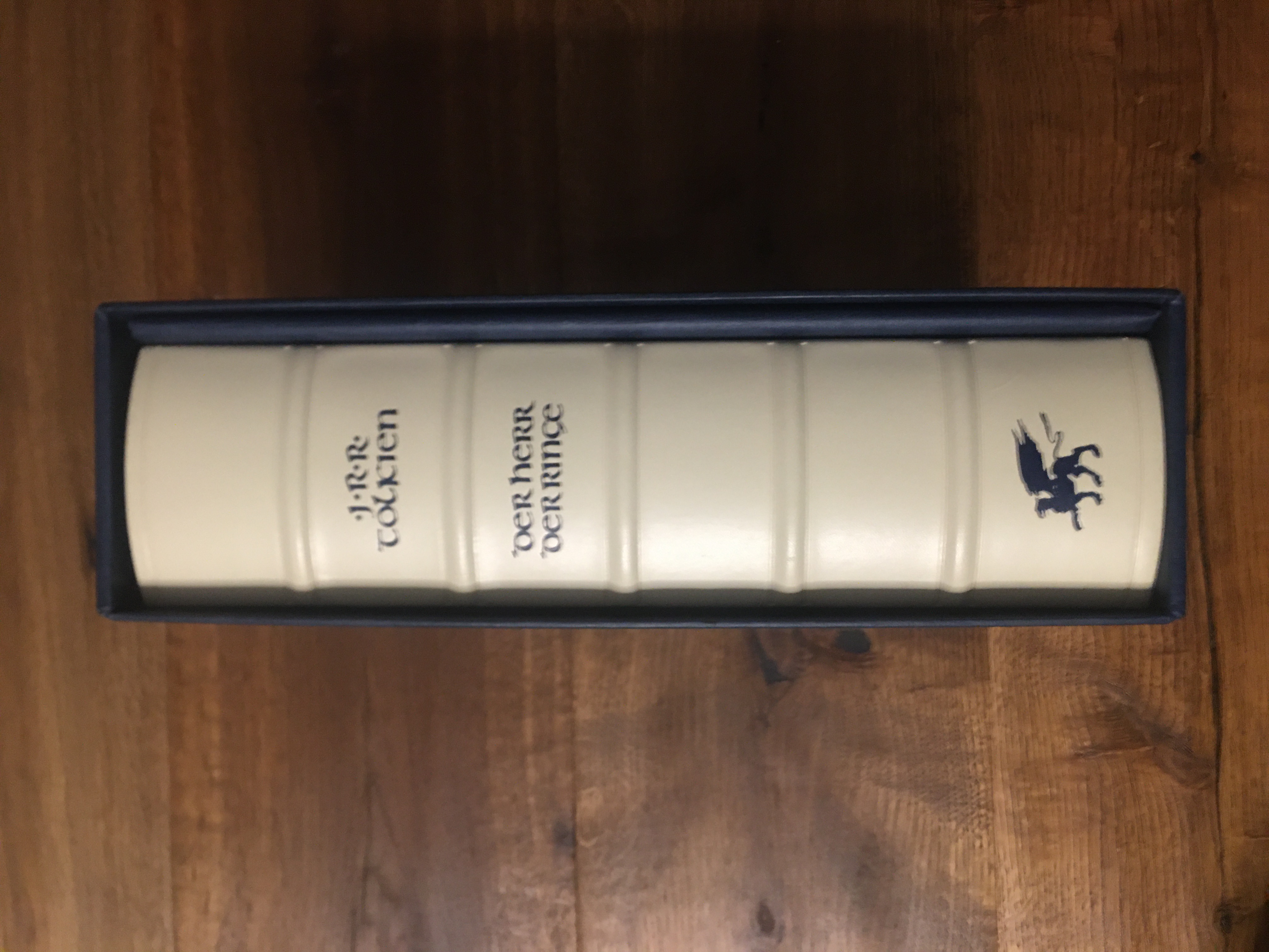
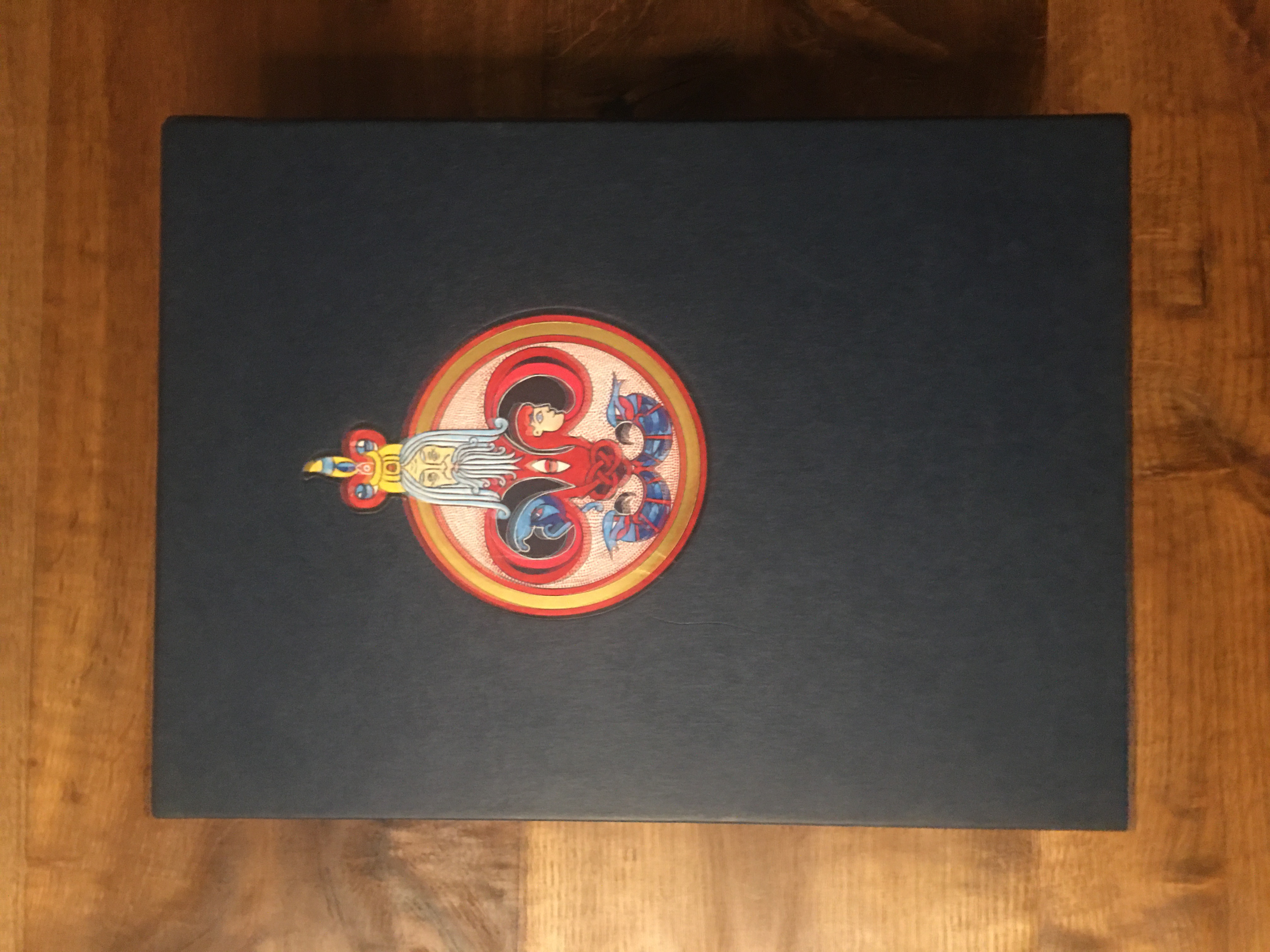
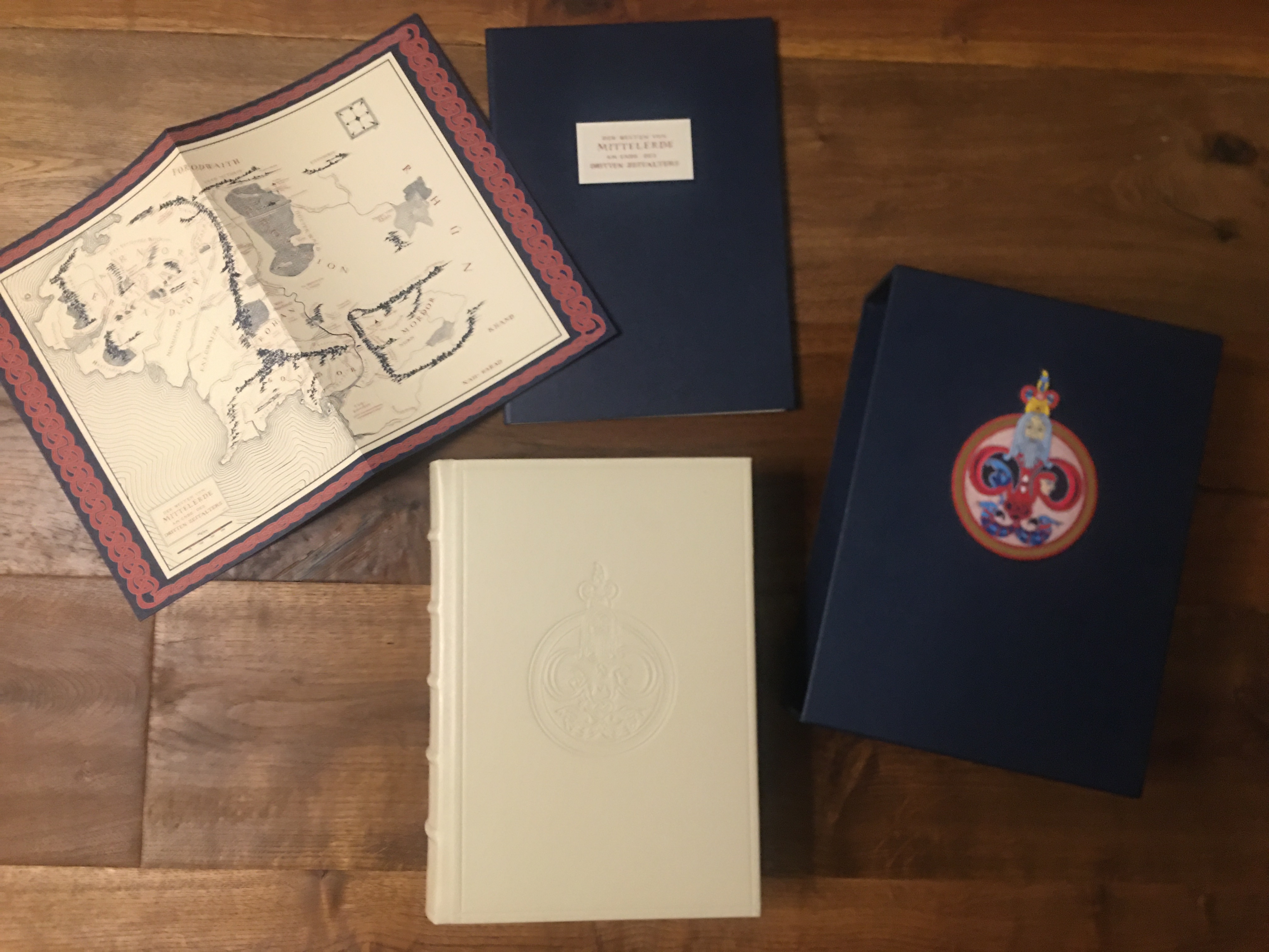
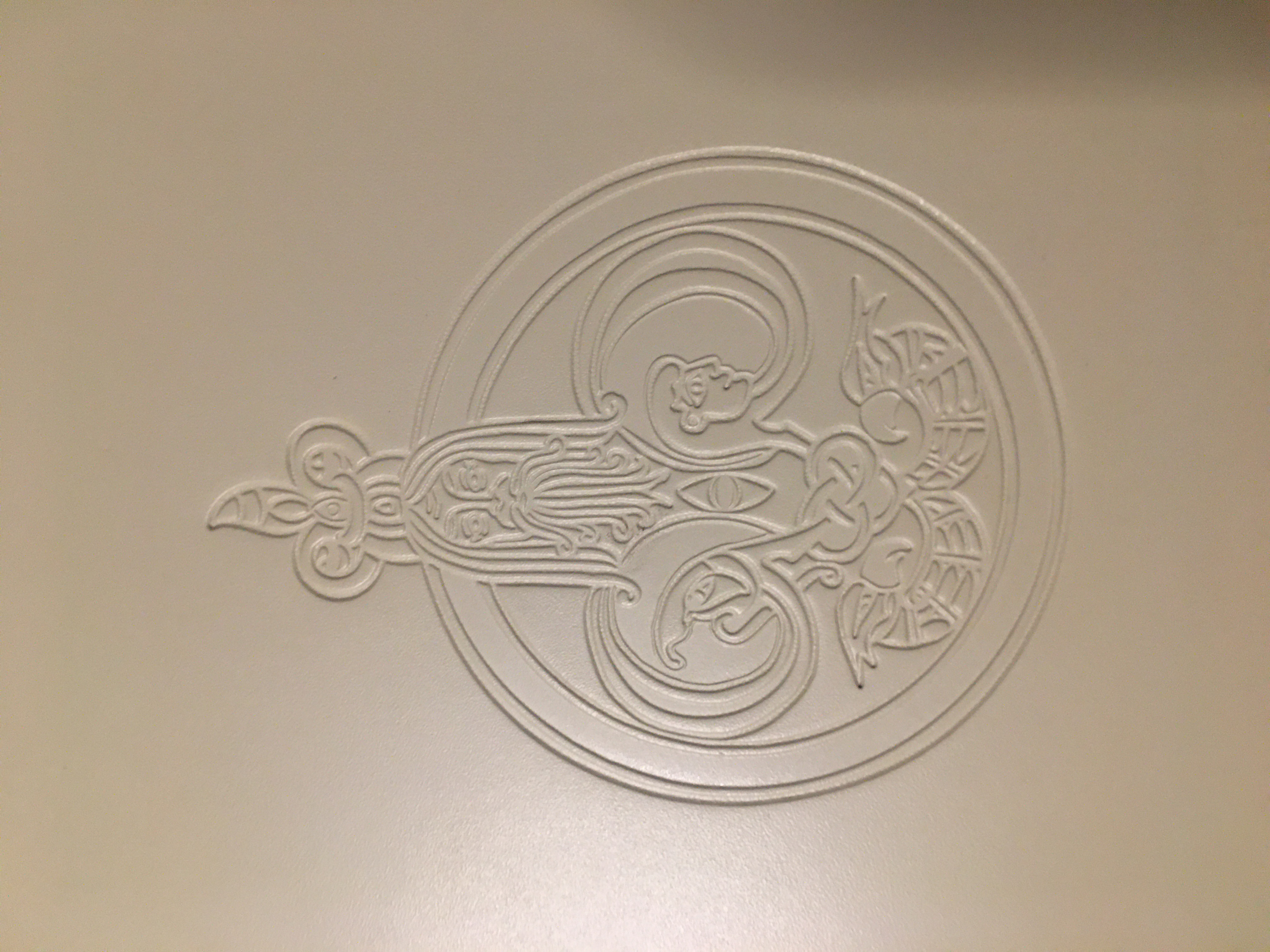
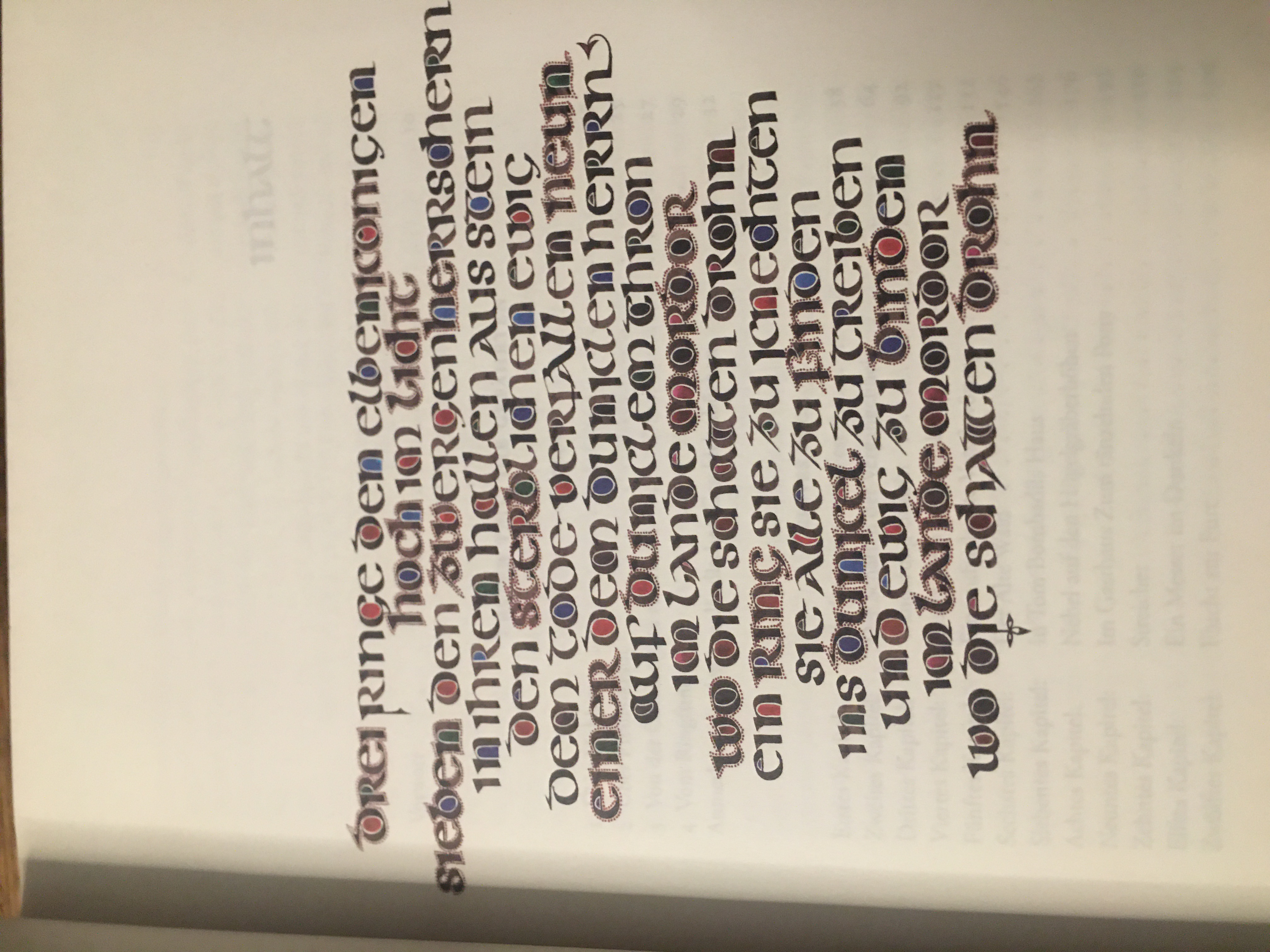
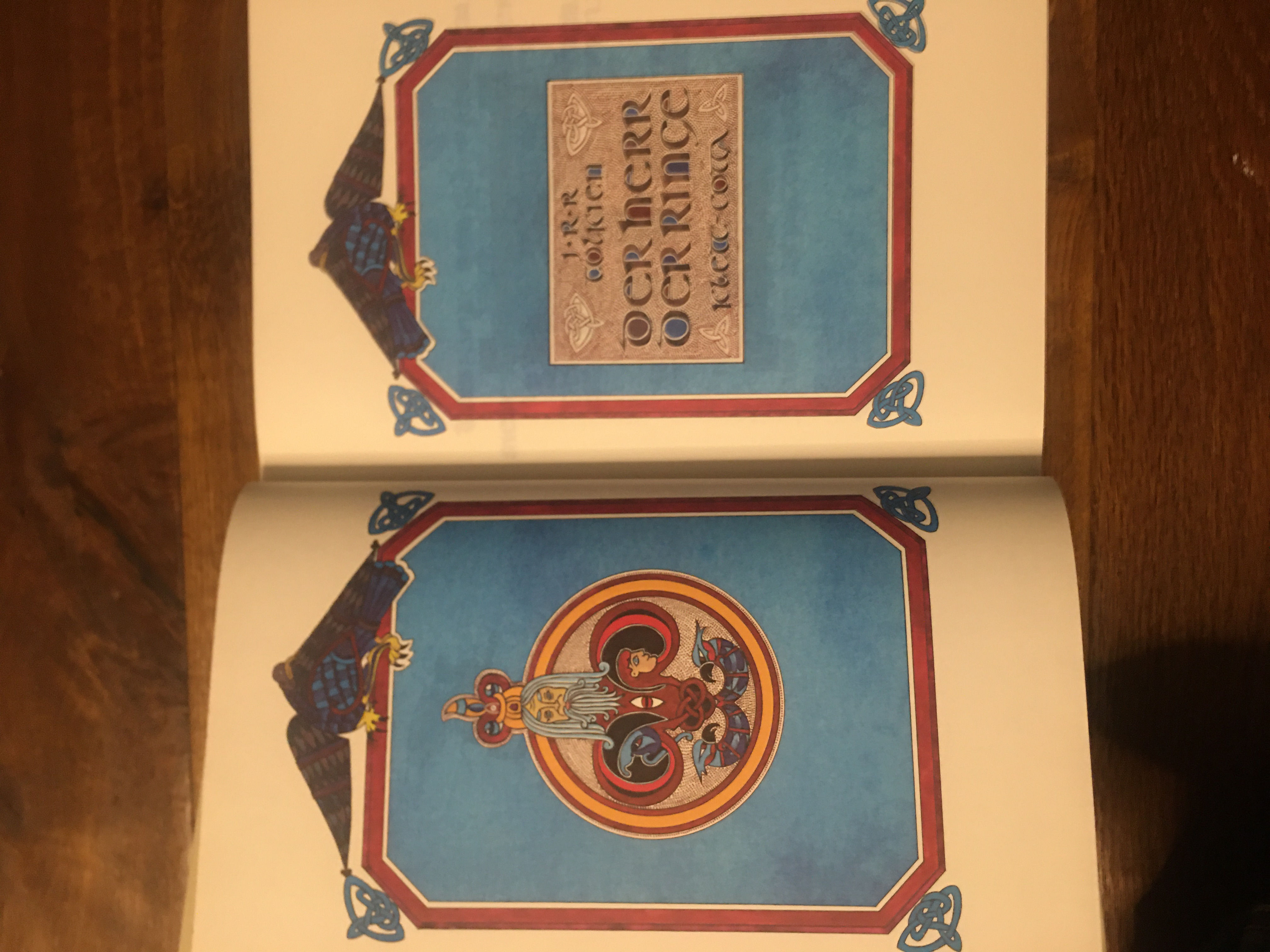
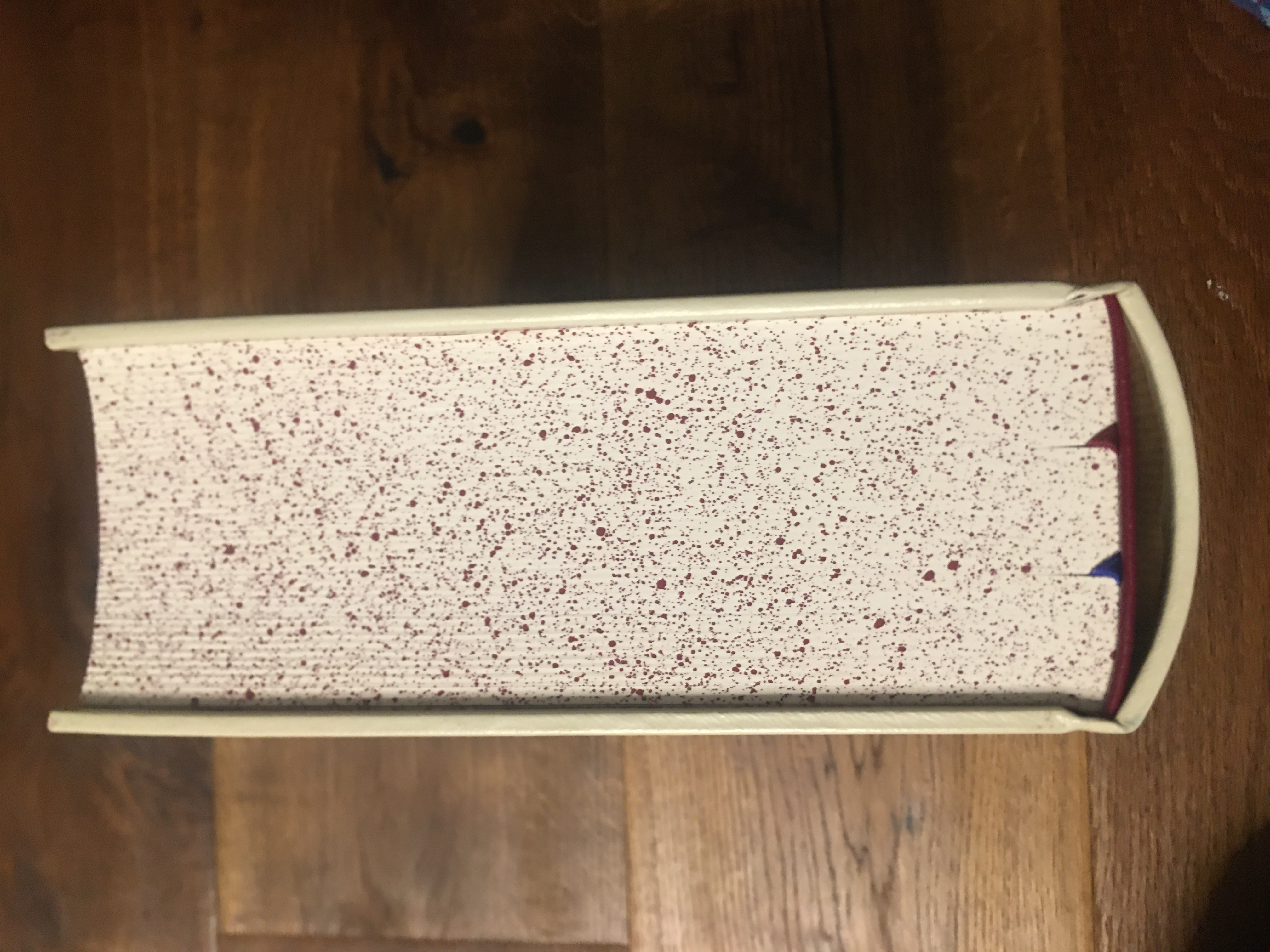
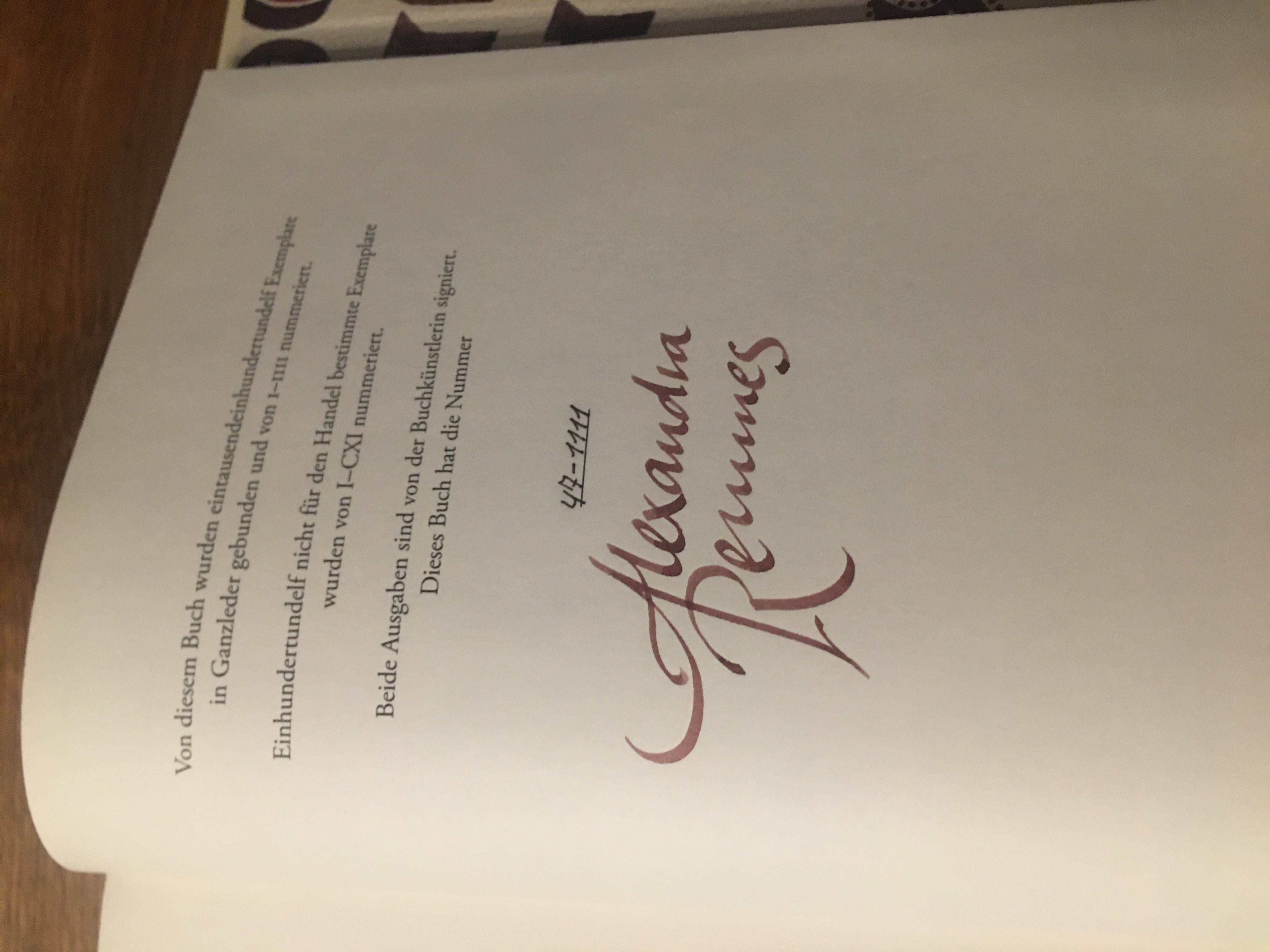
I would like to present a very special German edition of LotR. It is made like a medieval bible, bound in ivory coloured leather with raised ribs on the spine and speckled edges. There is an embossing showing Gandalf on the cover. It is illuminated by accentuated coloured first letters. It is limited to 1111 copies and signed by the artist. This is a very big and heavy book.

24 Apr, 2021
(edited)
2021-4-24 8:48:19 PM UTC
Edited by Khamûl on 2021-4-24 9:04:56 PM UTC
Edited by Khamûl on 2021-4-24 9:05:27 PM UTC
Edited by Khamûl on 2021-4-24 9:07:08 PM UTC
Edited by Khamûl on 2021-4-24 9:07:40 PM UTC
Edited by Khamûl on 2021-4-24 9:08:28 PM UTC
Edited by Khamûl on 2021-4-24 9:05:27 PM UTC
Edited by Khamûl on 2021-4-24 9:07:08 PM UTC
Edited by Khamûl on 2021-4-24 9:07:40 PM UTC
Edited by Khamûl on 2021-4-24 9:08:28 PM UTC
2021-4-24 8:48:19 PM UTC
They're called raised bands. They are anachronistic on modern books.
The spacing of the bands on those Italian editions also makes absolutely zero sense. The "twin" banding on that Norwegian edition makes no sense. The spacing of the bands on the CoH & S&G Super Deluxe's, likewise, make no sense. The "bands" to the head and tail of CoH and S&G also makes no sense. If modern books want to tip a hat to craft binding then an argument can be made for saying the false bands should make sense from a historical book construction perspective. None of these do. The GA&U Super Deluxes get a pass though.
The spacing of the bands on those Italian editions also makes absolutely zero sense. The "twin" banding on that Norwegian edition makes no sense. The spacing of the bands on the CoH & S&G Super Deluxe's, likewise, make no sense. The "bands" to the head and tail of CoH and S&G also makes no sense. If modern books want to tip a hat to craft binding then an argument can be made for saying the false bands should make sense from a historical book construction perspective. None of these do. The GA&U Super Deluxes get a pass though.
Khamûl wrote:
They're called raised bands. They are anachronistic on modern books.
The spacing of the bands on those Italian editions also makes absolutely zero sense. The "twin" banding on that Norwegian edition makes no sense. The spacing of the bands on the CoH & S&G Super Deluxe's, likewise, make no sense. The "bands" to the head and tail of CoH and S&G also makes no sense. If modern books want to tip a hat to craft binding then an argument can be made for saying the false bands should make sense from a historical book construction perspective. None of these do. The GA&U Super Deluxes get a pass though.
To be fair, 95% of any modern deluxe edition of a book makes no real sense. These editions are essentially just a style thing, and in this case they arguably look nicer when done "wrongly", e.g. the hubs on the CoH and some (not all) of the books shown here (IMHO) look better than the older GA&U editions. Fashions come and go.
Just making a simple point (for those unaware) that on older books they're not a fashion i.e. they're not part of the finishing of the book; they are part of the construction (the forwarding). Even on modern hand-bound books false bands help disguise actual raised areas on the spine (usually sewing tapes) that are hard to smooth out (without heavily lining the spine) when thin covering materials (inc. leather) are used. This is not just for show.
The problem here is many of these fine bindings are case-bindings i.e. not true bindings at all. Anyone truly interested in the history of books should also note books that are not rounded and backed. These are poorly constructed (in comparison) and will not hold up to being read/handled as well as a properly bound book that has had the spine rounded & backed. That most people don't read these is well known, but one should note corner cutting and a lack of craft when evidenced. The finishing on modern books is generally excellent; but this is hardly suprising since most of it machine executed.
The problem here is many of these fine bindings are case-bindings i.e. not true bindings at all. Anyone truly interested in the history of books should also note books that are not rounded and backed. These are poorly constructed (in comparison) and will not hold up to being read/handled as well as a properly bound book that has had the spine rounded & backed. That most people don't read these is well known, but one should note corner cutting and a lack of craft when evidenced. The finishing on modern books is generally excellent; but this is hardly suprising since most of it machine executed.
Stu wrote:
Khamûl wrote:
The problem here is many of these fine bindings are case-bindings i.e. not true bindings at all.
I think that is a really good point that is worth highlighting.
If you look at the German edition Ithildin shows us, despite all that quite nice printing (nothing to do with the binding) and some of the finishing; that binding it totally square. No rounding, no shoulders. The round that you see externally is the rounding of the hollow-back. LotRs is a big, thick book; but I'm sure it can be rounded and backed. That book is not. That book construction is possibly no better than a standard HarperCollins edition. Peeps need to know this.
Khamûl wrote:
Stu wrote:
Khamûl wrote:
The problem here is many of these fine bindings are case-bindings i.e. not true bindings at all.
I think that is a really good point that is worth highlighting.
If you look at the German edition Ithildin shows us, despite all that quite nice printing (nothing to do with the binding) and some of the finishing; that binding it totally square. No rounding, no shoulders. The round that you see externally is the rounding of the hollow-back. LotRs is a big, thick book; but I'm sure it can be rounded and backed. That book is not. That book construction is possibly no better than a standard HarperCollins edition. Peeps need to know this.
I think it could be incredibly helpful if some pictures or links were added here to show what “rounding”, “shoulders”, and “backing” mean. It’s all fascinating stuff.
Khamûl wrote:
Stu wrote:
Khamûl wrote:
The problem here is many of these fine bindings are case-bindings i.e. not true bindings at all.
I think that is a really good point that is worth highlighting.
If you look at the German edition Ithildin shows us, despite all that quite nice printing (nothing to do with the binding) and some of the finishing; that binding it totally square. No rounding, no shoulders. The round that you see externally is the rounding of the hollow-back. LotRs is a big, thick book; but I'm sure it can be rounded and backed. That book is not. That book construction is possibly no better than a standard HarperCollins edition. Peeps need to know this.
I agree - I noticed that on the German edition. I don't see why it wouldn't be possible to do it properly on an LoTR thickness book (and it would stop the pages flopping out from the spine like they do in the trade editions).
Urulókë wrote:
I think it could be incredibly helpful if some pictures or links were added here to show what “rounding”, “shoulders”, and “backing” mean. It’s all fascinating stuff.
http://papercutbindery.blogspot.com/2 ... rounding-and-backing.html





 17
17 3072
3072