Khamûl wrote:
Stu wrote:
The_Antiquarian wrote:
the sake of rebinding, so I just had a solander case made for it.
This time, I would like Richard Tong of Lyra's Books (a close associate of HarperCollins) to rebind my Silmarillion.
I think Lyras do some really nice work. The only thing that always feels like a technical error is the small space between the boards and the spine where the leather shrinks at the head and foot. It just feels excessive relative to other binderies, which is a shame as I really like everything else about their work.
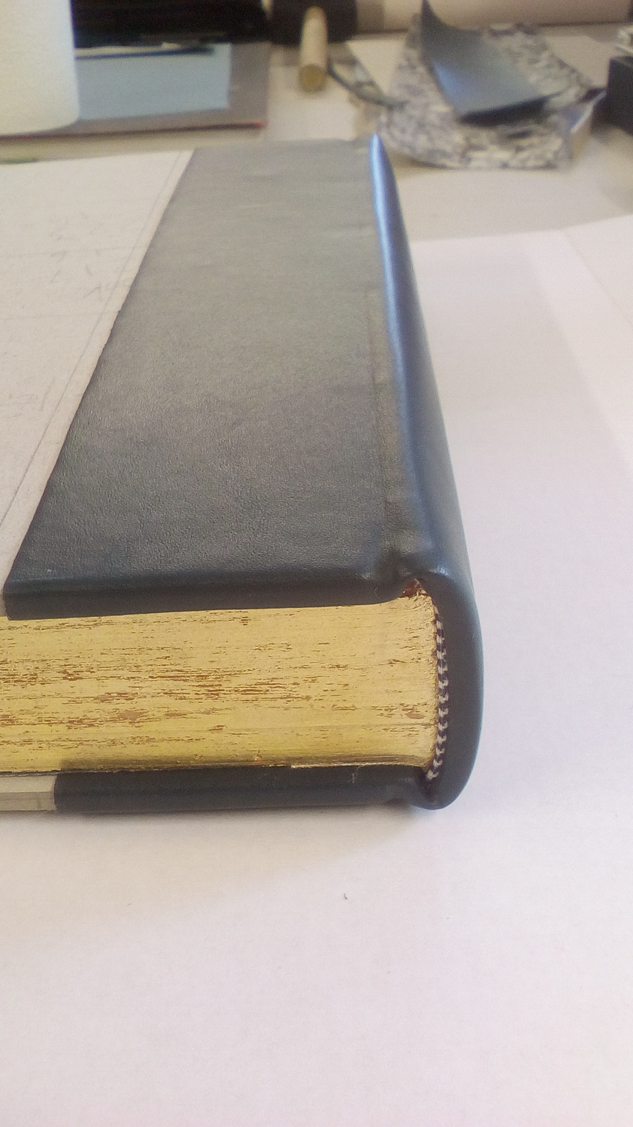
If you're talking about the traingular cut-aways ("back-cornering") to the head & tail of the boards at the spine, then that's to remove the sharpness of those corners to prevent them poking through the leather, when one is turning the leather in. It's also stylistic & helps with forming headcaps. It's not to do with leather shrinkage.
Yeah, that is what I'm talking about. The leather is clearly very tight around those areas on Lyras' work and those cut-aways are *much* more pronounced than I have seen on work from other binders. I was using the word "shrink" incorrectly - I meant where it is pulled around, not that it had shrunk after being bound. I think it looks pretty bad on some of their work (I've seen a couple of fairly extreme examples), but I assume it is a conscious stylistic decision. I love almost everything else about their bindings (far more so than most other binders).
Had a look at examples. It doesn't look excessive. Are you sure it's not just that other bookbindings (modern) that you've looked at simply haven't done back-cornering at all? (Having said that, Lyra's do themselves have examples where they haven't back-cornered.) Some binders don't do it because they (I assume) don't work headcaps; and they don't need headcaps because they maybe didn't do sewn headbands (for example), or didn't actually work with wet leather. It is stylistic is one sense, but it should also reassure you that there's a lot of good bookbinding practise (mostly hidden) going on there, in that particular re-binding. Personally, if I don't see this, it raises questions to how the whole binding was actually executed. There are lots of flashy case-binding examples out there; but case-binding isn't a "proper" binding in a traditional sense, if one cares about such details.

20 Aug, 2021
(edited)
2021-8-20 7:21:40 AM UTC
Edited by Stu on 2021-8-20 7:31:42 AM UTC
Edited by Stu on 2021-8-20 7:44:17 AM UTC
Edited by Stu on 2021-8-20 7:45:42 AM UTC
Edited by Stu on 2021-8-20 7:44:17 AM UTC
Edited by Stu on 2021-8-20 7:45:42 AM UTC
2021-8-20 7:21:40 AM UTC
I'll see if I can dig out some old images. There were definitely some where it appeared excessive to me, but to be fair I haven't looked at anything recent.
I'd tend to say if you look through *historic* bindings and don't typically see this to the pronounced degree, then it clearly wasn't historically needed to quite that degree and must be somewhat of a stylistic choice to exaggerate it -- it just isn't one I like. But, I'm definitely no expert on bookbinding, so I guess I can only comment on what seems to work visually and what doesn't. Like I say, for the most part I have really liked what I have seen, but the back-cornering was just too much on a couple of rebound Folio editions I saw sell on eBay some time back.
(I agree that case-binding isn't "proper" binding, but I don't think most quality bookbinders are doing case bindings).
See this example from Lyras looks good to me: https://www.tolkienguide.com/modules/auctions/293432806134
But this set - which I really like overall - looks "off" with regards to the heads/tails of the spines : https://imgur.com/gallery/koMw1rc
To be fair, maybe there is some optical illusion and distortion going on in the image.
Yeh, on that LotRs set it it's quite pronounced. The cut to the board is meant to be roughly double as long (head to tail) as short (spine to fore-edge). How much the leather is pulled into the groove is also dependent on the leather type & how tightly the leather is tied up. The S example is a lot more subtle.
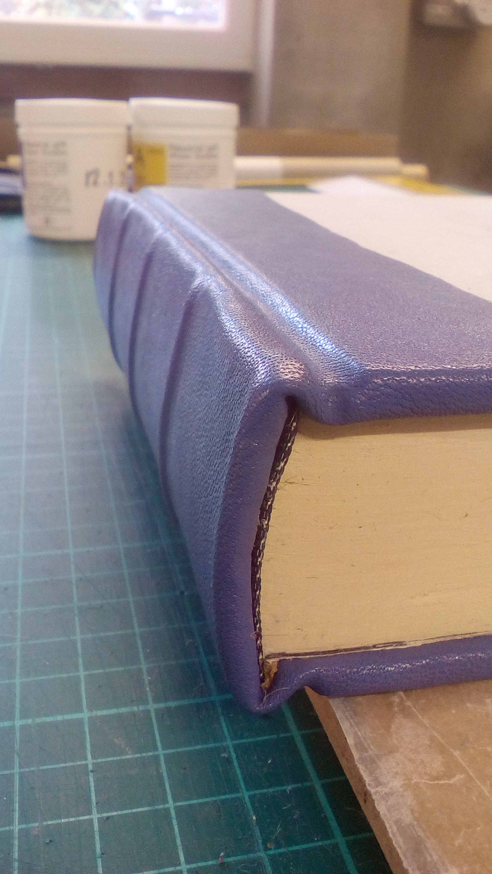
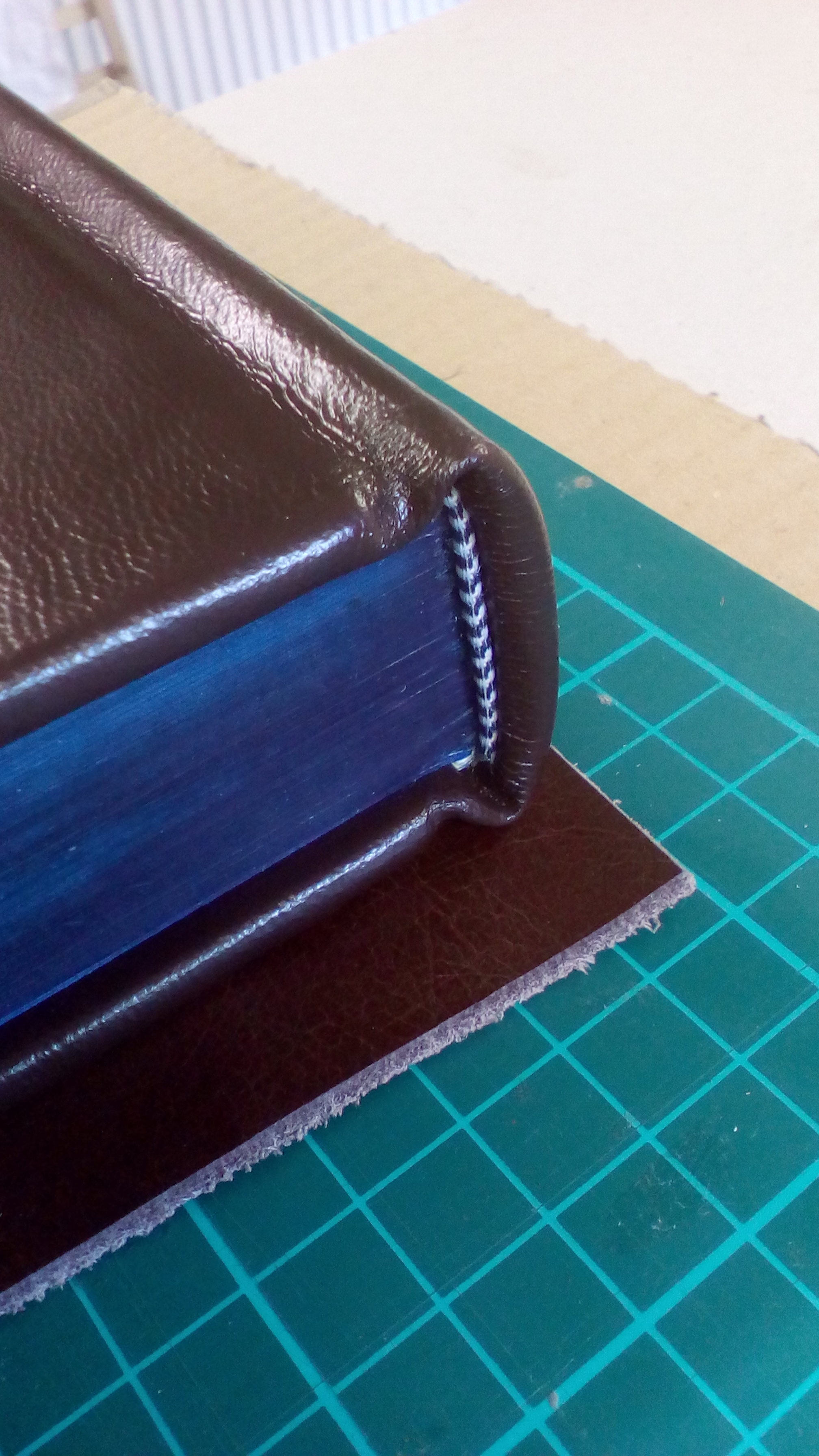
I've attached some examples of back-cornering on some of my own rebinds to illustrate what the cut looks like prior to covering with leather!
I've attached some examples of back-cornering on some of my own rebinds to illustrate what the cut looks like prior to covering with leather!

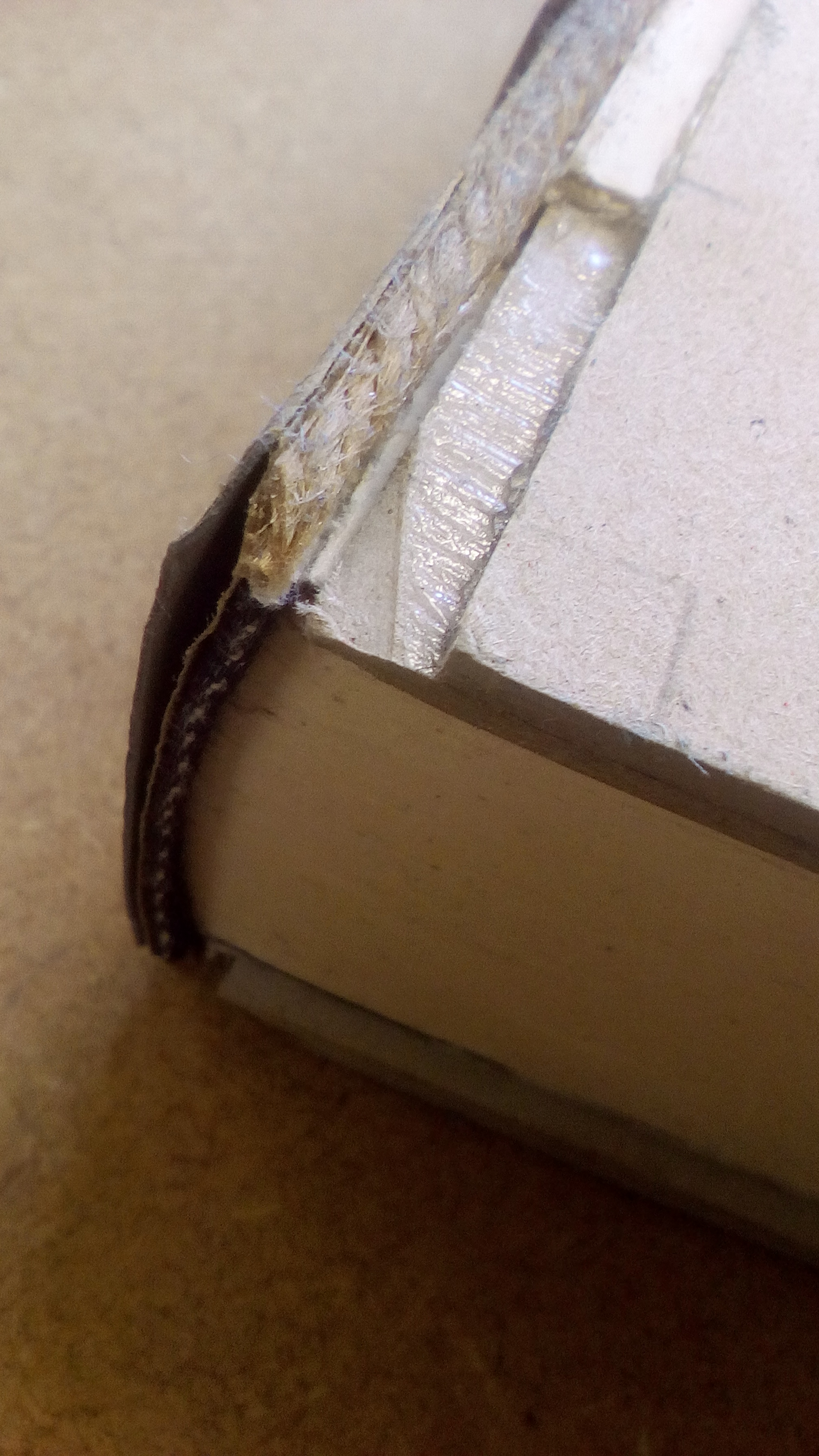
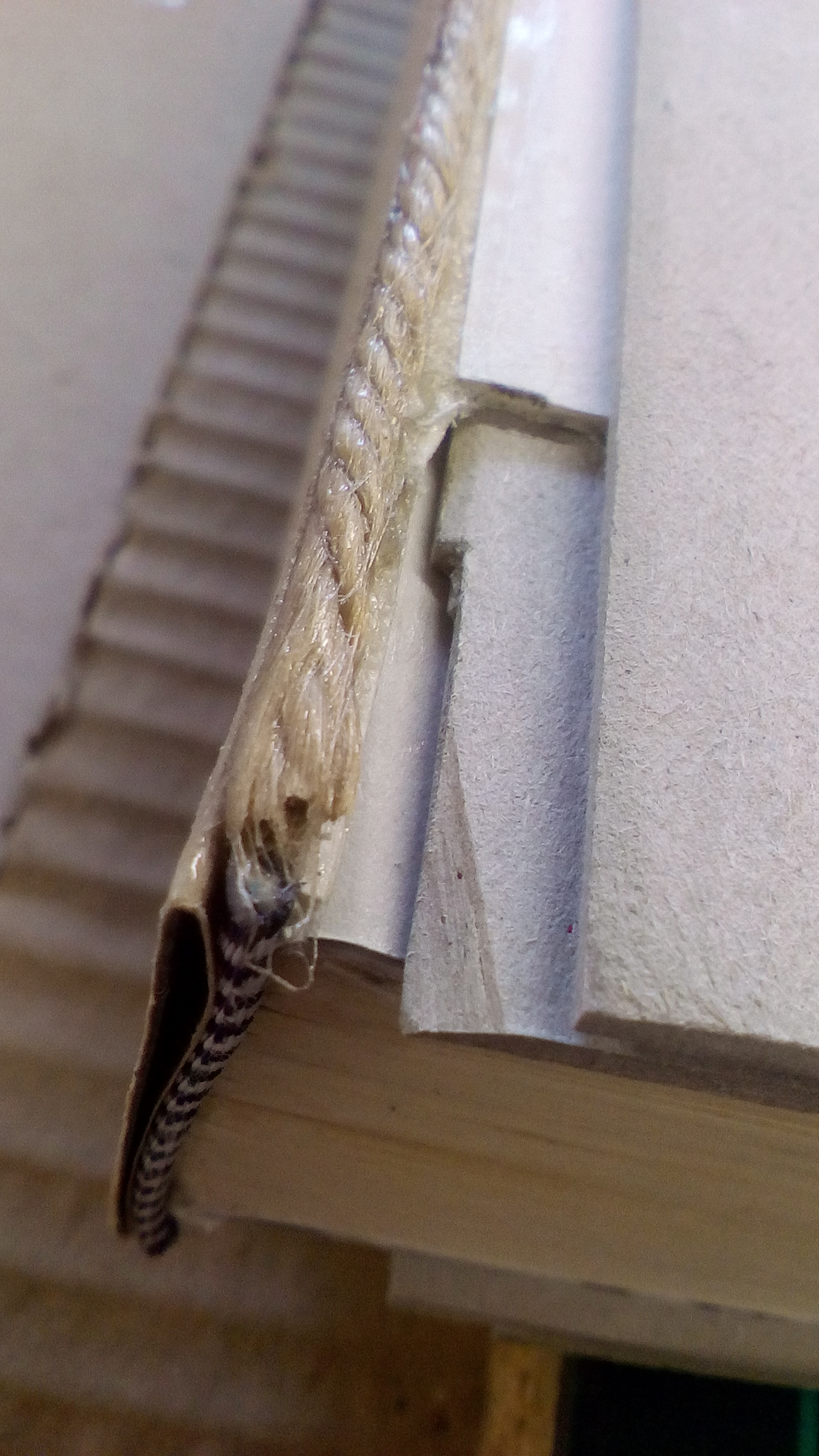
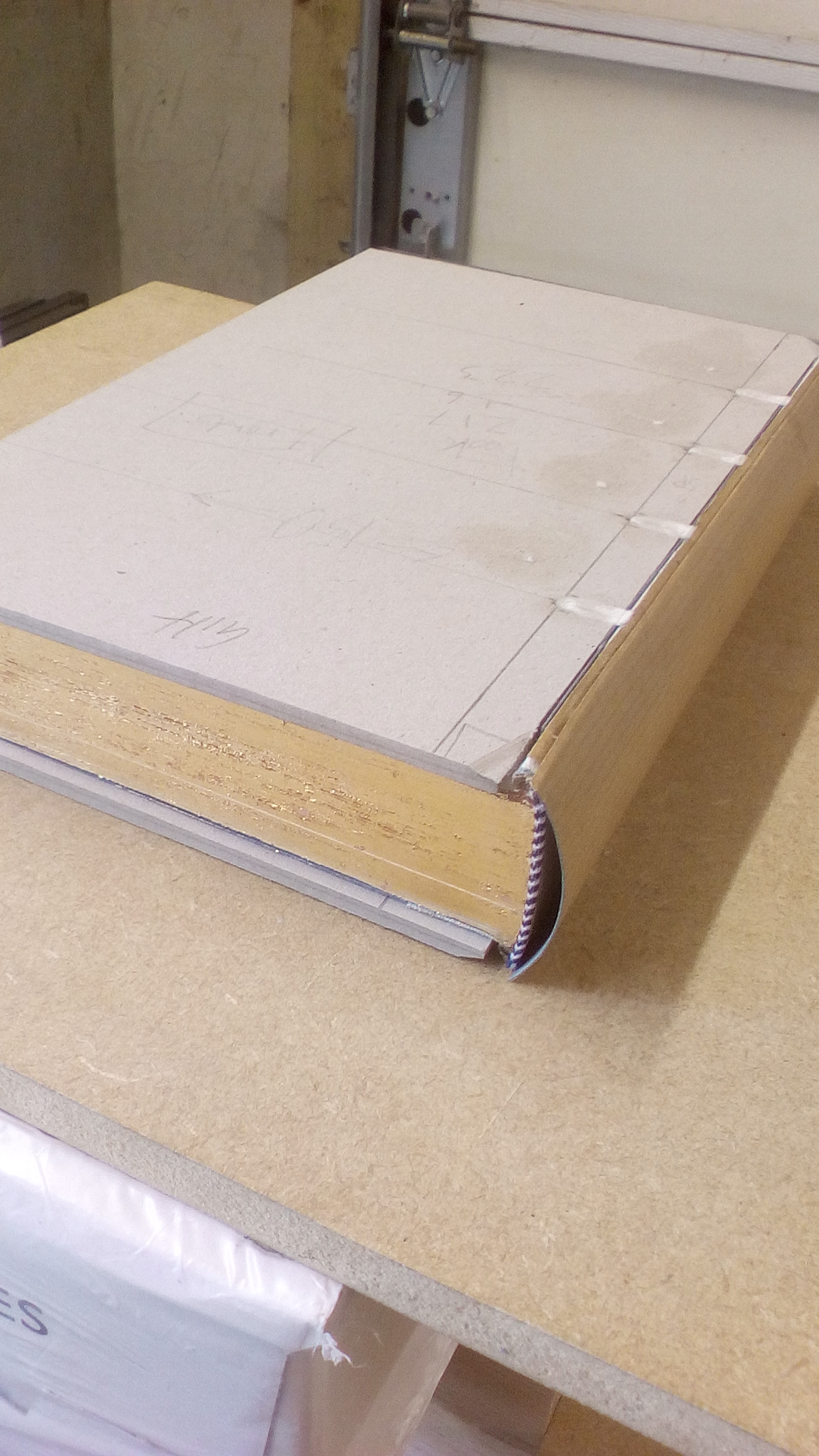
Thanks for the images Khamûl - that's really good to see the before and after. FWIW, yours looks exactly like I would expect, with some small indentation in the final product, and with the spine still relatively straight at the end (i.e. without significant outward bowing at the head and tail like can be seen on that LoTR set),
Would be great if you did a post sometime, showing your process all the way from start to finish on one of your rebinds, and maybe all he tools you have used.
I'd love to practice some of this stuff myself, but toddler has basically killed any hope of free time, so watching others is as good as it gets.
I will do that, Stu. Don't want bore everyone to death in every thread, so maybe an idea to keep it all in one place...
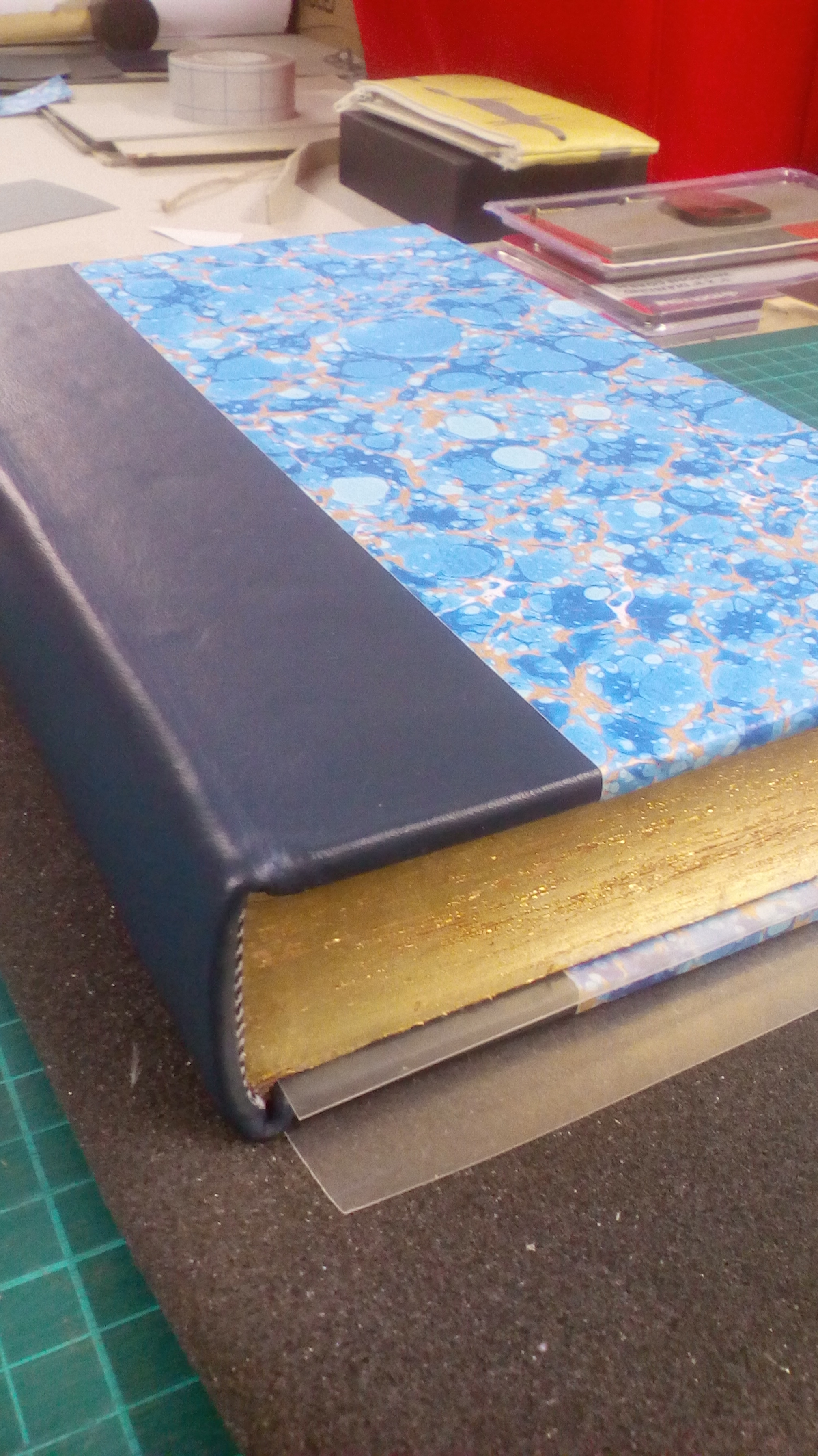
Below are two copies of The Silmarillion (alt. images above) which I've finished binding over tha last few months. I'll look at what one has the most supporting photos that would allow a decent talk-through. With every rebind I've done (so far) I've tried to execute a new technique; so every book is a bit of an "example of ___" project. Both of these are still to be finished i.e. titled in foil/gilt. It might be a few months before I get around to that.
Below are two copies of The Silmarillion (alt. images above) which I've finished binding over tha last few months. I'll look at what one has the most supporting photos that would allow a decent talk-through. With every rebind I've done (so far) I've tried to execute a new technique; so every book is a bit of an "example of ___" project. Both of these are still to be finished i.e. titled in foil/gilt. It might be a few months before I get around to that.
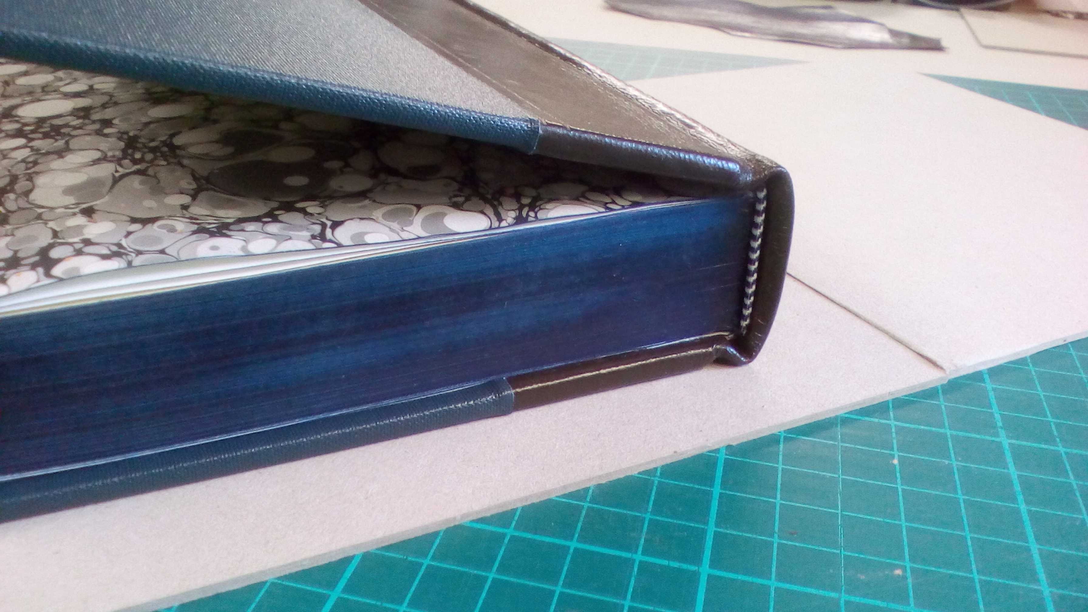
Khamul, the rebinding looks fantastic.
I will have some serious thinking to do on how I should get my Silmarillion rebound.
I will have some serious thinking to do on how I should get my Silmarillion rebound.

24 Aug, 2021
(edited)
2021-8-24 10:26:04 AM UTC
Edited by Khamûl on 2021-8-24 6:15:58 PM UTC
Edited by Khamûl on 2021-8-24 6:16:24 PM UTC
Edited by Khamûl on 2021-8-24 6:16:24 PM UTC
2021-8-24 10:26:04 AM UTC
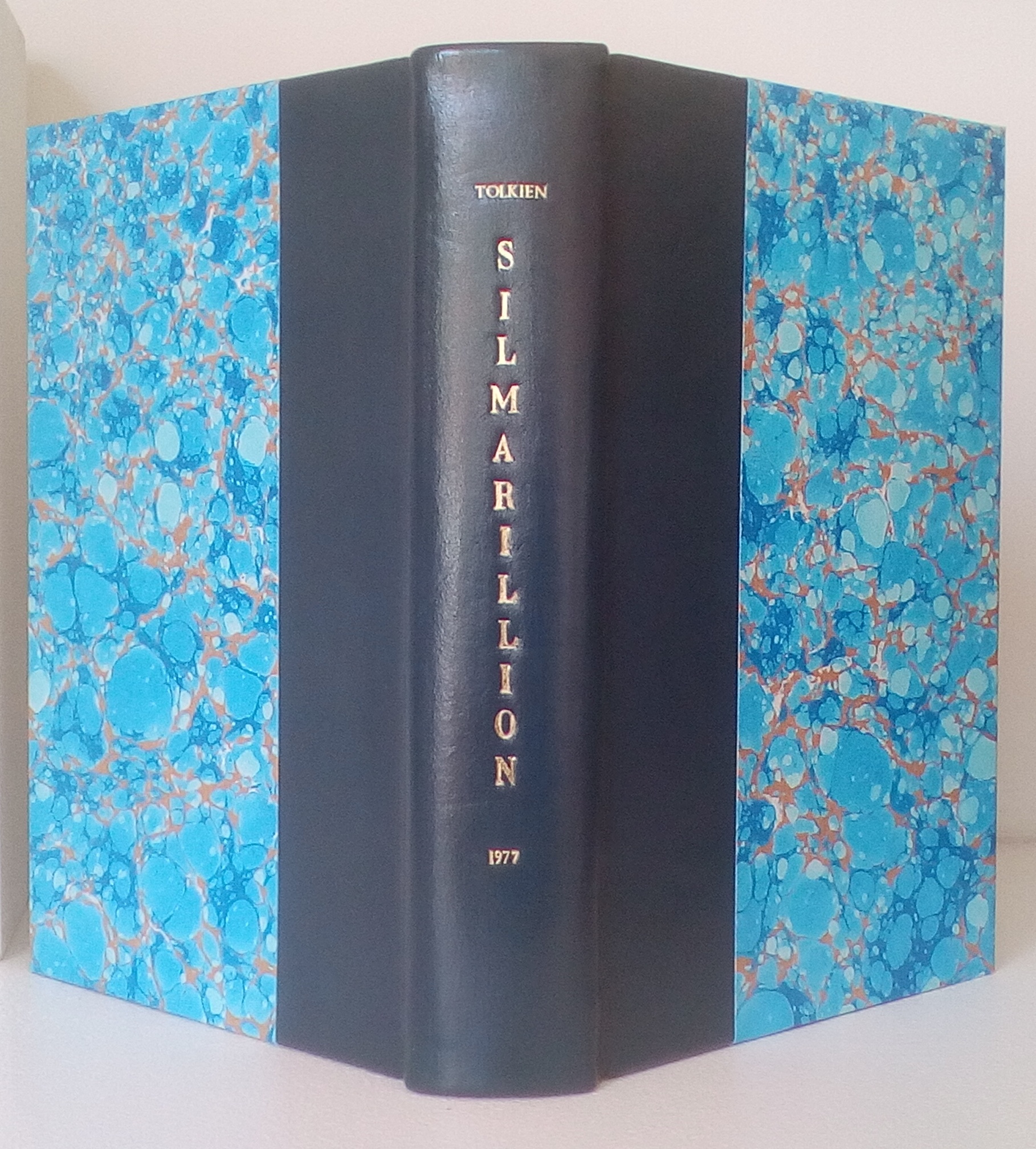
Sorry, one last photo. I tried out my new brass letters the other day. Did some trial runs & one of the leathers took the gilt tooling very well. Then, rather rashly, decided to tool straight on to the recent rebind I did. Before you say anything, the unconvential typographical layout was entirely intentional. I've been looking at a lot of work by a German binder, and like the head to tail upright lettering style, just for something different. Might still do a simple gilt line on the covers at the leather-paper join, haven't decided yet.




 4321
4321 1.96M
1.96M