So, what is better with better with LEGO (comparing to Clays) for HoME Deluxe edition? What changed within your experience?
I mean this font black color shifts to pale black is present on Clays copies for sure. I've even noticed it on one youtube video
By the way this video reveals that a deluxe set may contain mixed volumes. In this video Tom shows that he has volumes 1,3 printed by Lego and 3rd volume from Clays.
Does anyone possessing deluxe edition can confirm that Lego do not have this black-grayish font issue?
I mean this font black color shifts to pale black is present on Clays copies for sure. I've even noticed it on one youtube video
&
By the way this video reveals that a deluxe set may contain mixed volumes. In this video Tom shows that he has volumes 1,3 printed by Lego and 3rd volume from Clays.
Does anyone possessing deluxe edition can confirm that Lego do not have this black-grayish font issue?
Amedautrui wrote:
So, what is better with better with LEGO (comparing to Clays) for HoME Deluxe edition? What changed within your experience?
I mean this font black color shifts to pale black is present on Clays copies for sure. I've even noticed it on one youtube video&
By the way this video reveals that a deluxe set may contain mixed volumes. In this video Tom shows that he has volumes 1,3 printed by Lego and 3rd volume from Clays.
Does anyone possessing deluxe edition can confirm that Lego do not have this black-grayish font issue?
You can see a description of some of the differences here https://www.tolkienguide.com/modules/n ... hp?topic_id=2855&forum=12
Sorry, I can't comment on whether the print quality faults are present - the LEGO set is boxed away and the idea of digging through a bunch of boxes to find it is unappealing! I know Trotter has this set, so he may be able to have a quick look at his.
I personally wouldn't recommend buying this edition full-stop - I don't believe it will hold up to extended use and there are better options (i.e. 12 volume hardbacks). You are unlikely to be happy with this set, IMHO.
With regards to mixed volumes -- several such sets have been seen. I suspect a lot of the Clays sets were destroyed in shipping incidents (they were not shipped from HC in an outer carton, unlike LEGO). My guess is that some of the undamaged volumes of returns were mixed with LEGO copies in LEGO slipcases rather than discarding the entire sets.
Thank you very much for your reply! How can tag of fund that guy (Trotter) to ask about font? I really need to know it Lego print has this issue. Just look at what I am talking about (pictures attached below).
Unfortunately I am unable to purchase "print on demand" HoME volumes from Tolkien.co.uk. They do not have the delivery option to Ukraine anymore for some reasons, not to mention price of 40 gbp*13 volumes=520 gbp (before delivery costs even if it would have been possible).
Unfortunately I am unable to purchase "print on demand" HoME volumes from Tolkien.co.uk. They do not have the delivery option to Ukraine anymore for some reasons, not to mention price of 40 gbp*13 volumes=520 gbp (before delivery costs even if it would have been possible).
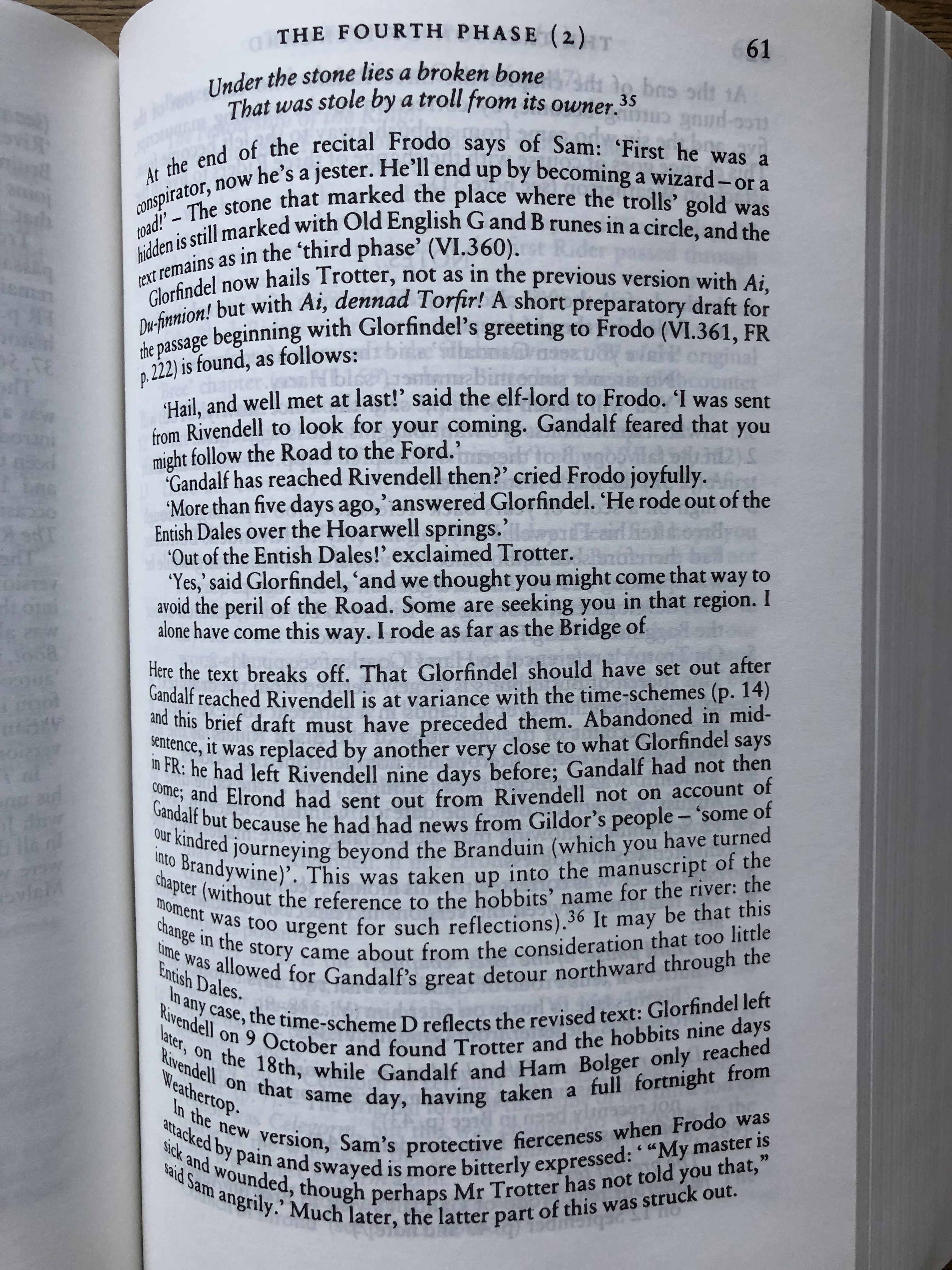
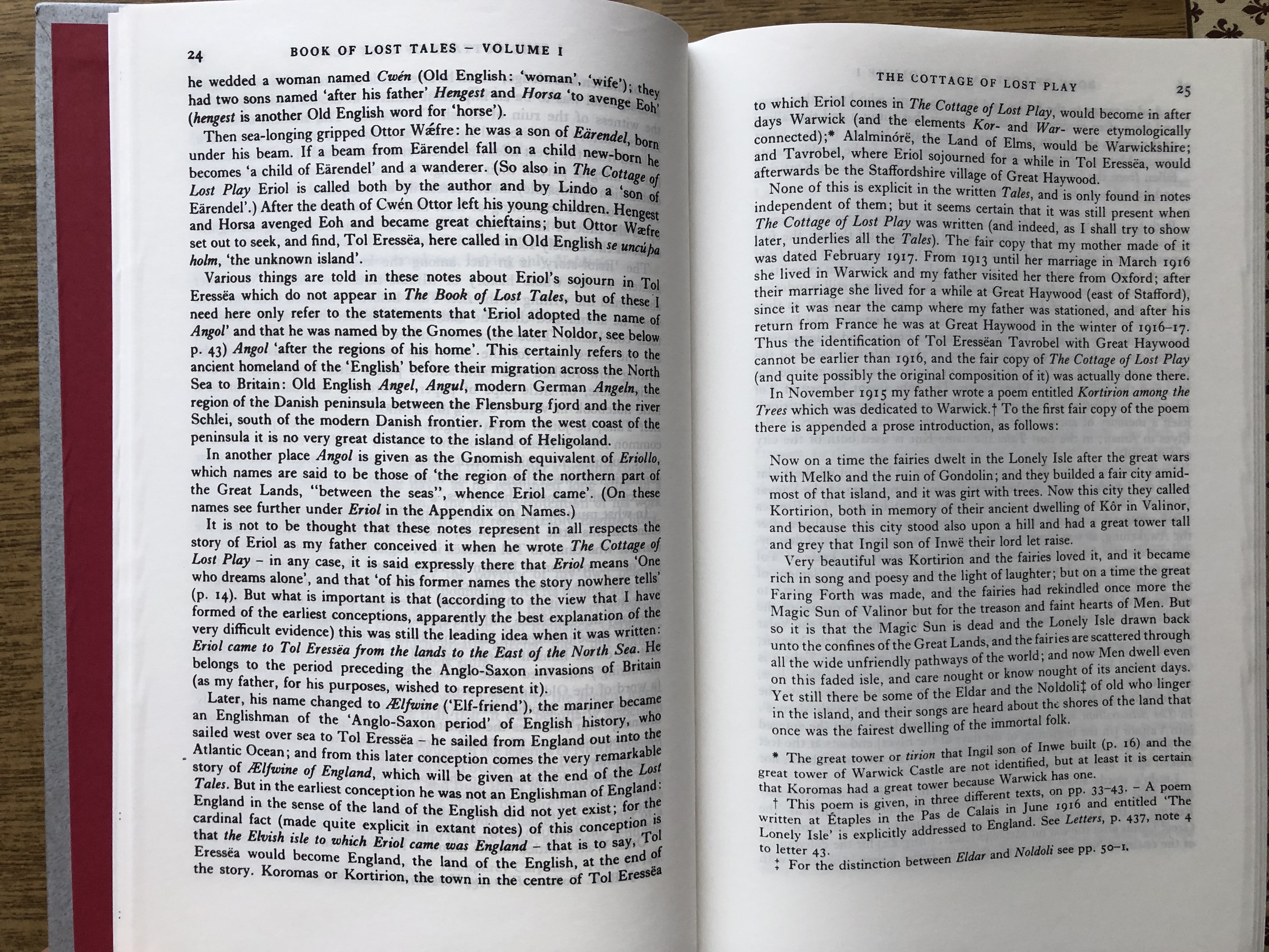
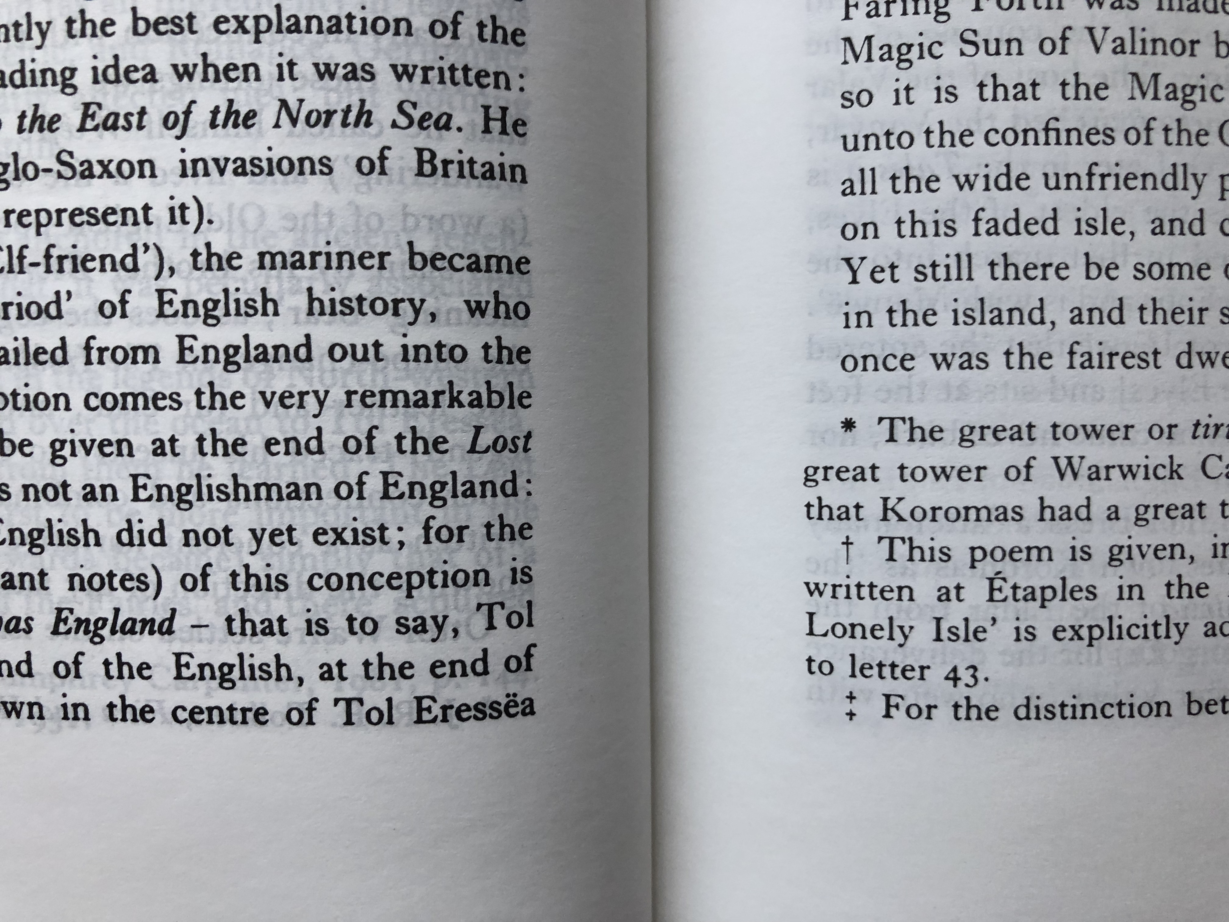
Amedautrui wrote:
Thank you very much for your reply! How can tag of fund that guy (Trotter) to ask about font? I really need to know it Lego print has this issue. Just look at what I am talking about (pictures attached below).
Unfortunately I am unable to purchase "print on demand" HoME volumes from Tolkien.co.uk. They do not have the delivery option to Ukraine anymore for some reasons, not to mention price of 40 gbp*13 volumes=520 gbp (before delivery costs even if it would have been possible).
I dug out the LEGO version and I can confirm it has exactly the same variance in print boldness that you see on the Clays version. Presumably the files or other print materials provided by HarperCollins are defective. I haven't checked my 3 volume standard edition as that is in a different box, but I would not be surprised to see the same problem.
Thank you for checking. What a shame to HarperCollins! I mean how can it even exist in a deluxe edition. Looks like I should be very careful with their upcoming Unfinished Tales special edition. I still doubt about purchasing it. Pre-ordered on Amazon, but most probably will cancel it. Looks like the only reason to pay 3-4 times the standard edition, may also fail (materials of the edition and its two "detachable" fold-outs) with quality issues.
Amedautrui wrote:
Thank you for checking. What a shame to HarperCollins! I mean how can it even exist in a deluxe edition. Looks like I should be very careful with their upcoming Unfinished Tales special edition. I still doubt about purchasing it. Pre-ordered on Amazon, but most probably will cancel it. Looks like the only reason to pay 3-4 times the standard edition, may also fail (materials of the edition and its two "detachable" fold-outs) with quality issues.
There is no way on earth I will be paying for the "deluxe" edition of Unfinished Tales, personally. Whilst I doubt it will be as poor as the "deluxe" HoME (which is not deluxe at all), it doesn't seem to offer good value and I personally don't like the way they have styled it. The standard edition will do me just fine.
I don't trust any HarperCollins Tolkien release these days until I've seen pictures of the actual books from an actual customer. I've been burned one too many times. I think they are burning a lot of the goodwill they have had with their customers, especially now it is quite well known that they foist very poor quality reprints onto (previously) unsuspecting customers. The game is starting to be up!
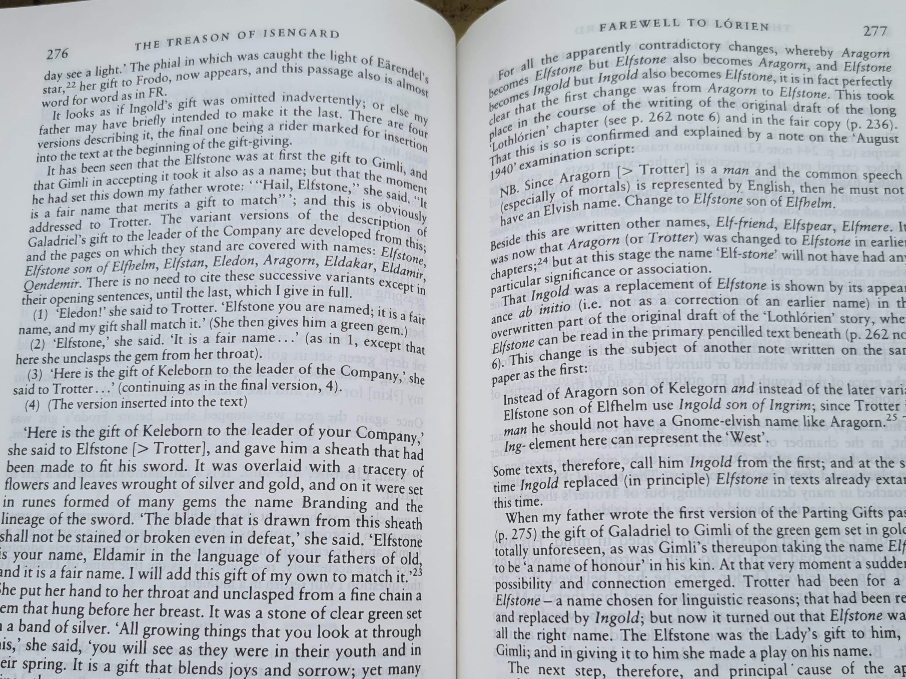
Looking at my deluxe set, all are Lego SpA. I usually like to buy 1st impressions as they are published but for financial reasons at the time I didn’t. I’ve ended with 4th impressions for all, but that doesn’t sound a bad thing from what I’ve heard of earlier slipcases, etc..
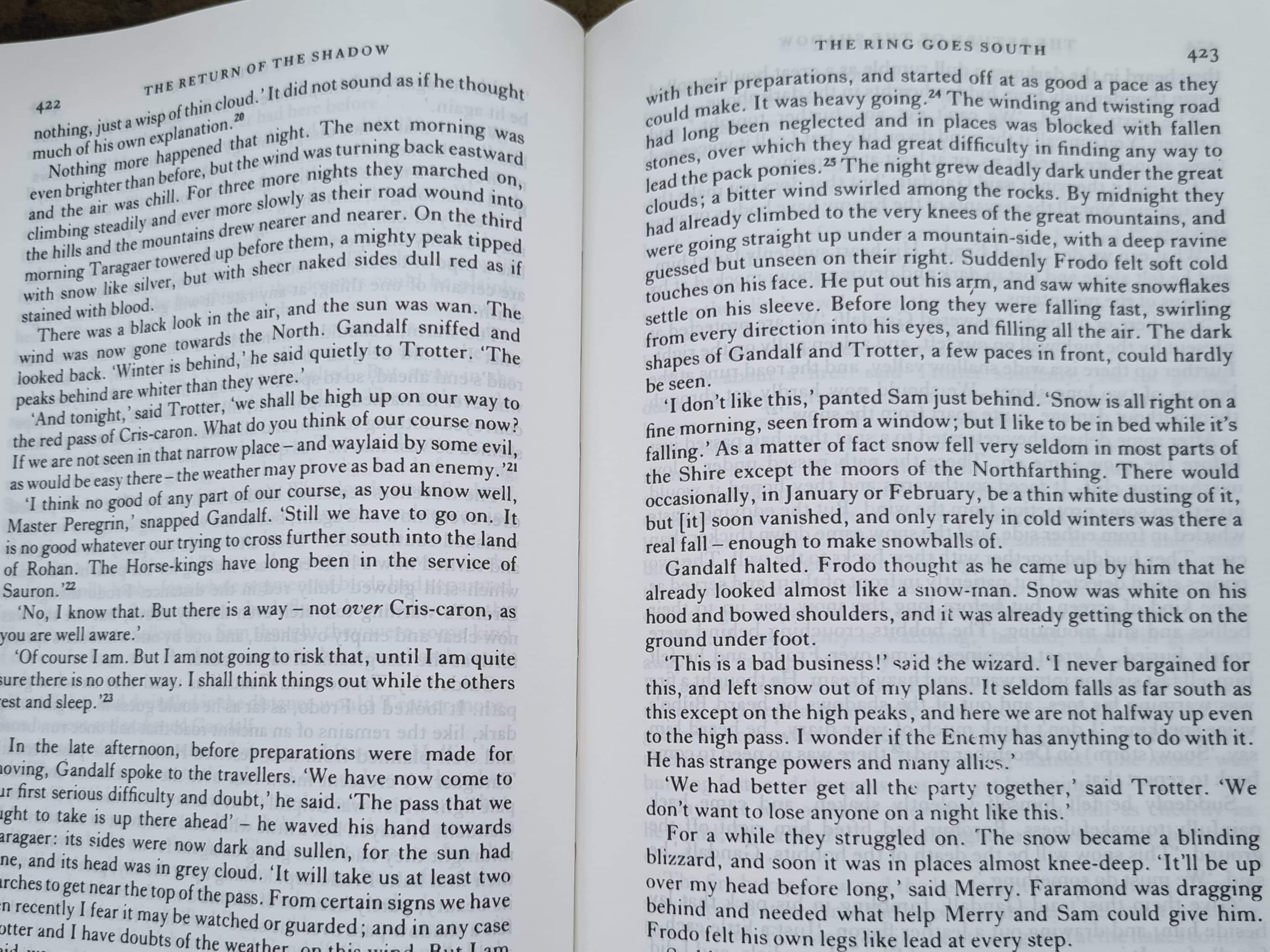
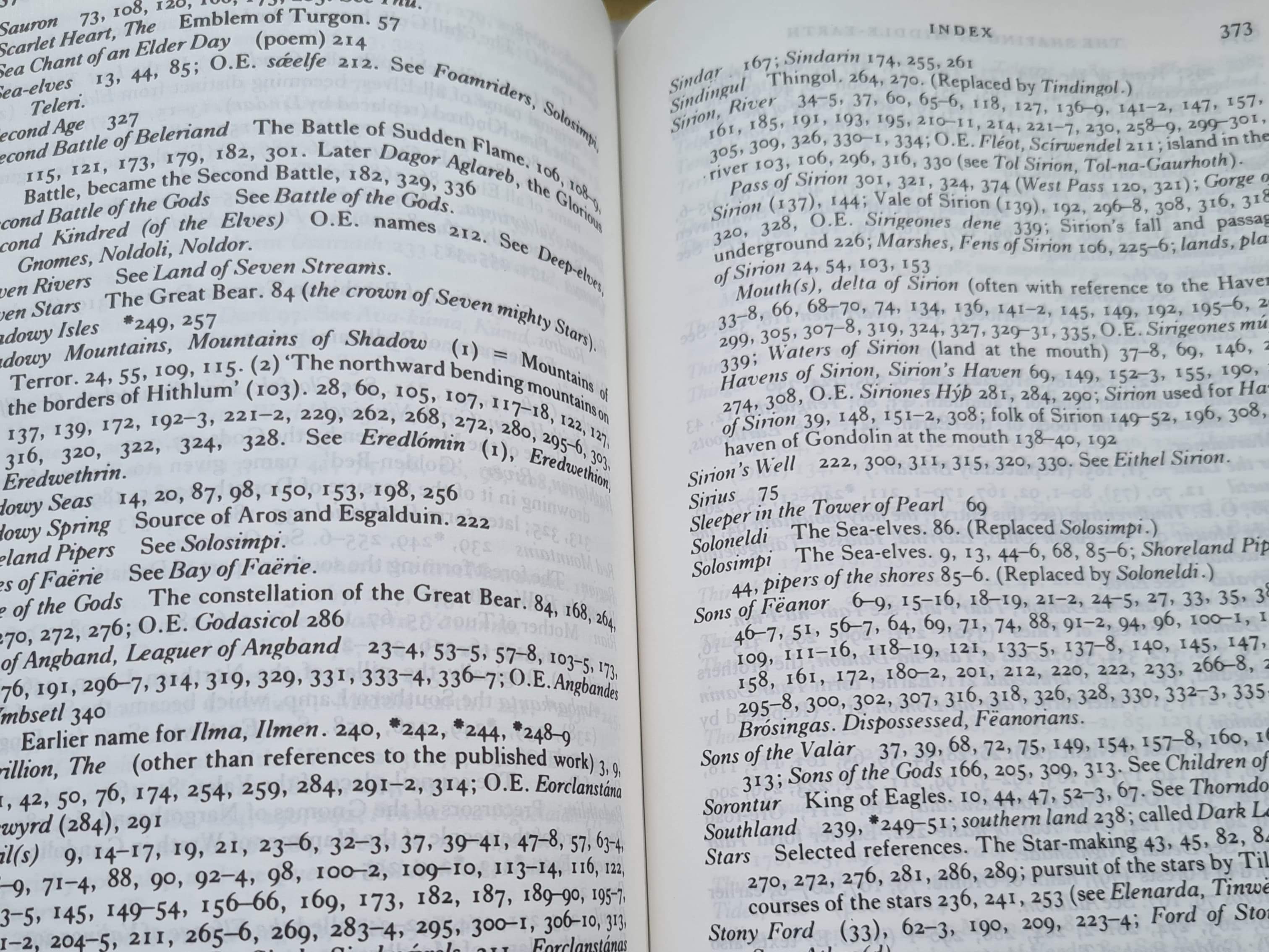
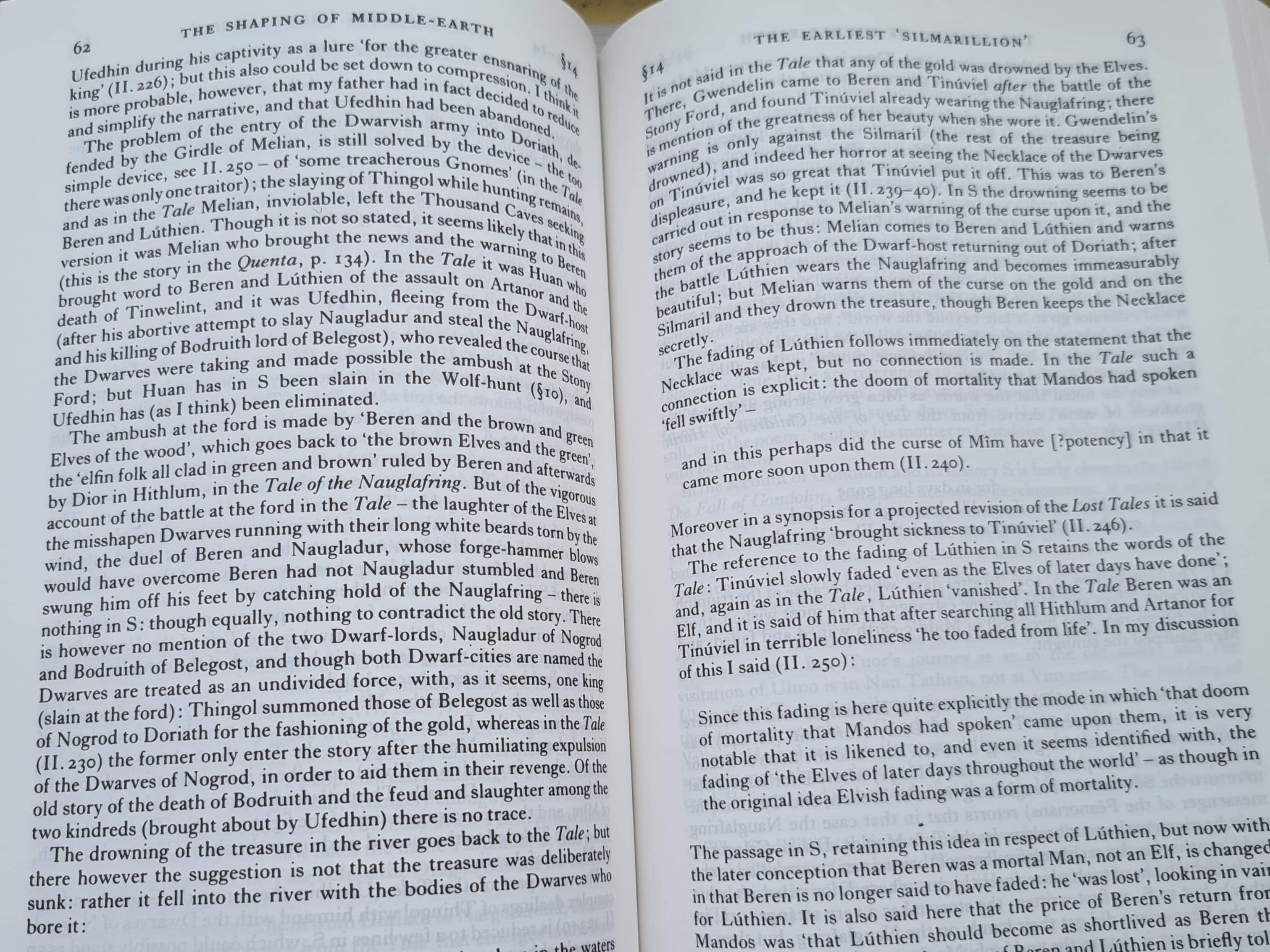
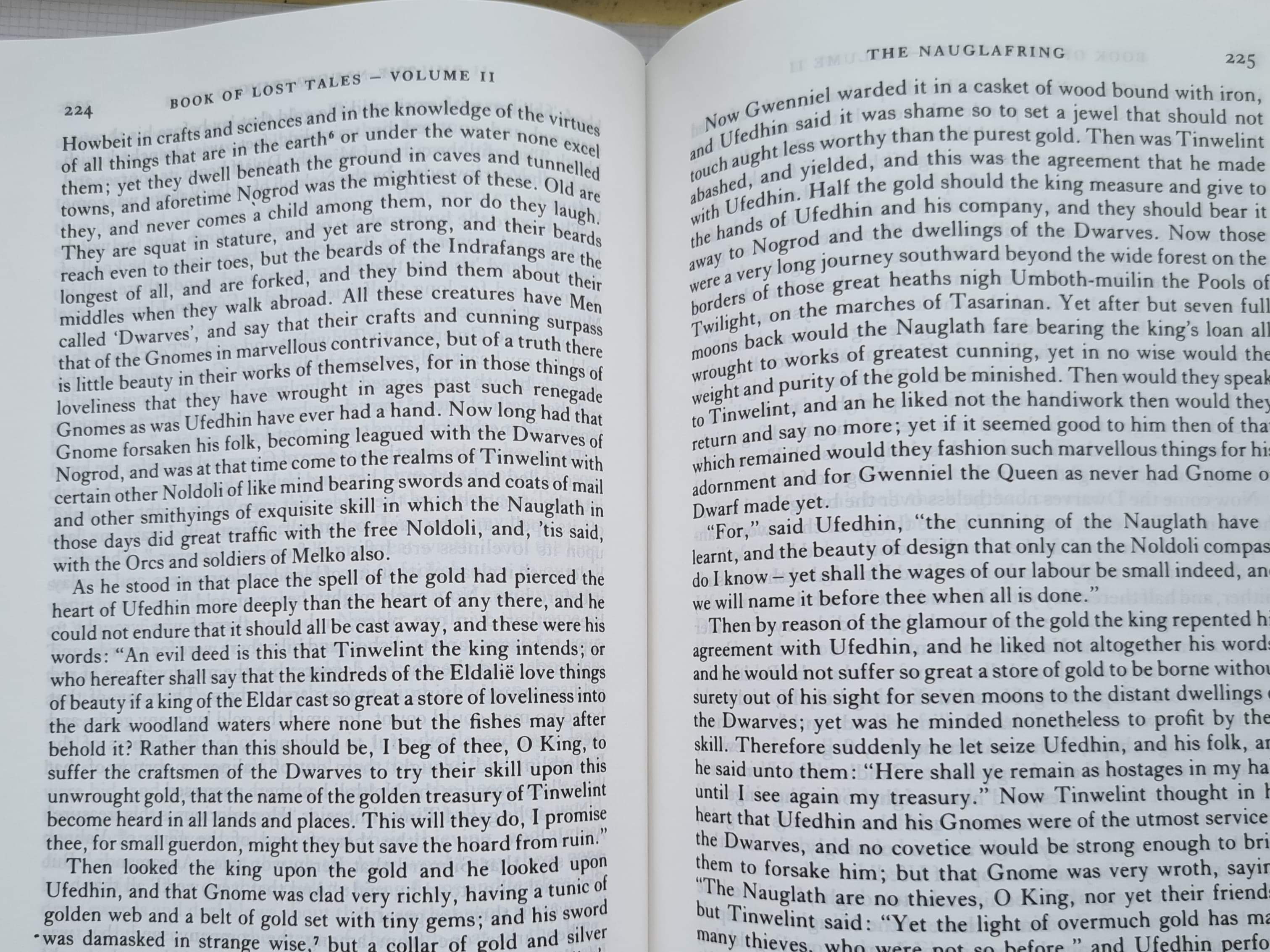
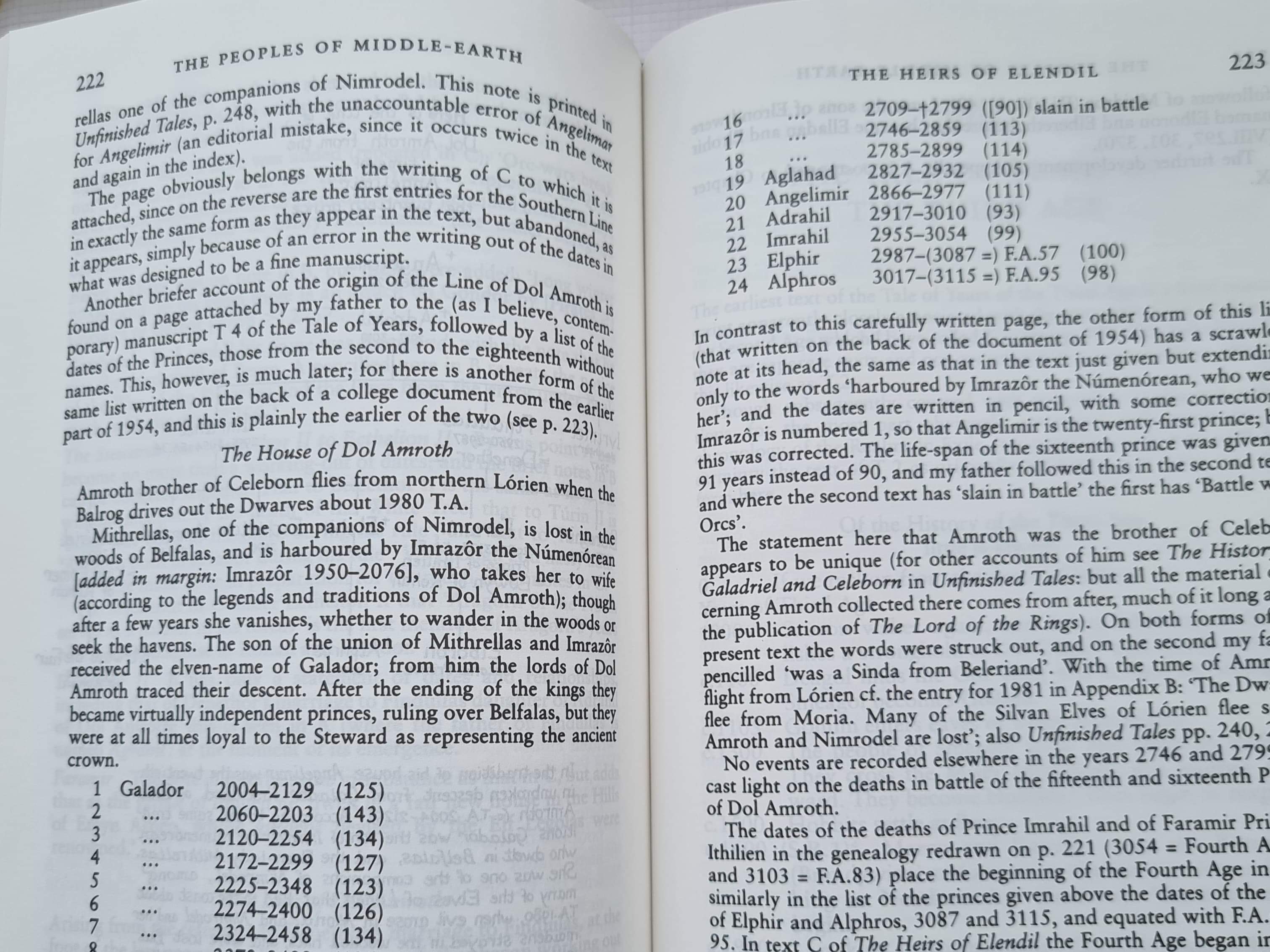
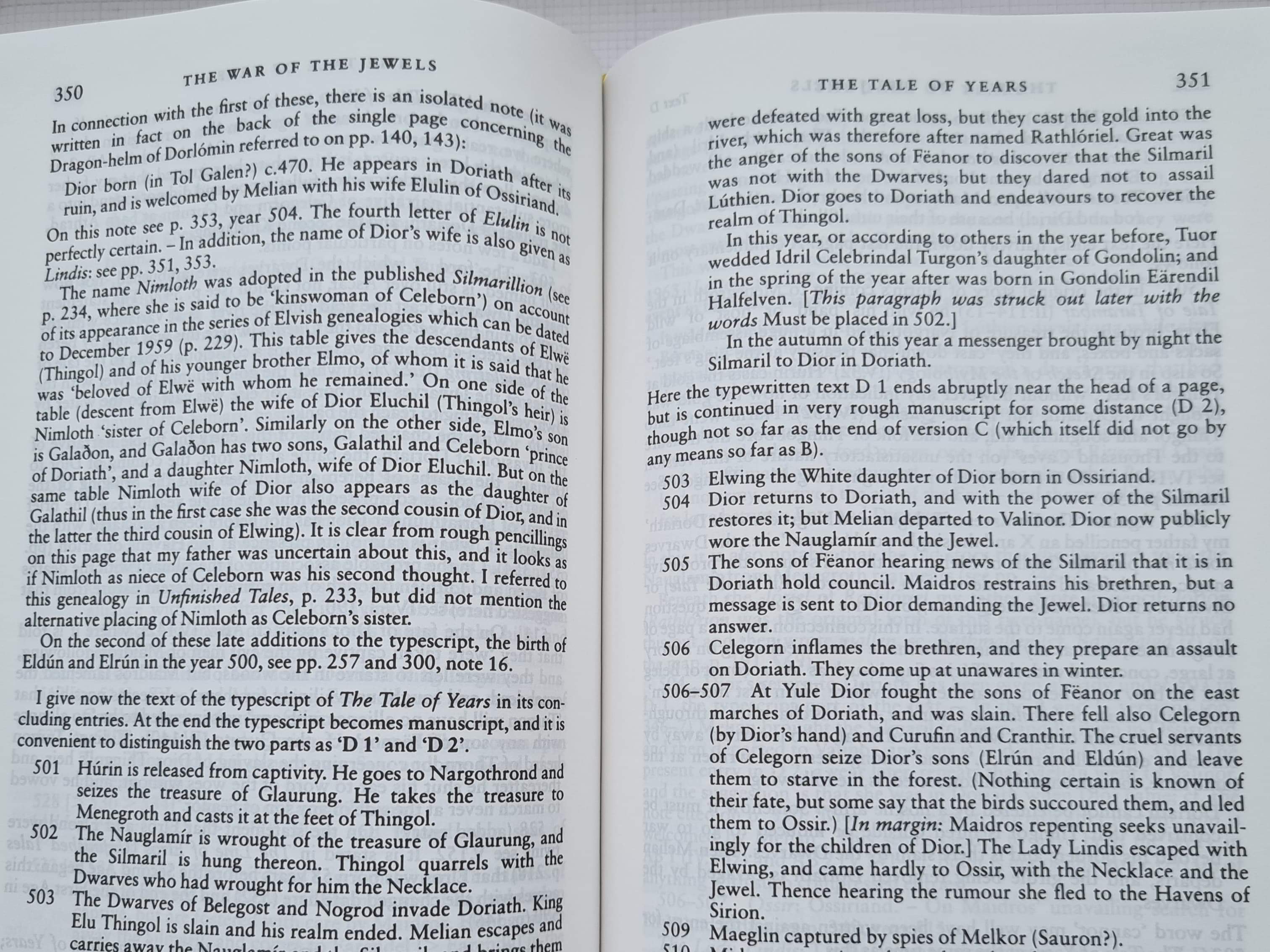
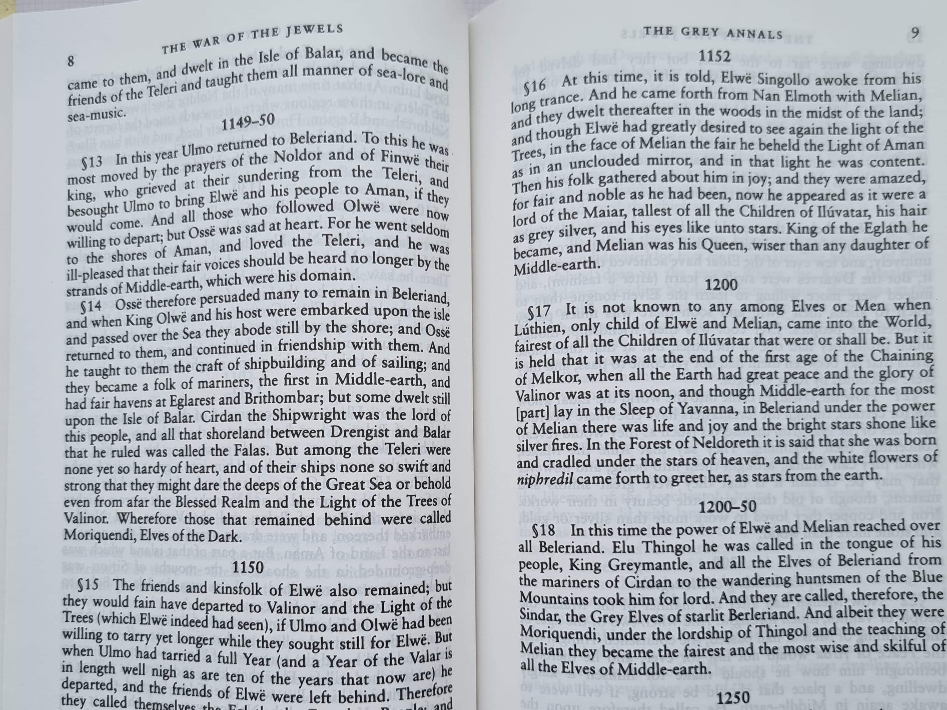
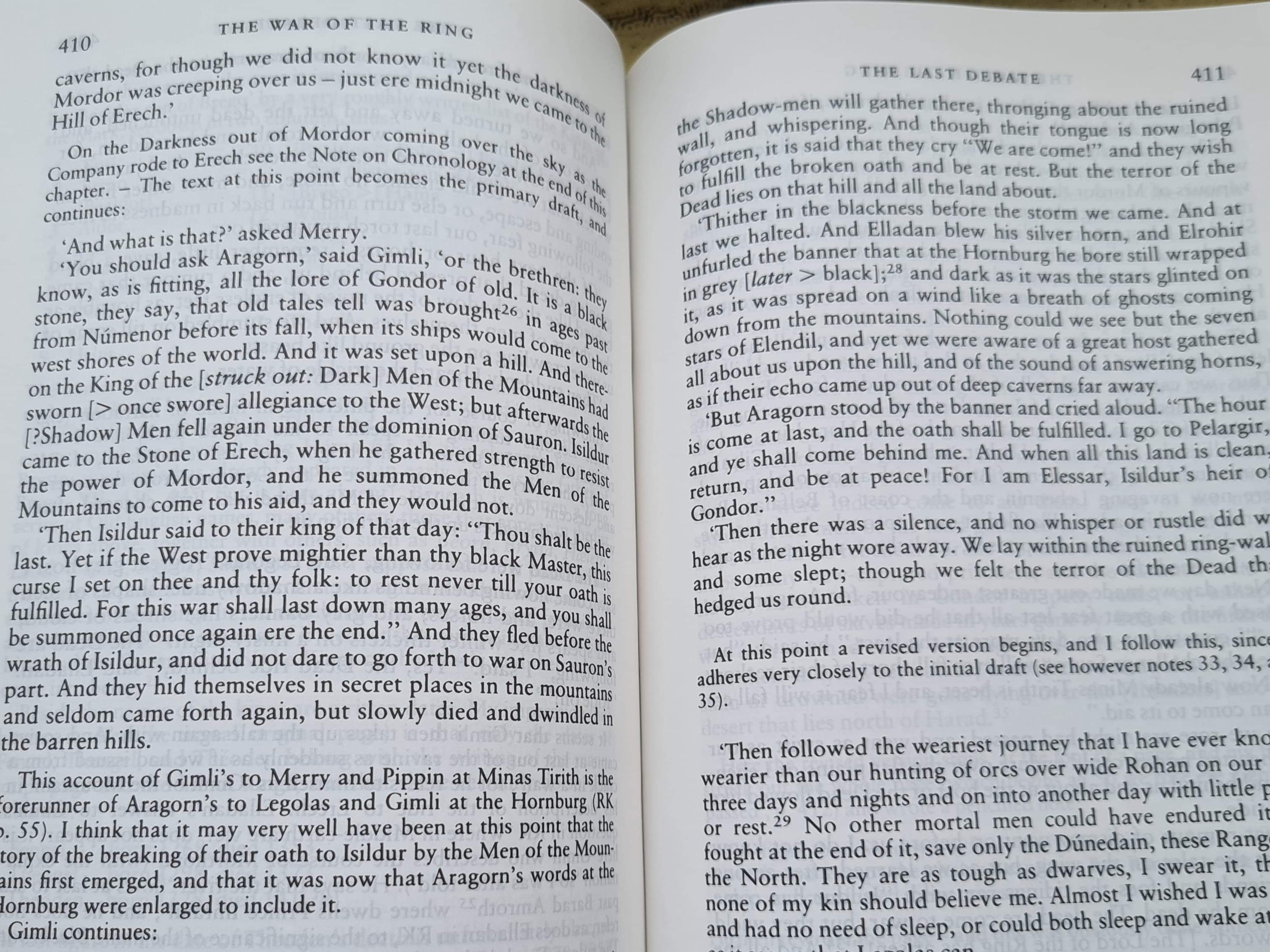
Here’s a few randomly opened pages from the three books. I’ll let you decide on the colours of the print.
Here’s a few randomly opened pages from the three books. I’ll let you decide on the colours of the print.
Thank you!
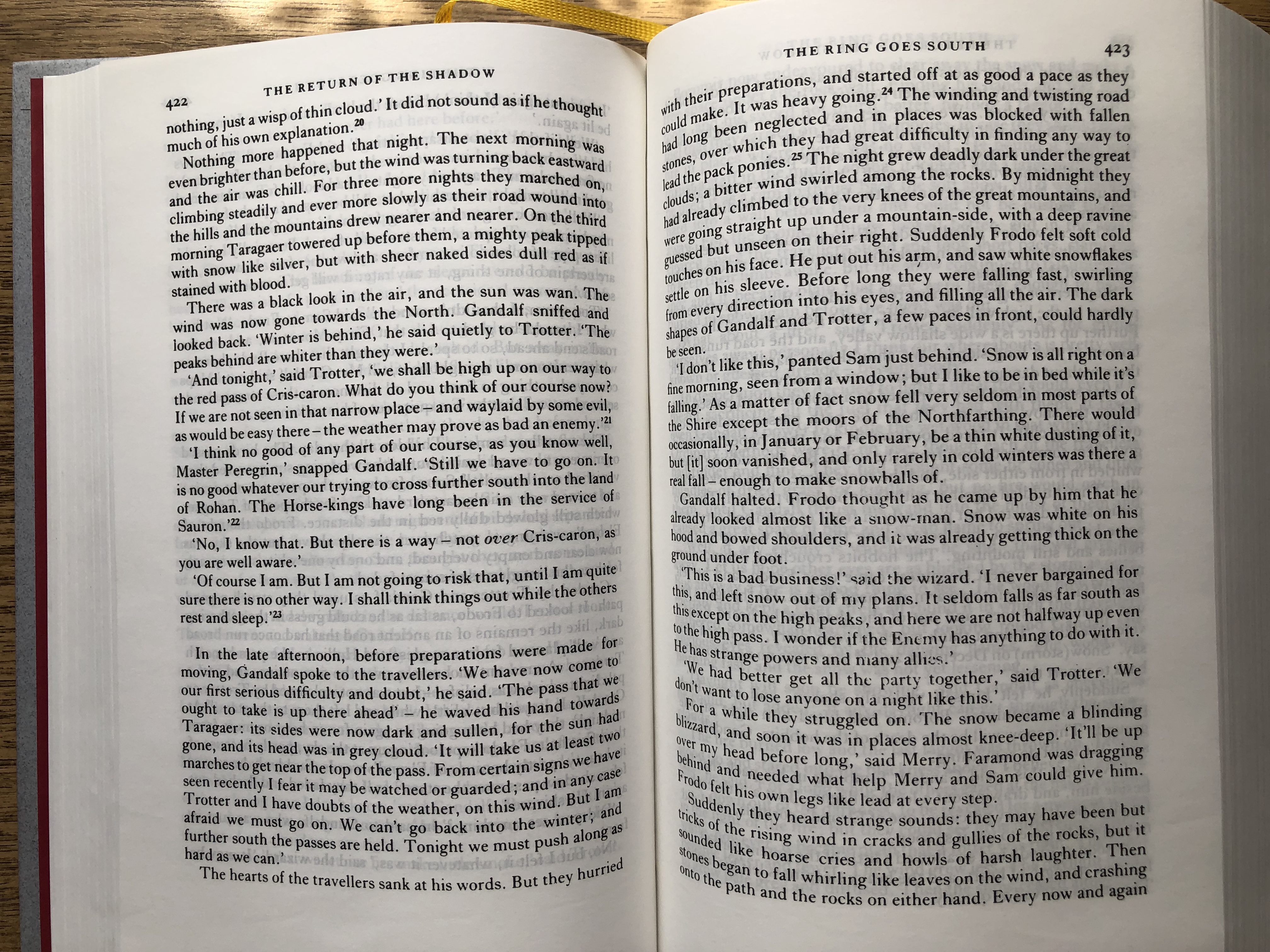
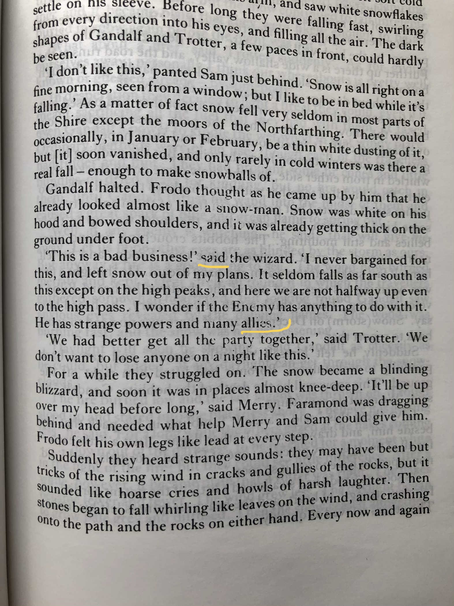
It is always harder to observe it via photos, but as far as I can see your copies looks quite better regarding dark color text, except for that some letters in words are printed with tears (like your first attached photo, right page, 4th paragraph: 'This is a bad business!' said the wizard). The letter "s" is printed not whole. In the end of that paragraph the same is with "e" in last word "allies". It happens also across all the 3 volumes. You will not believe, but my 1st print Clays copy has exactly the same "teared letters" in the same words on this page.
I think I got why it happens (teared letters at least). Looks like they use some kind of photocopy models of long-long ago originals for printing books. Like everything that is copied multiple times the quality degrades. I just do not get if and how may it be possible that they do not use the digital print layouts. I may be wrong because I am not so into modern mass print techniques, but really it cannot happen because of the physical print equipment. The one used in Italy and the one used in Great Britain are the two physically different equipments. So it is up to the print layouts.
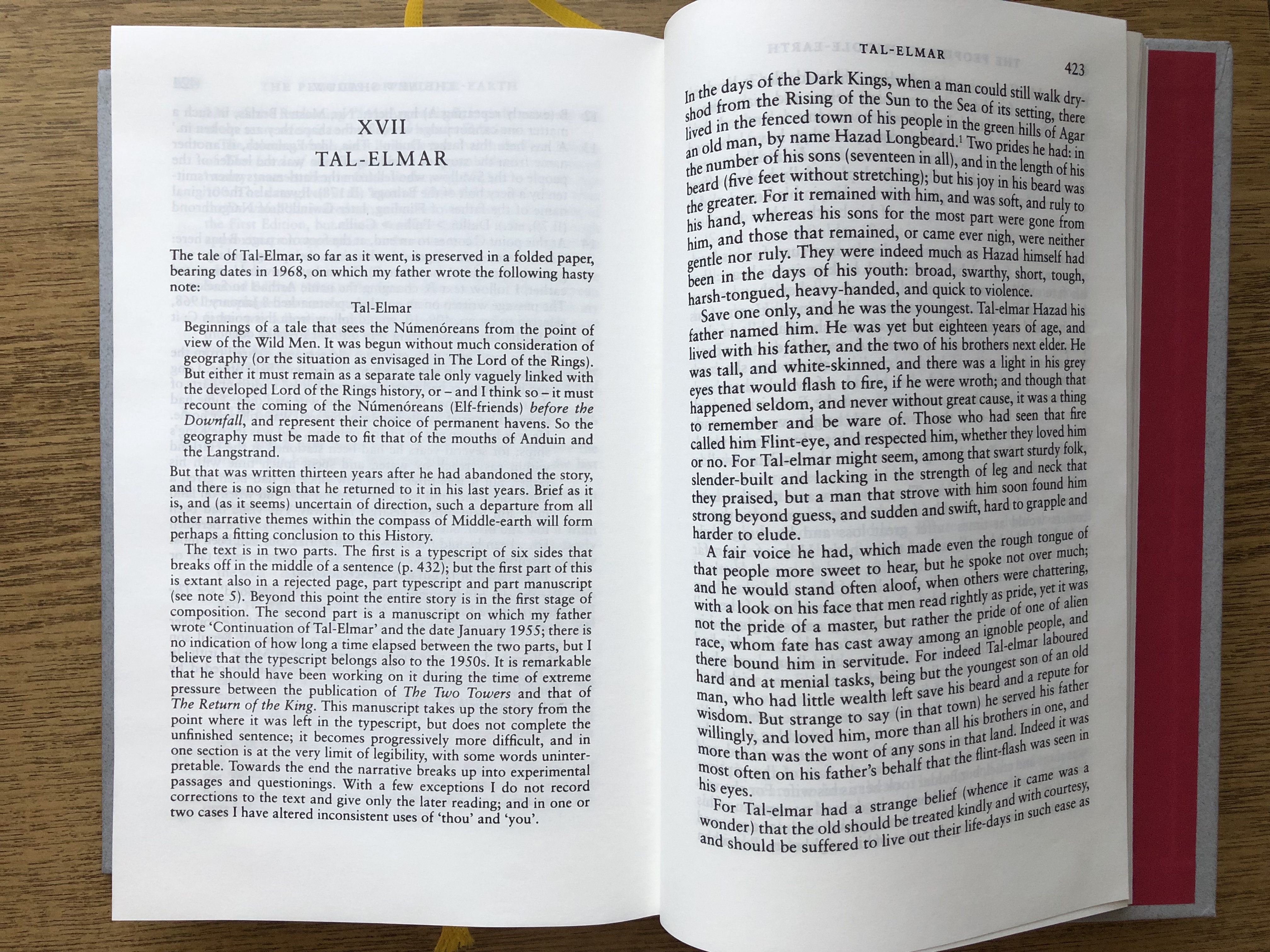
But interesting that print-on-demand books are go higher quality. Would be interesting to check exactly the same place and letters in volume 6 "The Return of Shadow", page 423. I am almost sure that the old prints (first ones are ok), but what about their 2010 "print on demand".
To be honest I am shocked that they just do not see and\or do not care about print quality and print layouts quality.
I attach same double page and your one first. Look, really same teared letters.
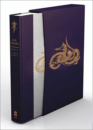
I've got a mixed (L.E.G.O.|Clays|L.E.G.O.) first impression set bought directly from warehouse by HC employee. The volumes simply aren't well enough bound/constructed for their size i.e. thickness/page-count. The slipcase is also really flimsy and isn't functional in any proper sense. I got mine for sub-£100 new with no postage so am reasonably happy. Just wanted a look at it to be honest.





 4331
4331 1.96M
1.96M