Stu wrote:
Khamûl wrote:
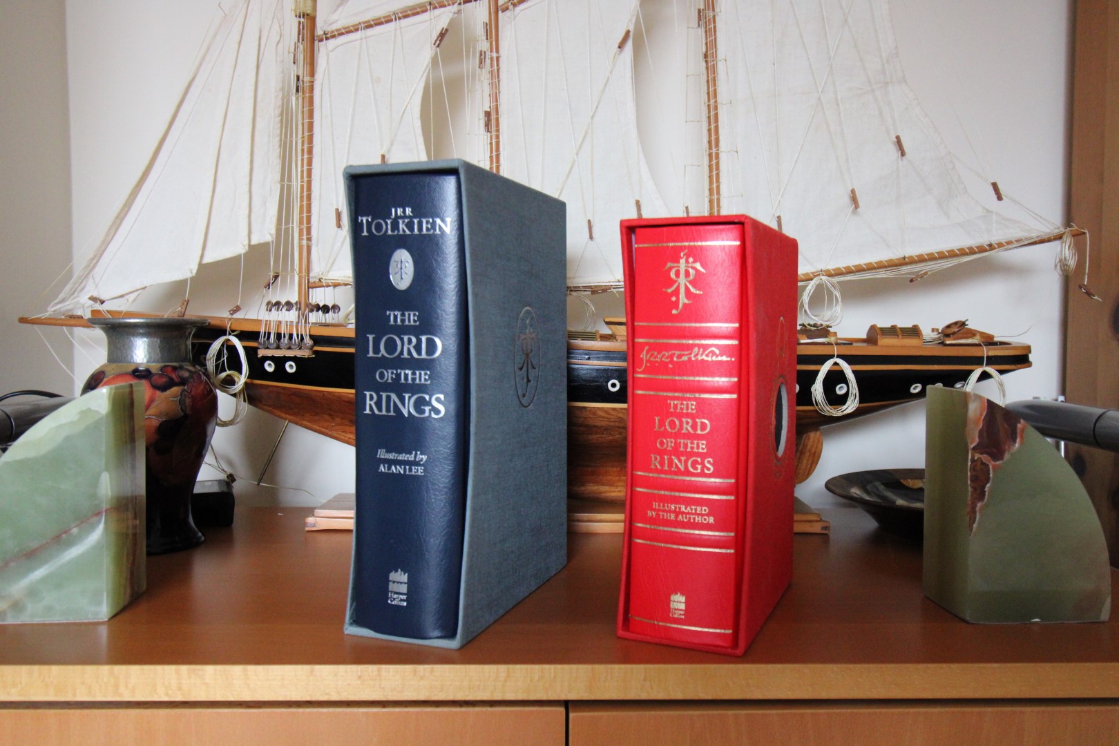
Okay, to bring this back on topic then. It's not unreasonable to ask what exactly I'm paying £100+ for here? I haven't bought the deluxe yet because I'm not convinced this is value for money. Production issues aside (those books are not as intended), most of the focus online is about the look of these editions i.e. the design. Which is interesting, although subjective. But in 20-30 years time is this going to be like a 90's HC edition today? This matters to me.
I don't think anyone will look back at this edition and consider it especially groundbreaking or important, either from a design or implementation perspective. I think it will be held up with same level of interest/disinterest as that red HMH one-volume leather (leatherette?) edition.
I think it is important to say that - assuming you don't get a dud - it isn't total crap (so far as I can discern). It is just very mediocre for the money.
The best thing about this deluxe edition are the extras IMO, not the book. The Mazarbul pages, the King's Letter, and the large foldout maps. Even the box is a new cool idea. It is a step up from the HMH leatherette (and it is leatherette Stu) as it has a superior slipcase. HMH did about 35 print runs of those over 3 decades, I hope HC doesn't stick with this edition that long

Khamûl wrote:
Also, ribs. Why is nobody talking about those non-existent ribs?
In comparing this edition with the previous deluxe illustrated edition from 1991 http://tolkienbooks.net/php/details2.php?id=1206
- The slipcases are both very well made
- The leather seems to me to be as good in both editions and a lot better than some other editions such as the Methuen Silmarillion http://tolkienbooks.net/php/details2.php?id=724
- The map and extras are better, book of Mazarbul and the facsimile letter from Aragorn.
- No ribs at all on the 1991 edition, did people complain about that at the time?
- Does anyone know the RRP for the 1991 Deluxe edition?
- The 1991 edition was limited and this one is not
- I much prefer the paper in the 1991 edition to the new edition.
- I know that at least one member of this forum has a printing error in the 1991 Deluxe, they happened then as well as today.
Overall I think this edition holds up quite well as a deluxe edition.

Thank you Trotter for this interesting comparison.
I might add one comment regarding the Silmarillion Deluxe from 2002. If the paper used was really nice, I have noticed that the impression process was not reset for this edition : it looks like a rescan of the sheets from the 1st edition, and the typeface looks blurry on some pages.
I definitely like the new Deluxe of the Lord of the Rings. It's not perfect, but I'm not that bothered with the paper quality. However, I would have liked HC used some coated paper for the illustrations.
Emilien wrote:
I might add one comment regarding the Silmarillion Deluxe from 2002. If the paper used was really nice, I have noticed that the impression process was not reset for this edition : it looks like a rescan of the sheets from the 1st edition, and the typeface looks blurry on some pages.
Not sure about this but it would have been reset text by 2002, not a scan of the 1st edition sheets.
Methuen S is not leather.
Also, I wasn't complaining about the ribs, I was merely pointing out that they look very flat. They aren't real raised bands so it's odd to incorporate them then have them like this.
Also, I wasn't complaining about the ribs, I was merely pointing out that they look very flat. They aren't real raised bands so it's odd to incorporate them then have them like this.
Trotter wrote:
Emilien wrote:
I might add one comment regarding the Silmarillion Deluxe from 2002. If the paper used was really nice, I have noticed that the impression process was not reset for this edition : it looks like a rescan of the sheets from the 1st edition, and the typeface looks blurry on some pages.
Not sure about this but it would have been reset text by 2002, not a scan of the 1st edition sheets.
Sorry, if I was not clear enough and expressed myself wrongly. I'm just talking about printing quality, not the content itself.
When I'm looking at it, especially the first pages (introduction by C.T.), fonts don't seem very sharp to me.
Emilien wrote:
Trotter wrote:
Emilien wrote:
I might add one comment regarding the Silmarillion Deluxe from 2002. If the paper used was really nice, I have noticed that the impression process was not reset for this edition : it looks like a rescan of the sheets from the 1st edition, and the typeface looks blurry on some pages.
Not sure about this but it would have been reset text by 2002, not a scan of the 1st edition sheets.
Sorry, if I was not clear enough and expressed myself wrongly. I'm just talking about printing quality, not the content itself.
When I'm looking at it, especially the first pages (introduction by C.T.), fonts don't seem very sharp to me.
Yeah, those first few pages on the 2002 Black Deluxe were scanned. They are absolutely horrible. The rest of the pages are OKish, but it isn't a good edition.
So I have my HMH 50th Anniversary deluxe in one hand and my HC 2021 HC red ribbed deluxe in the other and I can keep only one.
It's the HMH edition but I'd grab the 2021 HC extra's also if I could!
It's the HMH edition but I'd grab the 2021 HC extra's also if I could!
I picked up the trade version at a bookstore today (just because it was there). Paper quality has been mentioned before but there also seem to be inconsistencies between different pages. Some have a more yellowish tone while others are whiter. I do not mean the pages with illustrations but regular pages. On the more tinted pages the text seems a little smudged compared with the whiter ones. Has anyone else noticed this or have I bought a dud.


 0
0 41
41