12 Aug, 2020
(edited)
2020-8-12 5:11:44 AM UTC
Edited by Stu on 2020-8-12 5:29:36 AM UTC
Edited by Stu on 2020-8-12 5:30:29 AM UTC
Edited by Stu on 2020-8-12 5:32:26 AM UTC
Edited by Stu on 2020-8-12 5:30:29 AM UTC
Edited by Stu on 2020-8-12 5:32:26 AM UTC
2020-8-12 5:11:44 AM UTC
Caudimordax wrote:
It was mentioned somewhere in the thread that someone created a mockup of what a properly deluxe HoME would look like. Been scouring the forums and haven't turned anything up. Anyone got a link for science?
Yeah, I did one. I'll have a look to see if I can find it. It will be in the fora here somewhere, but likely in "new releases" and not necessarily labelled for easy finding...
Edit:
If you scroll through the link there is a mockup of the spines, front board and box
https://www.tolkienguide.com/modules/n ... t_id=17497#forumpost17497
And a 3D one here:
https://www.tolkienguide.com/modules/n ... p?topic_id=1500&start=830
Stu wrote:
Caudimordax wrote:
It was mentioned somewhere in the thread that someone created a mockup of what a properly deluxe HoME would look like. Been scouring the forums and haven't turned anything up. Anyone got a link for science?
Yeah, I did one. I'll have a look to see if I can find it. It will be in the fora here somewhere, but likely in "new releases" and not necessarily labelled for easy finding...
Edit:
If you scroll through the link there is a mockup of the spines, front board and box
https://www.tolkienguide.com/modules/n ... t_id=17497#forumpost17497
And a 3D one here:
https://www.tolkienguide.com/modules/n ... p?topic_id=1500&start=830
Renders look close to what they did in reality, but still, If I was HC, I'd stay away from producing deluxe-looking outside HoME until I'd be able to produce the same deluxe-quality inside the book.
Looking through my recent mailing with HC I see that they acknowledge inability to produce the physical print consistent quality of HoME texts compared to the ones it the rest of the deluxe-series. But POD versions are the ultimate choice as I get now, if someone cares much about print quality (like me).
Here how they explain it "...Unlike the rest of the Tolkien deluxe editions, however, the text in these omnibus editions was by necessity produced using archive copies of the original books, which means that the print will never be as fine or as even as it is in the newer Tolkien editions.".
I just don't know why they dared to produce the deluxe version of it. Is is obvious that fans buying non-regular and quite pricey deluxe books will compare to the rest of the books and may see bothering details that will never be noticed by most readers. They confirm that the only reason it is called deluxe was book covers, the rest is the same as in the regular 3-volume edition.
By the way, I was right guessing that PoD versions of 13 HoME volumes are printed in other way, than these omnibuses.
Here another comment from HC:
"While ‘colour shifts’ are unintentional – these books are printed mono black – printers and publishers usually work within a tolerance of +/- 10%, so some greyness can occur in any book.
...., the POD editions are printed digitally rather than by conventional wet ink. If you wish to sample one, volume 13 – the Index – might be of interest, because the page numbers in the consolidated index will also relate to those in the omnibus editions. The pages in the other 12 volumes use the same source material as the omnibuses, so will display some of the same features (such as the chipped letters). The paper is thicker, so there is less show-through, otherwise there should be little discernible difference, and they take up a lot more shelf space"
Amedautrui wrote:
Renders look close to what they did in reality,
Hmm, You may wish to look again -- the spines were actually completely different (which is the main stylistic complaint that people have about this edition). Also the box has cutouts to facilitate removal. They are, of course, superficially similar as you would expect -- at the time I was trying to predict what they would probably come out with based on the existing Deluxe format. As it turned out, they basically just took the standard design, made it less durable and charged more...
I personally don't see the need for another version for many years or at all. I think the market is probably fairly tapped out and digital is the way forward for this kind of work. We already have a deluxe edition that came out in 2001, and whilst flawed - it is superior to any of the other 3 volume editions.
And then of course, the 12 volume editions can be purchased used (mostly quite cheaply) and do not exhibit any of the problems. Other than the Index, the POD versions are not going to help you.
With all the negative press HarperCollins have received the last few days on here I would like to temper that with some of the great things they have put out recently. The deluxe Sir Gawain is a really nice release and the new illustrated box is stunning and so well printed that it bucks the trend of poor publishing not just from HarperCollins but in the wider industry given the challenges they all face. Those challenges will only be
So I emailed HC to say so, we are quick to complain but we are less inclined to offer our thanks. Dawn replied with a brief note thanking me for the feedback and also to say she will pass my suggestions about a Silmarillion in the same style as the new illustrated box-set onto the 'Tolkien editorial team'.
So I emailed HC to say so, we are quick to complain but we are less inclined to offer our thanks. Dawn replied with a brief note thanking me for the feedback and also to say she will pass my suggestions about a Silmarillion in the same style as the new illustrated box-set onto the 'Tolkien editorial team'.
onthetrail wrote:
With all the negative press HarperCollins have received the last few days on here I would like to temper that with some of the great things they have put out recently. The deluxe Sir Gawain is a really nice release and the new illustrated box is stunning and so well printed that it bucks the trend of poor publishing not just from HarperCollins but in the wider industry given the challenges they all face. Those challenges will only be
So I emailed HC to say so, we are quick to complain but we are less inclined to offer our thanks. Dawn replied with a brief note thanking me for the feedback and also to say she will pass my suggestions about a Silmarillion in the same style as the new illustrated box-set onto the 'Tolkien editorial team'.
I totally agree on the fresh LOTR&HB 4-volume set! I own it and the quality is just amazing!
Amedautrui wrote:
onthetrail wrote:
With all the negative press HarperCollins have received the last few days on here I would like to temper that with some of the great things they have put out recently. The deluxe Sir Gawain is a really nice release and the new illustrated box is stunning and so well printed that it bucks the trend of poor publishing not just from HarperCollins but in the wider industry given the challenges they all face. Those challenges will only be
So I emailed HC to say so, we are quick to complain but we are less inclined to offer our thanks. Dawn replied with a brief note thanking me for the feedback and also to say she will pass my suggestions about a Silmarillion in the same style as the new illustrated box-set onto the 'Tolkien editorial team'.
I totally agree on the fresh LOTR&HB 4-volume set! I own it and the quality is just amazing!
Tell HC too, and if you plan to buy Unfinished Tales and would like a Silmarillion in the same style tell them that too.
onthetrail wrote:
Amedautrui wrote:
onthetrail wrote:
With all the negative press HarperCollins have received the last few days on here I would like to temper that with some of the great things they have put out recently. The deluxe Sir Gawain is a really nice release and the new illustrated box is stunning and so well printed that it bucks the trend of poor publishing not just from HarperCollins but in the wider industry given the challenges they all face. Those challenges will only be
So I emailed HC to say so, we are quick to complain but we are less inclined to offer our thanks. Dawn replied with a brief note thanking me for the feedback and also to say she will pass my suggestions about a Silmarillion in the same style as the new illustrated box-set onto the 'Tolkien editorial team'.
I totally agree on the fresh LOTR&HB 4-volume set! I own it and the quality is just amazing!
Tell HC too, and if you plan to buy Unfinished Tales and would like a Silmarillion in the same style tell them that too.
I've communicated with HC for the last week or so. The talk was about HoME deluxe issues: torn letters issues from negatives and my 1st print black color degradation. I am not sure they will be happy to get at least one more email from me(
I've also failed with the word «shifts» writing "Huge shifts" (about black color), but I had misprinted and it became "Huge shits". It ended up with David Brawn e-mailing me directly to caution about crossing red lines of politeness and harassing support team with my emails. I've replied to his letter, explained that I had best intentions to report on issues and apologized for misprints led to misunderstanding, but 24 hours later I still have no replies from David. I am not even sure if he received my reply. Maybe my message went to spam folder in his mailbox or maybe I am filtered now by HC firewall, not sure.
Well, there is still a chance that David will reply some time later (he is a busy person), but I wouldn't write him or via enquirers address at least some time. They are not happy with my degree of HoME concern. I tried to explain and demonstrate with photos that there is no way 1st print of deluxe HoME (at least) can be called deluxe, for me personally, because of color print defects and huge color shifts. My tries ended up with a lot irritation from support team exploded after my mistype «shift > shit». But, at least:
1) I hope they will pay attention to more and more obvious (with years) torn letters (issues from negatives). They promised to do it.
2) They will pay attention to black color shifts and black color degradation issues that happens a lot in 1st print (and maybe even in the current ones, this is what I cannot know or check).
3) I received the confirmation of how differs the regular omnibus editions and print on demand ones.
4) I know now that even 1st print deluxe editions from HC should be checked flipping page-after-page right after purchase and not within regular reading (that may take a lot much more time to notice issues). Jus now, 3 years later I have got (thanks to several especially defective pages of HoME) that something may be wrong across all 3 volumes, checked them and here we are.
I’d also ask them why Ukraine is now excluded from delivery location for POD HoME volumes (because I was advised by David to buy Index volume 13 to check if digital print fits my quality expectations; no other ways to place order for POD exist), but I really think they are not ready now to deal with something of that kind from me.
By the way their tolkien.co.uk site looks now like they started it to change, but not ended with changes.
The last mail from David even contained a question if I am leaning towards replacement or refund by my messages. I explained that my most valuable reason to spend so much time was to help, to show what looks like absolutely missed. I hope it worked at some degree. I just insisted on the issues existing and not fitting something with deluxe label and 225 GBP price at all. Not a single deluxe edition on 1st print made me feel bad or overpaid, really. But this one, it was another experience.
So I am pass for now with contacting HC.
I still acknowledge that HC produced a lot of incredible editions, 20 of which I own happily.
Oh dear, that is indeed a badly placed typo. No wonder you received a warning. Maybe a little cooling off would suit.
I must confess that I find most of your irritations about the quality of the pages to be minor as it has been the case for many years across many publishers and printers. You are of course free to feel that way and I am not suggesting you don't have a high expectation when it comes to standards, I personally am more concerned with other areas of publishing than internal print variations due to modern inking processes. I also feel the responses you have received from HC were appropriate and offered the best answers you are likely to find in these matters. But you are correct in your conclusion, check books 'page by page' and assess quality based on your desires. If one is not happy then return and seek a refund.
As for the POD HoME topic that has been hot here. I have one rule with POD/Made to Measure/Bespoke items and that is that they will be in that exact style in that exact moment. The moment that item has been produced it is done, the next one could be different and I think to expect any different is a little crazy. If one orders a POD item and then comes back a year later when card-stock, paper, staff, materials, machines, printers and who knows what else could have changed and one then expects an item to be the same? Crazy. A POD item is not a collectible, it is a convenience.
onthetrail wrote:
As for the POD HoME topic that has been hot here. I have one rule with POD/Made to Measure/Bespoke items and that is that they will be in that exact style in that exact moment. The moment that item has been produced it is done, the next one could be different and I think to expect any different is a little crazy. If one orders a POD item and then comes back a year later when card-stock, paper, staff, materials, machines, printers and who knows what else could have changed and one then expects an item to be the same? Crazy. A POD item is not a collectible, it is a convenience.
A POD was not the topic for any issue discussion. I never owner one. I've heard about it good things only.
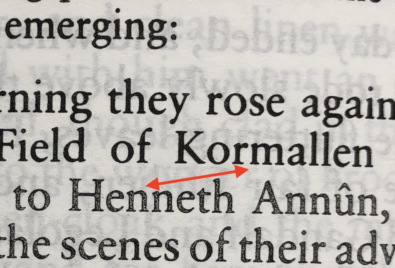
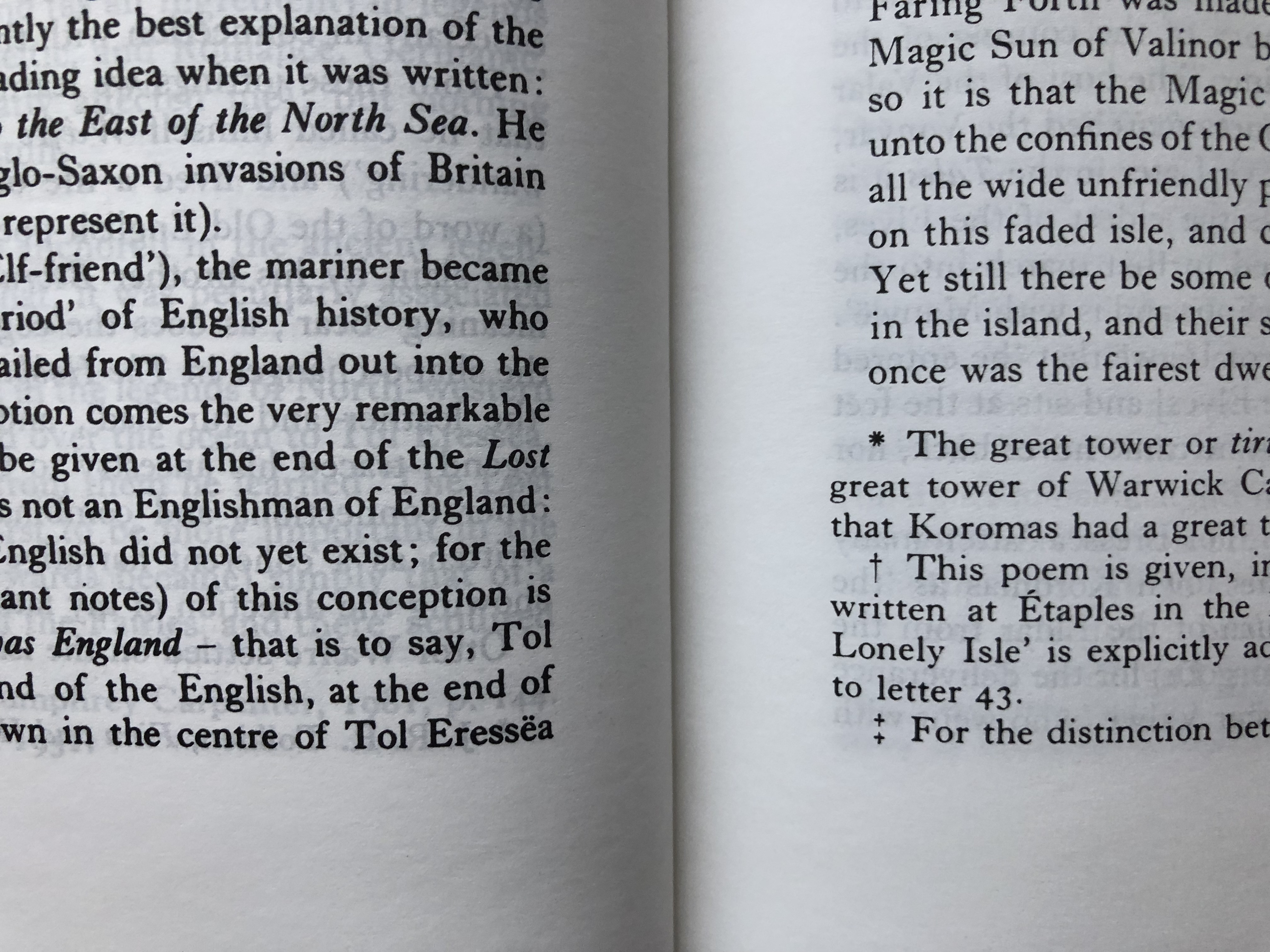
I also complained not about shifts in color between two different books, editions or so (I do not compare two books), I was talking about what I will show here agin, jut to be sure we are talking about the same things. Even though image on the screen of device cannot reproduce how an eye see it in real life, you can still see enough.
Do you see on images what I see? Look at images fullscreen, please. These two things are fluctuating across all 5000+ pages constantly back and forth. This multiple degrees of black shifts up to the defective pale ones, this is why it catches eye so much.
First image demonstrates what I call "black color degradation". It is nothing but print defect, because it is changing on a sample page line after line, sometimes even on half of the word. You can see, it is not even black color shifts. You can see that while upper two lines of the text are with fully black-colored letters, the lower ones are semi-full/partially filled with ink and having like white dots with just no ink inside, the inked part is also not black, but grey.
The second image demonstrates two opposite pages within one continuous text fragment. It is no way mentioned by HC +/-10% of expected variation.
Have you really seen anything like this before in any of HC books (I mean not deluxe, but even a regular ones)? I ask because I have never seen. I checked (now intentionally looking for this issue) all my HC books flipping random pages each to notice as simple as it is in HoME. Really nothing even similar, except one case - 60th anniversary edition omnibus 1-vol LOTR special edition (2014, 1st edition, printed in China). But to find black shifts (image 2 issue, not 1) you should spend some time and I was aware of it since purchasing in 2014. I just decided it is because of print in China and stayed with it. That shift also happens there just in 15 or 20 places and mostly slight ones.
And the copy I own was already a replacement item from Book Depository, because the original one had a lot of pages with blurred text, you know, when the text is printed unfocused or I don't know how to explain. I just decided at that time that slight shifts vs unreadable blurred text will pass to avoid next replacement tries.
So, I agree with you that each of us has his own expectation, but I can distinguish a print defect from a slight variation of norm.
May be I had too good experience with HC before I encountered first issue in 2014 and much more significant now. So we can agree on that I was very lucky before now


My mention of Pod was more generally to the forum. Not specifically to you. I should have been clear.
Yes I see your images and the inking. My point is that I personally am not concerned by those shifts. It was not to suggest you should think otherwise but I think that those variations are expected. They may not be ideal but if they don't affect my reading then I can't get too worked up about them.
Yes I see your images and the inking. My point is that I personally am not concerned by those shifts. It was not to suggest you should think otherwise but I think that those variations are expected. They may not be ideal but if they don't affect my reading then I can't get too worked up about them.


 0
0 66
66