Facsimile First Edition - Analysis of Flaps
11 Nov, 2016
(edited)
2016-11-11 9:44:05 PM UTC
2016-11-11 9:44:05 PM UTC
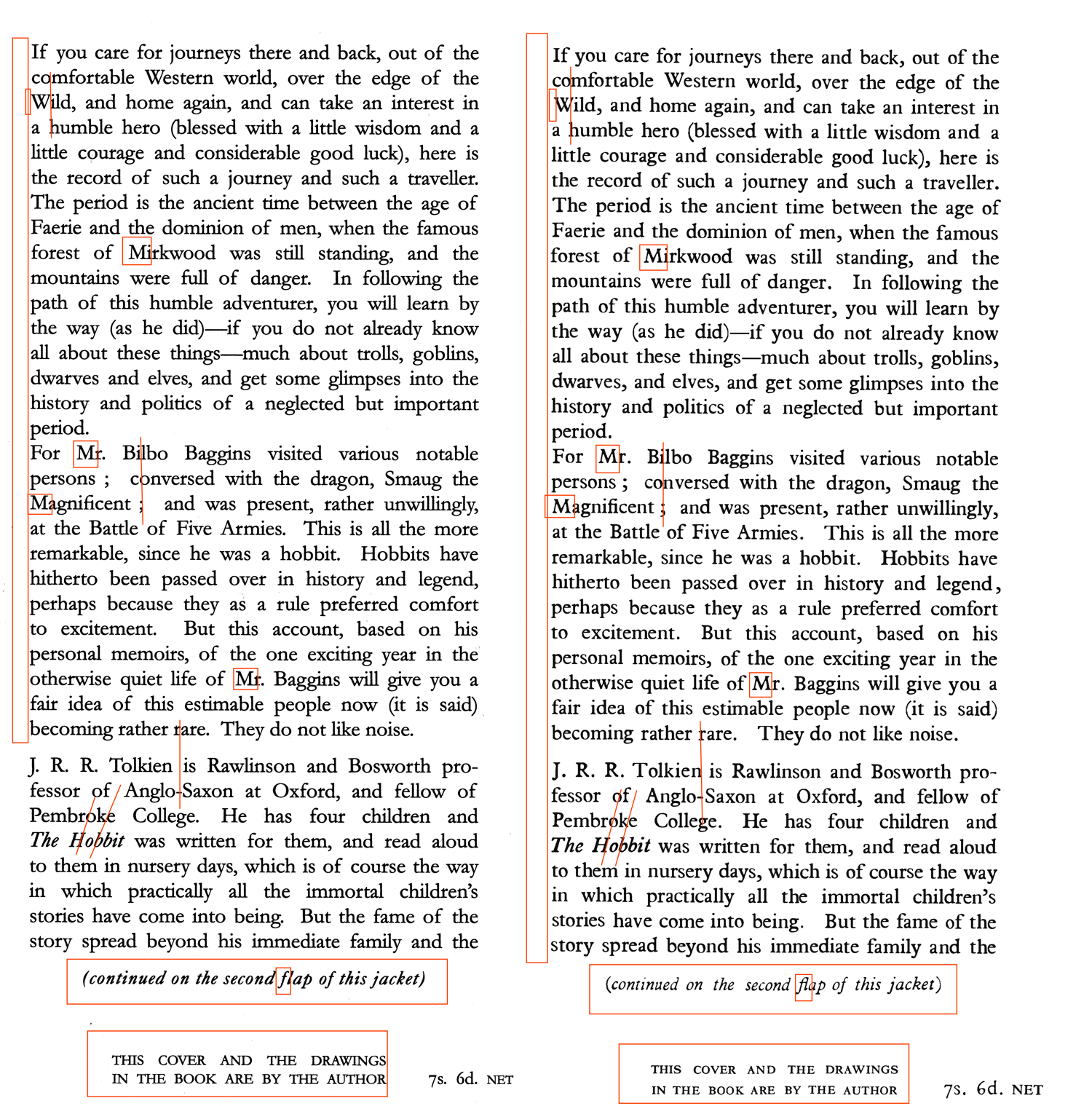
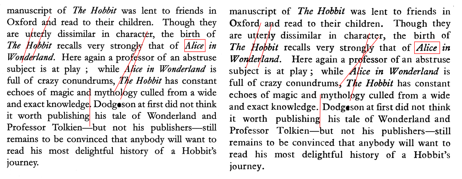
I finally got around to doing a comparison of the facsimile first Hobbit flaps with the real thing (or - more correctly -with a tidy up of a scan of the real thing which retains correct sizing and positioning). HC actually did a reasonable job here; Just a bit of additional proofing would have helped (and they needed to use a couple of additional fonts for specific characters -- when I did my 4th impression, I ended up using characters from four different fonts).
Alignment is difficult, so various words don't align as original from one line to the next (I've just pointed out a couple of obvious ones, as it would be a sea of red ink otherwise). Particularly with italics, there are problems with the level of slant between capitalised characters and lowercase. This is particularly evident on "Hobbit" and "Alice". Uppercase "M" characters are a problem. Other than that, the sizing of the "continued.." and "Drawings by" sections have issues.
Like I say, I don't think it was a bad job (re-typesetting this stuff is very time consuming), but equally, we need to be careful not to allow it to become the 'bibliographic truth'.'
Left Side is Facsimile, Right side is tidied up scan of genuine jacket


 1
1 177
177