19 May, 2007
2007-5-19 10:56:58 PM UTC
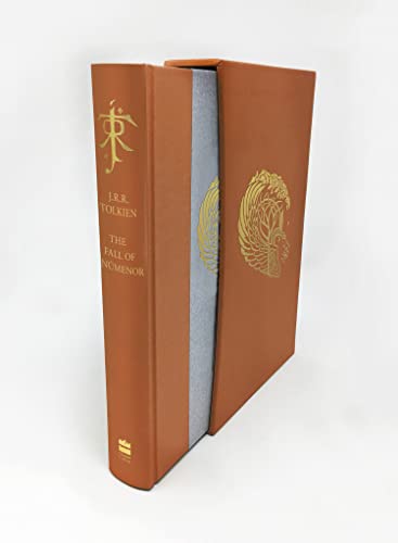
To celebrate 30 years of the Silmarillion we will see the first publication of a deluxe edition of The Silmarillion, featuring a revised, reset text. There is not a lot info available yet and
this page will be updated as new information comes in. What I do know is that this revised The Silmarillion will be bound in cloth and leather and set in a clothbound slipcase. It will be published on the 5th of November 2007 and cost 60 GBP

20 May, 2007
2007-5-20 10:19:41 AM UTC
So it's not going to match the recent deluxe editions of LR, H and CoH? That is a shame. I know of a lot of people who want to complete their sets.
I hope that this cloth and leather edition is of better quality than previous HC attempts, which have been a little disappointing when compared with old Unwin editions.

20 May, 2007
2007-5-20 3:45:31 PM UTC
I agree with Deagol. It seems strange that Harper Collins would already have the current set of deluxe editions in print, and then decide not to follow it up with a Silmarillion to match. I do, however, love all of the quarter leather books they have released, so I am sure it will be nice. Hopefully, it will be a truly limited edition (1000 or less), instead of the 10,000+ that they have been cranking out on the other deluxe editions. I would also love to see it as an illustrated deluxe. I really enjoyed CoH with Alan Lee's works.
Whatever the case, it is still very early. I suppose that there is a chance that it could end up matching the other current deluxe books. The price of 60 GBP certainly matches, while other recent quarter leather editions have been listed at 100 GBP. Any thoughts Beren?

20 May, 2007
2007-5-20 6:56:13 PM UTC
It is very good any news about a deluxe edition is released, but my opinion is that this news may change while the time moves on. The prize is never the same as announced in the end, the binding also not, and also not all books being discussed do finally see the light... or much later.
I went inside the HC backend and saw the ISBN, pub. date, description of the Silmarillion title with THE SILMARILLION: 30TH ANNIVERSARY EDITION (de luxe edition)... I always thought the Silmarillion would match the three we have now. Even speculated so much on it that i have now ten shrinkwrapped 1sts of each lying here, waiting for a Silmarillion to finally go for sale. So it seems now (but may change tomorrow) they will go for a 30th anniversary edition and make it special and not to go in the set...
time will tell... as usual... and I will see what info i can find and ask the people at HC to tell me more.

20 May, 2007
2007-5-20 11:02:01 PM UTC
The main problem I have with the black quarter leather editions that HC put out was that nothing matched - they were all different heights, the spine lettering varied and they even changed the covering on the slipcase for the last one. They don't easily slide in and out of the slipcases either, and the cloth has a tendancy to fray.
Even though the more recent deluxe editions use cheaper binding materials, I think that they 'work' better and look much more presentable.

21 May, 2007
2007-5-21 1:35:32 AM UTC
Yes, it is strange that the black quarter-bound books do not match. Even within the History of Middle Earth set they do not match in height. Personally, I have a third print of LotR, second print of The Hobbit, and first of the Silmarillion, so at least the slipcases match in their faux leather covering.
I love leather bound books, but the Harper Collins books do have the tendency to fray at the pont where the leather meets cloth. I would love to see some full leather editions made again, similar to the super deluxe ones from the 1980's. That said, I again agree with Deagol that the new deluxe editions 'work' better together. I do have the one small gripe about there being no circular window in the CoH slipcase, but that is minor.

21 May, 2007
2007-5-21 7:30:44 AM UTC
what i cannot understand at all is that when you put the three deluxe next to each other the logo and text are not on the same hight. The Hobbit and The Lord of the Rings have the logo on exact the same height, the CoH has the logo a bit higher then should be... also the text are not on the same line. This is a detail that would make the SET really look great. Sad they forgot to align the logo and text this time. The hole indeed is not there but you do not see that when they are on the shelves...
Also the paper used for The Lord of the Rings is very white, ... i like the US deluxe edition better there, since white paper always tend to give me a headache when reading.


 29
29 10.46K