14 Oct, 2021
2021-10-14 2:37:41 PM UTC
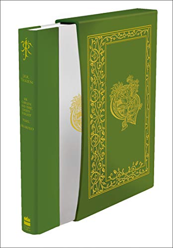
I have just received The Lord Of The Rings Illustrated version, and I have to admit being a little disappointed, as all the publicity photos show the cover to be a brilliant white when this is not really the case ,m rather a a light grey colour , and the red sprayed edges also look slightly dumbed down too not vibrant like in the pictures .

14 Oct, 2021
2021-10-14 2:44:38 PM UTC
I imagine the idea was to emulate the first edition - the dust wrappers were light grey, which I think add to the overall effect. The top edges of the three vols. were a nice shade of red, which I also like.

14 Oct, 2021
2021-10-14 3:21:20 PM UTC
Tolkienreader2021 wrote:
I have just received The Lord Of The Rings Illustrated version, and I have to admit being a little disappointed, as all the publicity photos show the cover to be a brilliant white when this is not really the case ,m rather a a light grey colour , and the red sprayed edges also look slightly dumbed down too not vibrant like in the pictures .
I agree w/
garm HarperCollins was going for the slightly off white color of the 1st Ed. dust wrappers. In regards to the promo pictures vs. the actual book, it's never quite what you see in the promo pictures from book publishers. There are all kinds of different shades and filters put on those pictures by the photographer.

14 Oct, 2021
2021-10-14 4:16:50 PM UTC
I’m sorry I’m obviously showing my ignorance , the promo pictures made it look brilliant white like the map inserts , so sorry to complain , as long as there hasn’t been an error that’s all I’m concerned about , looking forward to this and , thankyou both for putting mind at rest , and apologies again

14 Oct, 2021
2021-10-14 4:27:32 PM UTC
Nothing to apologise about and feel free to ask as many questions as you like.

14 Oct, 2021
2021-10-14 5:31:22 PM UTC
We all had concerns about the mock-up pictures prior to the book releases, and questions about the actual books now that they are trickling out. Nothing to apologize for!
I should have my trade edition by Monday as well. Hard to tell from people's photos what the actual book color is because everyone's cameras and lighting are different. I'll try to take some representative photos as soon as I can.

14 Oct, 2021
2021-10-14 8:48:03 PM UTC
Off white, per the original 1st Editions, was definitely the right call from HC here. I'm a lot happier with how the real thing looks (albeit not seen in person) than how the mockups and publicity photos looked. Based on what I have seen, the trade is the better looking edition (i.e the jacket looks better than the deluxe boards).


 36
36 9837
9837