Books and other printed materials >> Assistance required with Fellowship of the Ring UK 1st Editions
Assistance required with Fellowship of the Ring UK 1st Editions
3 Sep, 2006
2006-9-3 8:36:36 AM UTC
2006-9-3 8:36:36 AM UTC
I noticed on Ebay a seller has a copy of the FOTR 1st/1st http://cgi.ebay.co.uk/FELLOWSHIP-OF-T ... 29223QQrdZ1QQcmdZViewItem in quite poor condition but some of the best photographs that I have ever seen of this edition (about 50 in total).
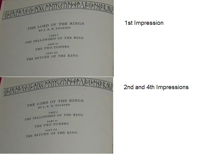
I own a 2nd, 4th impression and Readers Union FOTR and I know that one of differences between the 1st Impression and the later impressions are the Elvish inscriptions on the title page (Hammond page 94).
Both my 2nd and 4th Impression books have a problem with the Top inscription in that the far left line of vertical dots is missing, but these are shown in the Reader Union edition. I have attached a picture showing the difference betwen the impressions, look at the top left of the two images.
This looks to be another undocumented mistake that was made when the book was reset by Jarrold and Son's without the knowledge of the publisher of Tolkien for the 2nd Impression.
If you have any early pre 1960 FOTR's Can you have a look at your copy? I would be intested to know when this was fixed and the 4 vertical dots were shown again on the page.


 1
1 80
80