An interesting piece on the newly announced Beren and Luthien.
https://johngarth.wordpress.com/2016/1 ... mment-page-1/#comment-770
https://johngarth.wordpress.com/2016/1 ... mment-page-1/#comment-770

20 Oct, 2016
(edited)
2016-10-20 5:58:36 AM UTC
Edited by Urulöké on 2016-10-21 2:24:45 AM UTC
Edited by Urulöké on 2016-10-21 2:25:16 AM UTC
Edited by Urulöké on 2016-10-21 2:25:16 AM UTC
2016-10-20 5:58:36 AM UTC
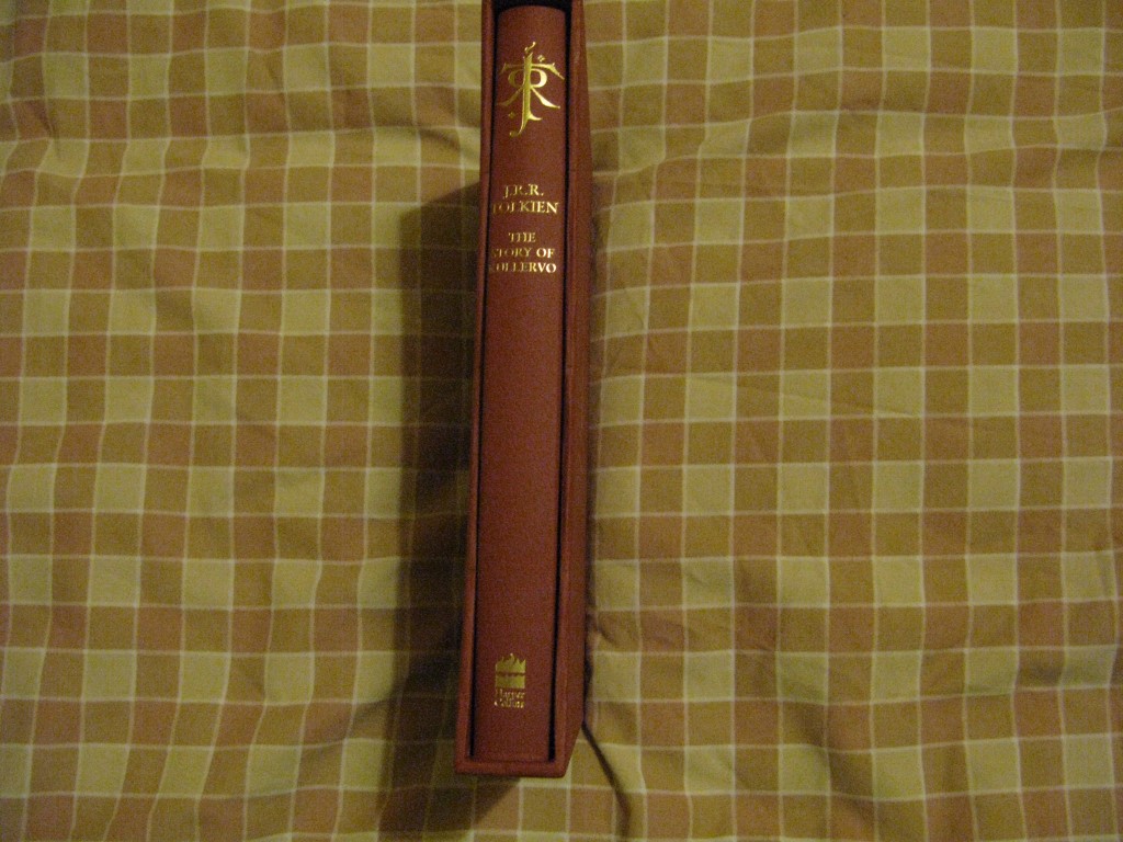
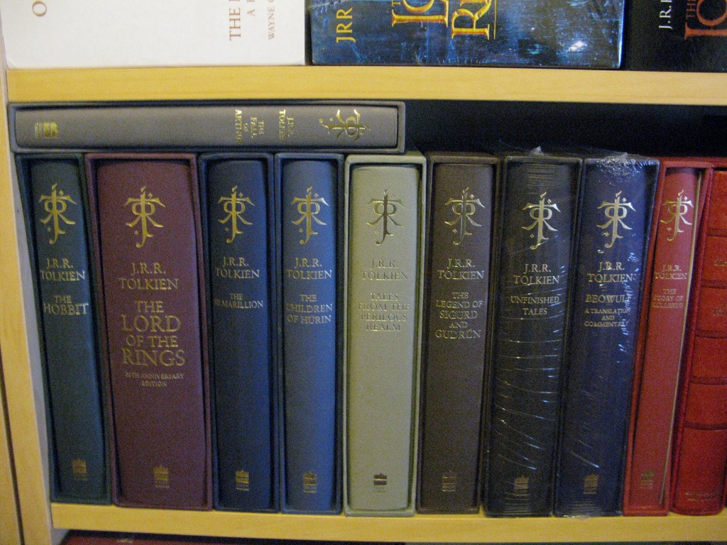
Some pictures of the Deluxe Story of Kullervo
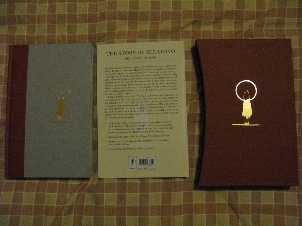
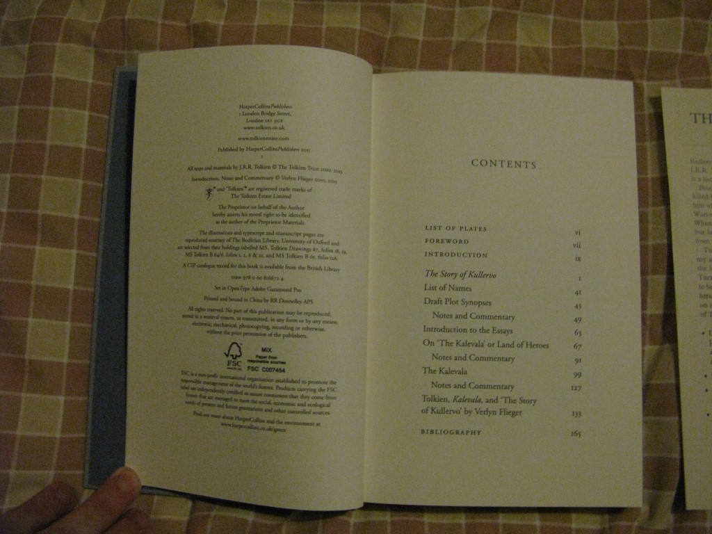
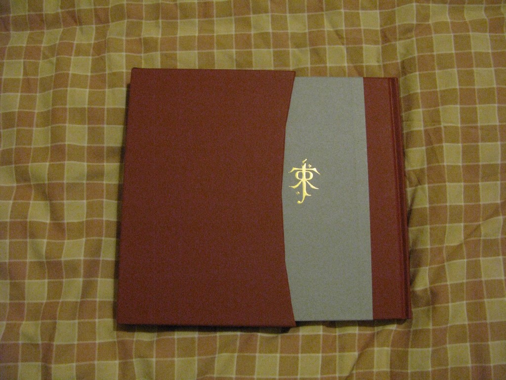
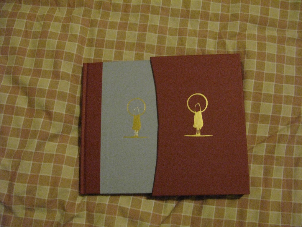


Brandon K wrote:
Someone was mentioning the letters at the bottom of the pages, for the signatures. I understood the concept of signatures but I didn't know about them being lettered in old books, so that was cool to learn. There's no "A" which is understandable, but... they skipped J, going from I on page 129 to K on page 145?
The signature numbers are interesting as they show how the book was originally printed. The sheets would be folded and cut so that they formed something that resembles a booklet of pages and then these are placed together in the correct order and glued or sewn onto the binding (16 pages in total). The signature numbers are a checkmark for the binders to make sure that they are in the correct order, as some pages did not have page numbers on them.
I and J are to similar so only one was used.
Thanks very much for the pics, Trotter!
The book does look very nice indeed, especially lined up alongside the rest of your editions in the series. It's also rather exciting knowing there'll very soon be yet another one of these.
By the way, I may be nitpicking, but doesn't the slipcase have a more "boxy curve" rather than a "curvy curve"? What I mean to say is there seems to be four distinct cuts that make up what (I think) is usually just a single smooth curve.
EDIT: I promise I am not as crazy as my post might indicate
The book does look very nice indeed, especially lined up alongside the rest of your editions in the series. It's also rather exciting knowing there'll very soon be yet another one of these.
By the way, I may be nitpicking, but doesn't the slipcase have a more "boxy curve" rather than a "curvy curve"?
 What I mean to say is there seems to be four distinct cuts that make up what (I think) is usually just a single smooth curve.
EDIT: I promise I am not as crazy as my post might indicate


20 Oct, 2016
(edited)
2016-10-20 9:13:07 AM UTC
Edited by Stu on 2016-10-20 9:38:44 AM UTC
Edited by Stu on 2016-10-20 9:39:52 AM UTC
Edited by Stu on 2016-10-20 9:39:52 AM UTC
2016-10-20 9:13:07 AM UTC
Earl wrote:
Thanks very much for the pics, Trotter!
The book does look very nice indeed, especially lined up alongside the rest of your editions in the series. It's also rather exciting knowing there'll very soon be yet another one of these.
By the way, I may be nitpicking, but doesn't the slipcase have a more "boxy curve" rather than a "curvy curve"?What I mean to say is there seems to be four distinct cuts that make up what (I think) is usually just a single smooth curve.
EDIT: I promise I am not as crazy as my post might indicate
Nah, you aren't crazy. I noticed that right away. On the plus side, at least the sides of the slipcase aren't wafer thin, as that is something we have seen before on this series.
The other thing that is noticeable is that the HC logo and the JRRT logo are higher up than on all the other books. The title is also a little to the left. I'd be interested to see it next to FoA, as that also has the slightly reduced size logo. I think is appears to be positioned better on FoA.
The Kullervo copyright pg. is carrying the incorrect date; it reads "2015", the year the standard hardback was published. No mention of 2016.
Didn't HC do this was another recent release?
BH
Didn't HC do this was another recent release?
BH
Father Christmas Letters incorrectly claimed to be a paperback. Year might have been wrong as well. That was a little while back, mind.
May I request of anyone a picture of just Húrin-Sigurd-Arthur-Beowulf-Kullervo (deluxe) standing together?
By the way, I may be nitpicking, but doesn't the slipcase have a more "boxy curve" rather than a "curvy curve"?What I mean to say is there seems to be four distinct cuts that make up what (I think) is usually just a single smooth curve.
Well, its made in China.
Stu wrote:
Father Christmas Letters incorrectly claimed to be a paperback. Year might have been wrong as well. That was a little while back, mind.
There is also the infamous Chinese reprint of The Hobbit Deluxe which fails to identify itself as a reprint and proudly boasts a "1" on the copyright page

---
Yes, I am sour they printed Kullervo Deluxe in China. The Italian Hobbit Facsimile got my hopes up.
Morinehtar wrote:
I think you are right to make your voice heard on the matter. It is disappointing from a quality and ethical perspective. It is the details that always seem to be wrong as the Chinese inevitably cut corners (quite literally in the case of this slipcase -- they need to cut curves!).
I guess they will make more effort on the first prints as they know HC will be paying more attention, and subsequent prints will be worse. That's just the way it works in China, unless you are 100% on top of the supplier and rejecting their sloppy work.
Yes, I am sour they printed Kullervo Deluxe in China. The Italian Hobbit Facsimile got my hopes up.
I think you are right to make your voice heard on the matter. It is disappointing from a quality and ethical perspective. It is the details that always seem to be wrong as the Chinese inevitably cut corners (quite literally in the case of this slipcase -- they need to cut curves!).
I guess they will make more effort on the first prints as they know HC will be paying more attention, and subsequent prints will be worse. That's just the way it works in China, unless you are 100% on top of the supplier and rejecting their sloppy work.





 4360
4360 1.98M
1.98M