I can definitely see her style being best-suited for Tolkien's other tales, intended for your younger age groups, such as Mr. Bliss and Tales From the Perilous Realm. As much as I enjoy Alan Lee's artwork, to me, his art doesn't quite suit the tone of The Hobbit - the artwork itself is great, but it doesn't give it a "children's book" vibe the way that Catlin's does.
Generally I don't go in for illustrated editions from Lee and Howe, not for any talent reason, they are both extraordinary artists with deep understanding of Tolkien’s words but I personally feel that both are so hardwired into the film world that their style bleeds between book and adaptation too much for me.
It just doesn't sit right for me. Catlin on the other hand stands out, at least for me, much in the same way that Baynes does and I think she really could do a marvellous job with other Tolkien works. Her limited prints that she sold of Frodo and Gandalf gave a little flavour of what she could do and I thought it was beautiful.
But all that said, I like to support art and I've now ordered the new edition. The suckered we are for a good looking book ?
HarperCollins sent me a pair of beautiful pictures of the set to share. It really does look beautiful!
Available today from most booksellers.
Available today from most booksellers.
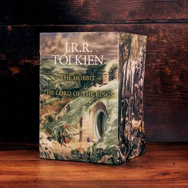
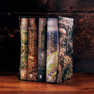
My copy (the one I as never ordering and did not want) will arrive today. This looks stunning from the pics.
Looking to get one of these as soon as I can find it below £50 including delivery in the UK, not to far off at the moment.
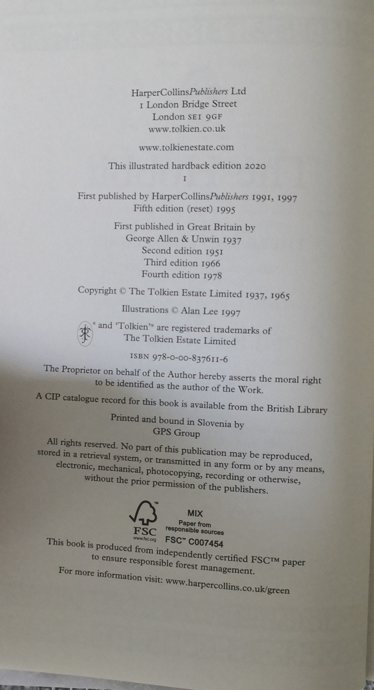
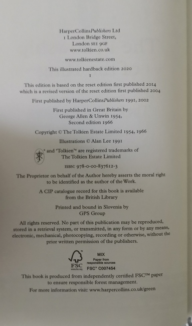
Received my set, it is substantial, it looks large and it is large, heavy and feels well made. It is printed in Slovakia Slovenia.
Looks like a nice set from first impressions. One bug bear is the rear dust-jackets and I want to fire the person at HarperCollins who OK'd it. RotK stands out like a sore thumb from the others and it is really annoying that HC can't get the simplest continuity correct.
I really like the red lettering for The Lord of the Rings and green for The Hobbit. A nice touch.
(Admin: Any pics below that are too close to the wick for copyright of course please remove.)
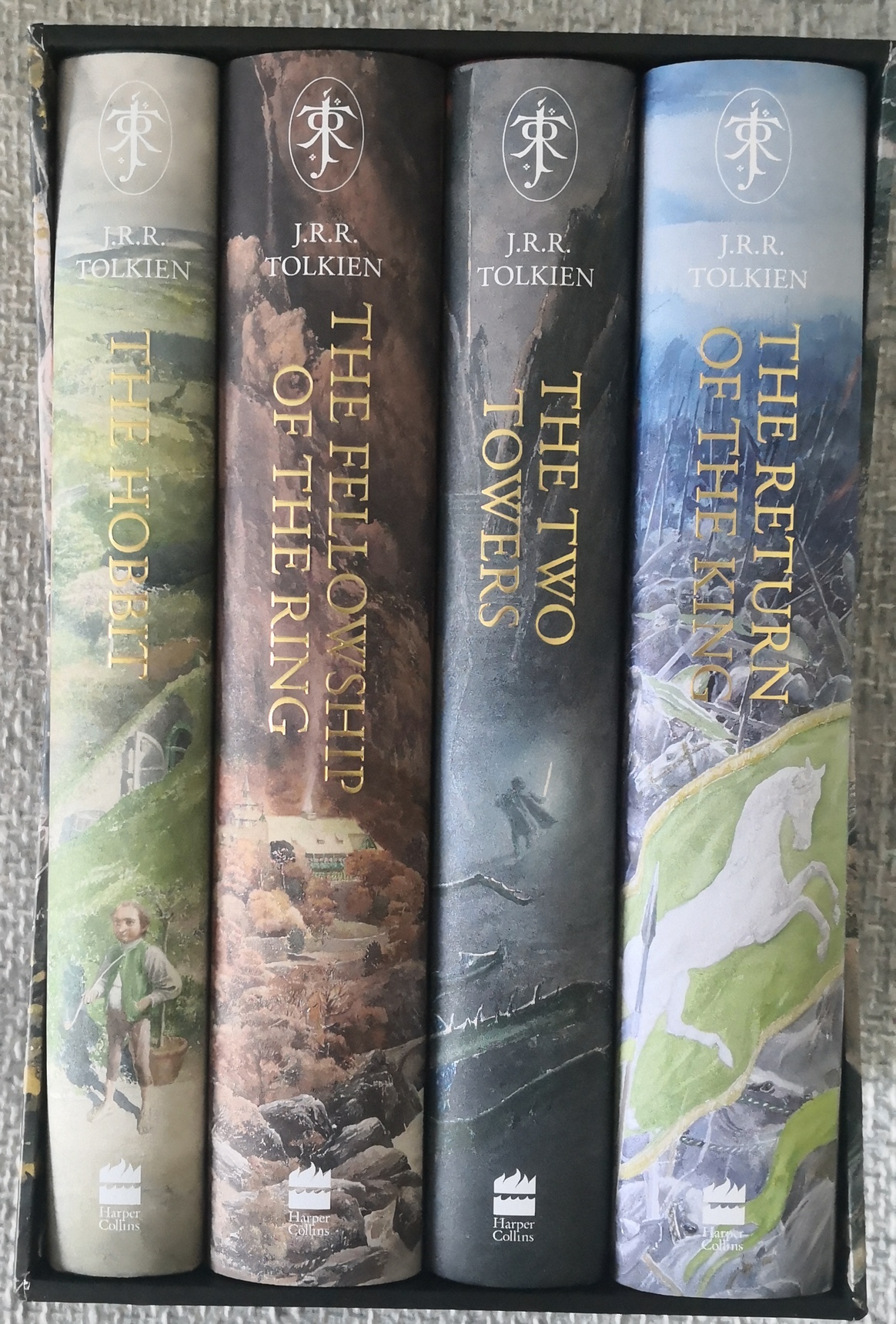
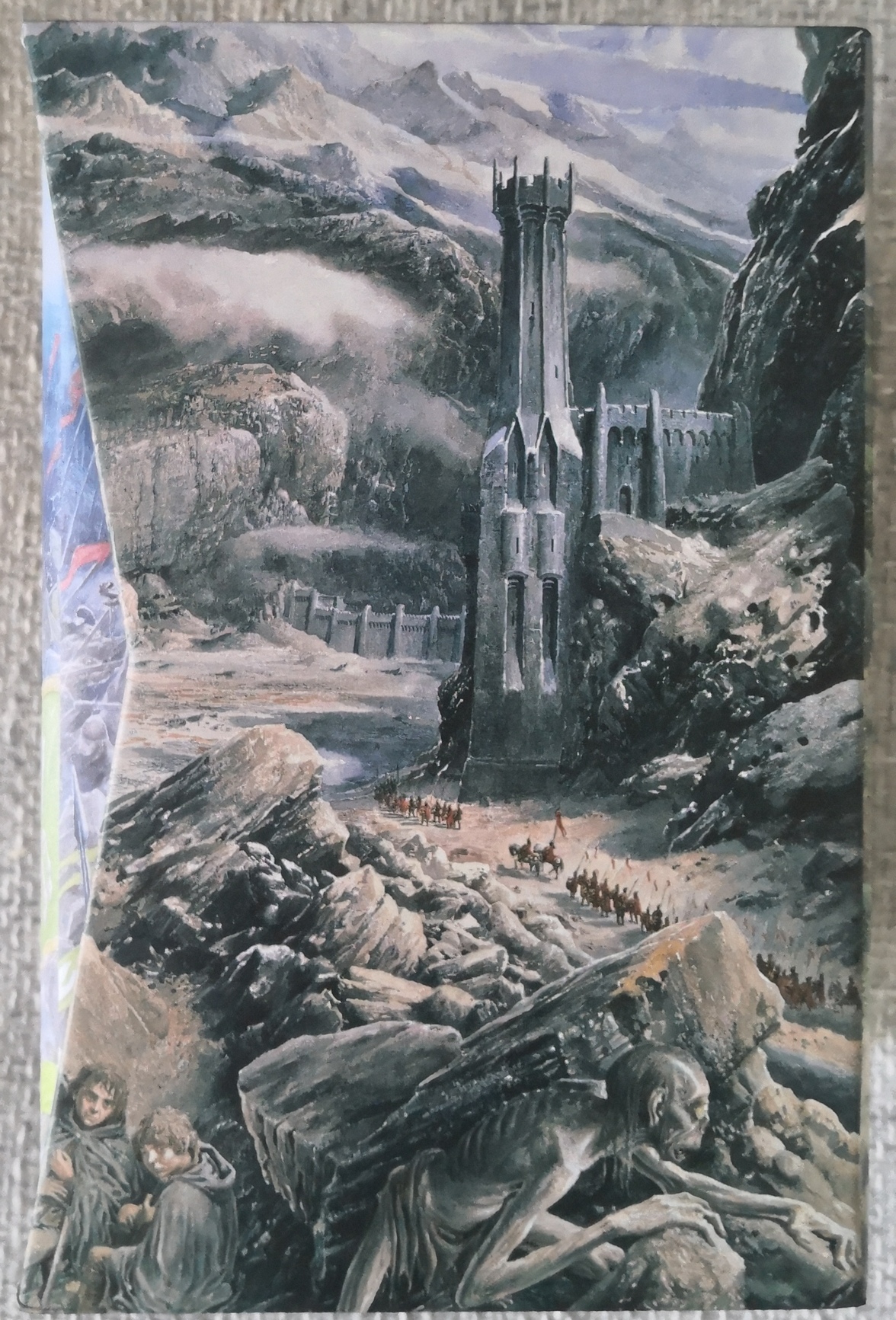
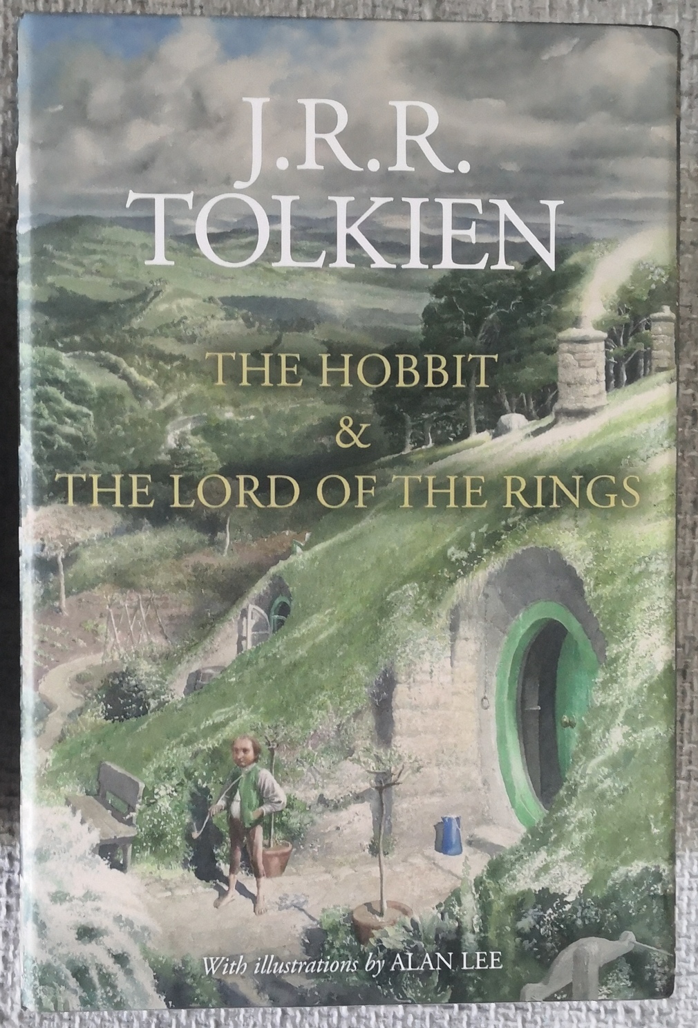
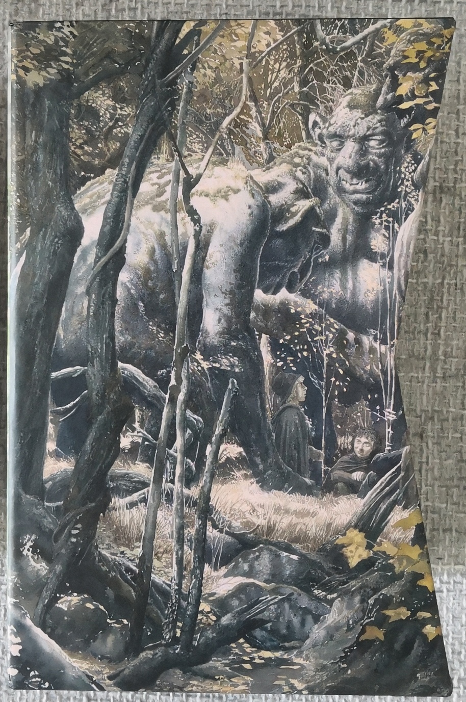
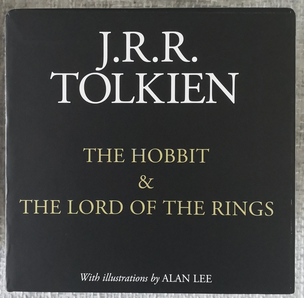
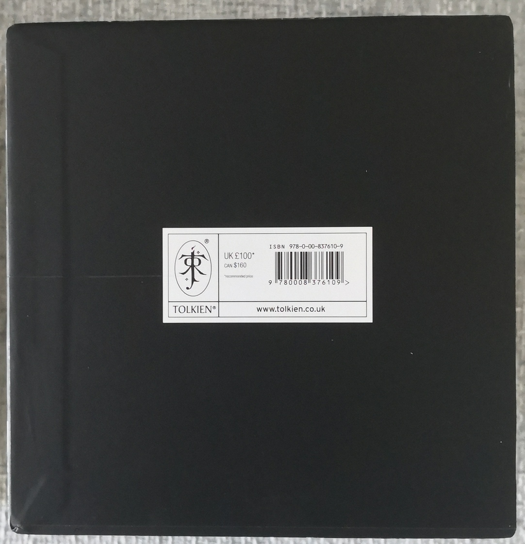
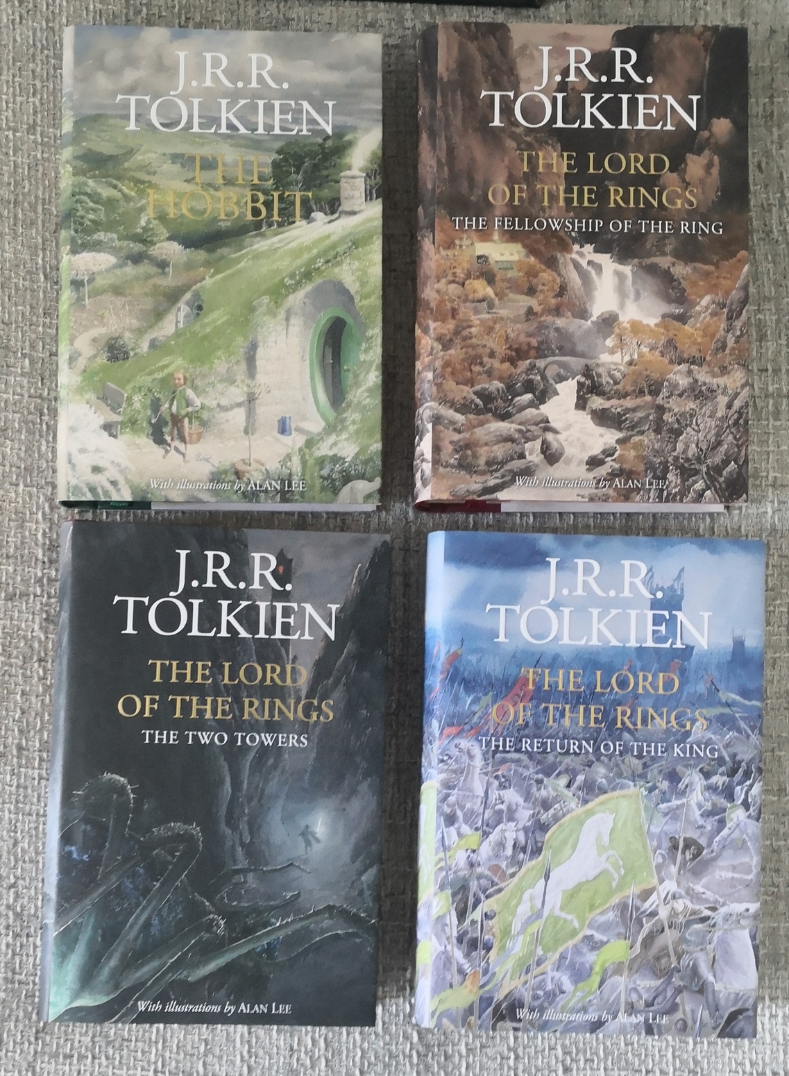
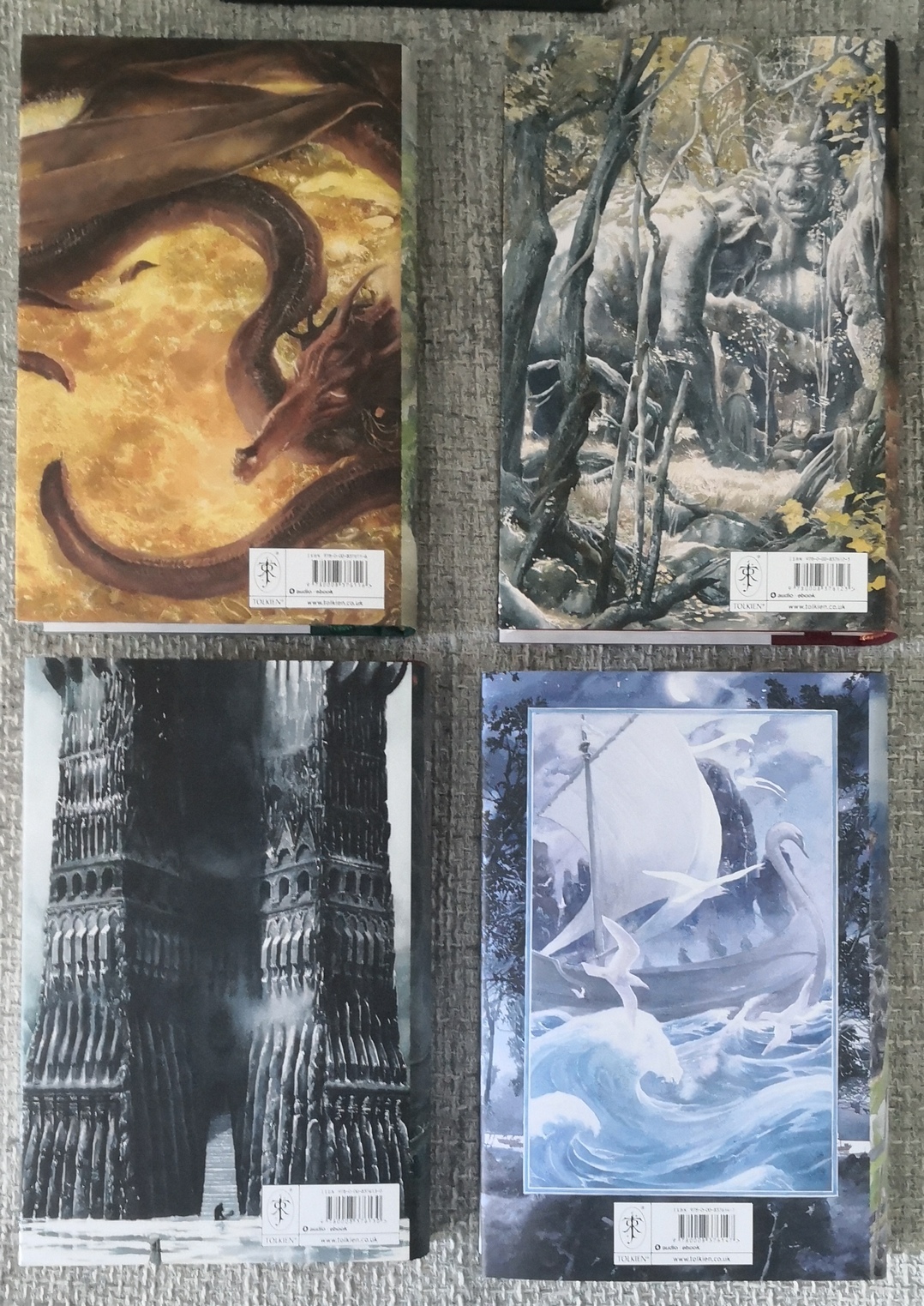
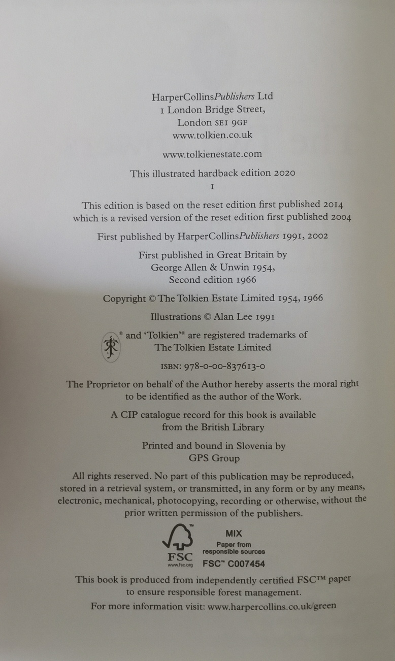
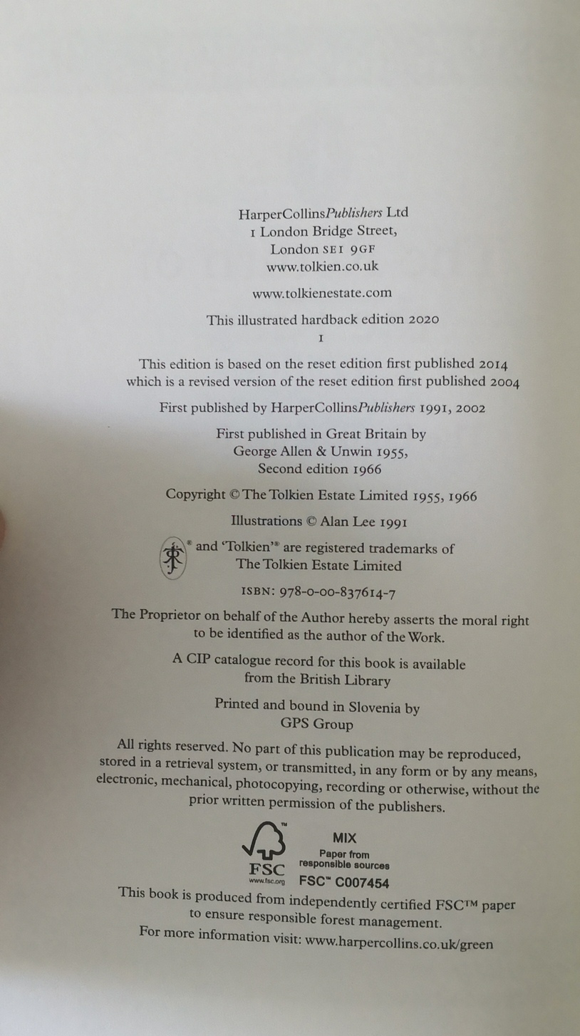
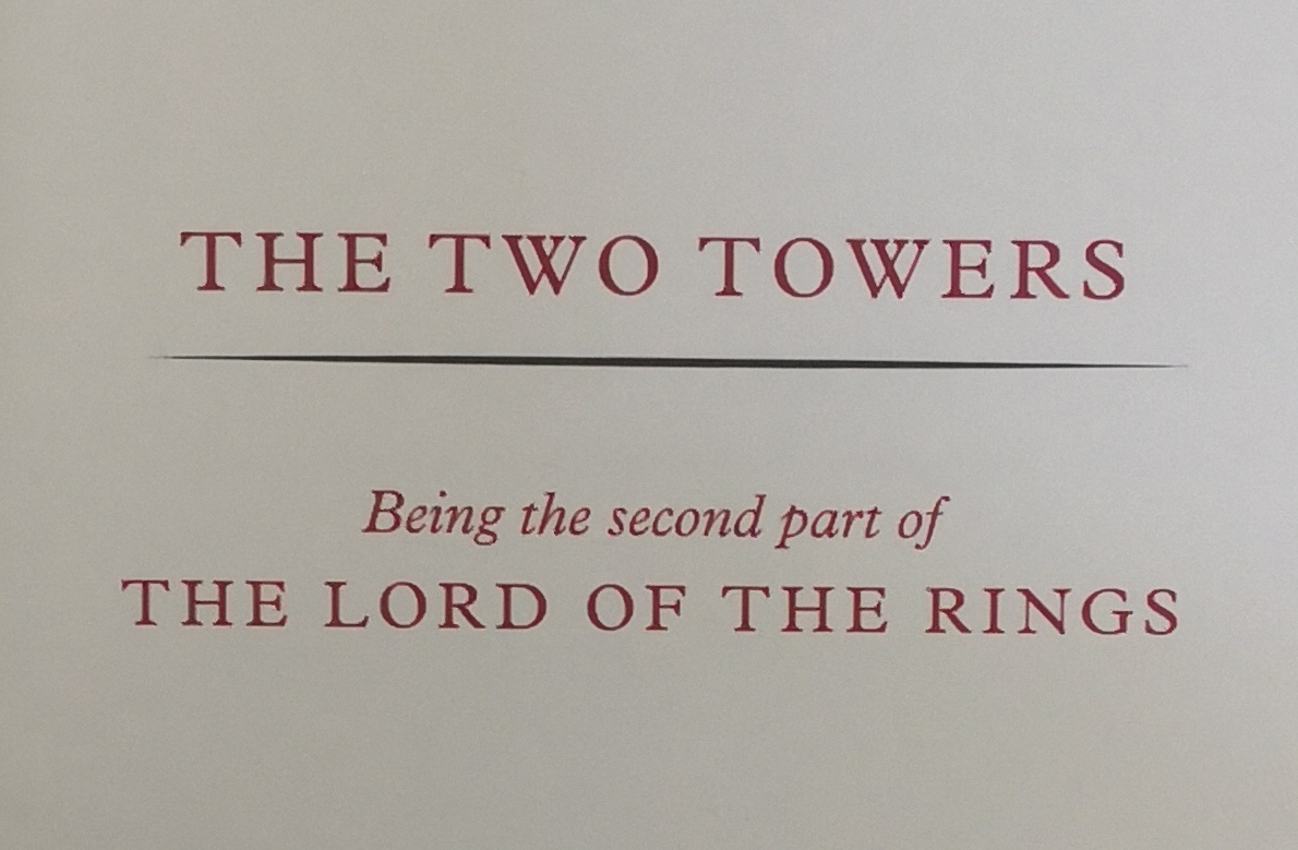

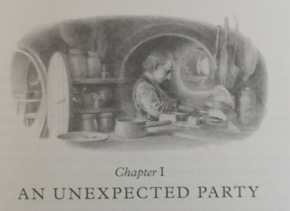
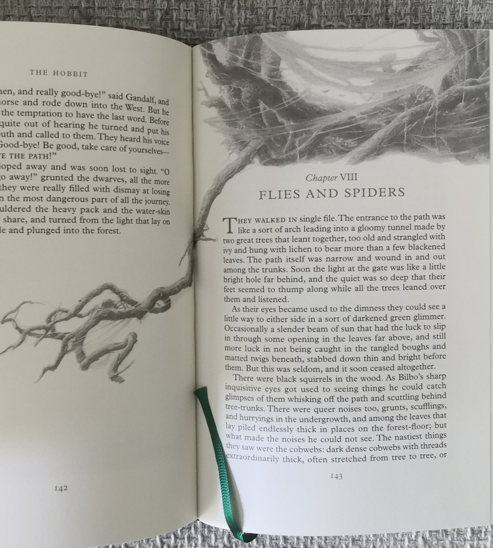
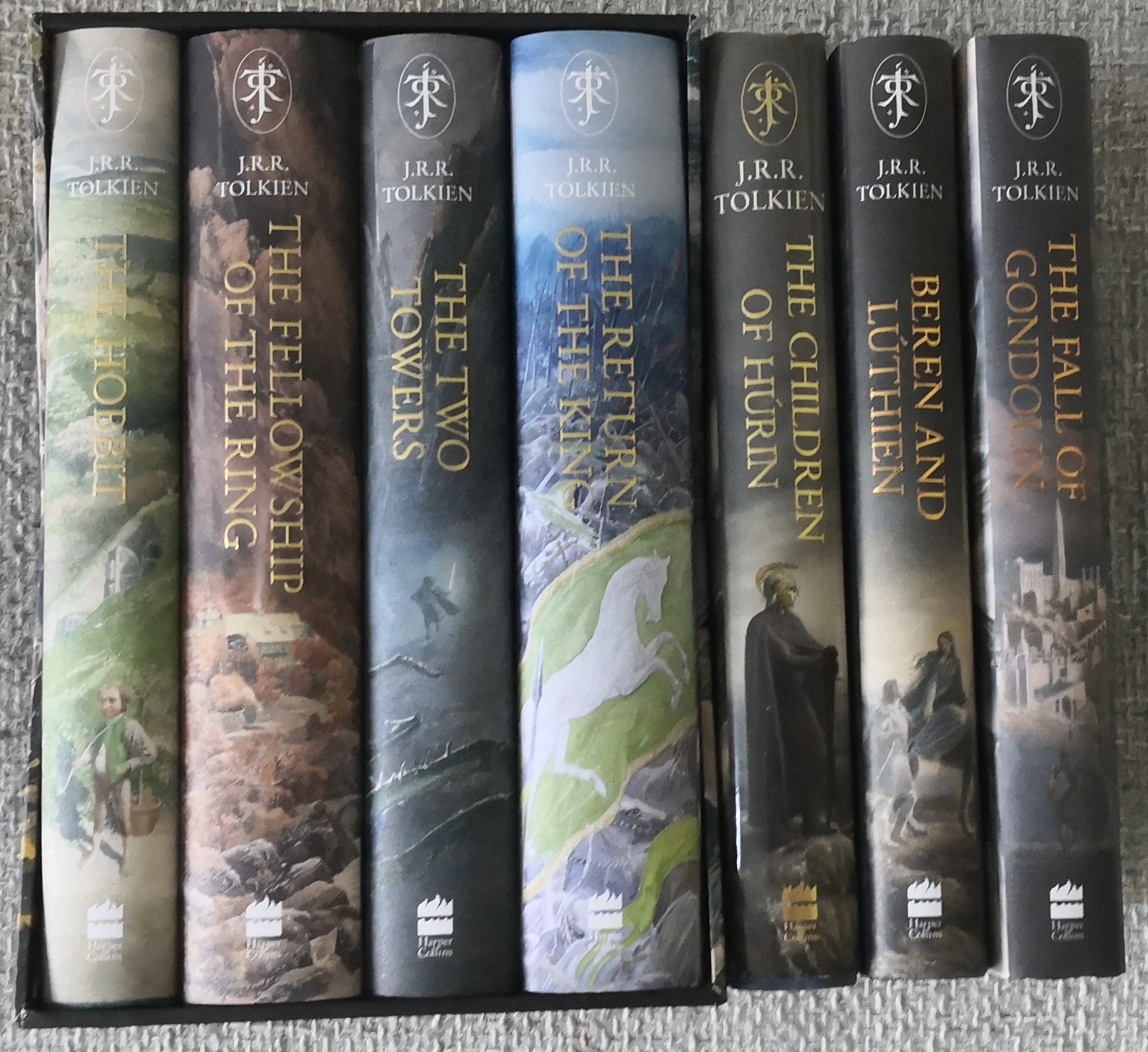
The set really does look absolutely gorgeous. And I agree about the RotK book... they came *this* close to perfection 
I myself won’t be purchasing this, but I can’t wait to thumb through one when I can get a chance.

I myself won’t be purchasing this, but I can’t wait to thumb through one when I can get a chance.
What you're not realizing is this - that image has appeared on the rear of the dustjacket for the 2002 illustrated edition! The Stone Trolls too, I believe. Though I don't recall what was used for the rear for The Two Towers though I know Orthanc was the cover. I would switch The Hobbit's front and back covers, though.
Looks like THE illustrated edition - no unyieldly 1-book edition, here!
What does the Nazgul frontispiece look like, the first few pages into The Fellowship of the Ring?
Looks like THE illustrated edition - no unyieldly 1-book edition, here!
What does the Nazgul frontispiece look like, the first few pages into The Fellowship of the Ring?
insurrbution wrote:
What you're not realizing is this - that image has appeared on the rear of the dustjacket for the 2002 illustrated edition! The Stone Trolls too, I believe. Though I don't recall what was used for the rear for The Two Towers though I know Orthanc was the cover. I would switch The Hobbit's front and back covers, though.
Looks like THE illustrated edition - no unyieldly 1-book edition, here!
What does the Nazgul frontispiece look like, the first few pages into The Fellowship of the Ring?
It has nothing to do with realising anything. I am talking about continuity of design and layout. Return of the King stands out because the bar code is centre and the image is framed unlike the other 3.
I am not home now to check but I'll post an image later if I get a chance.





 806
806 514K
514K