Depends on what sort of de luxe. If it’s the de luxe editions with the hard boards that mark easily, printed in China on less than attractive paper, then I will not be buying. If it’s the new type, like the recent Silmarillion and Unfinished Tales, then I’d be interested.
Stu wrote:
Put it this way, I will probably buy a deluxe edition of the old style just for completeness (rather than getting the trade), whereas I wouldn't buy one of the new style (because I'm not actually bothered about having a deluxe). There are a lot of people with the old style books. The logic of the binding choice here doesn't have much to do with whether there are internal illustrations -- it is down to what will get the best return, I'd imagine.
I'm in this boat, at this point I'll pick up Deluxe editions in the old style to match the 14 or so others I have in that style; but I'm not picking up the new Deluxe style from the Sil and UT Illustrated Editions.
While I somewhat like the style of them (I liked Sil's image selections better than UT) but I don't need more editions at this point just taking up space. Already paired what is displayed in my collection down a bunch (need to list a lot of them as they are just sitting in boxes in storage right now).
Will be following more closely now waiting for a render to show which style it'll be done in before making ordering.
Urulókë wrote:
The Brazilian translation of The Nature of Middle-earth will be published simultaneously with the UK and US editions on September 2nd. I am guessing other translations may be announced in the next few weeks as well. Looking good!
I can confirm that the German edition will be published the same day.
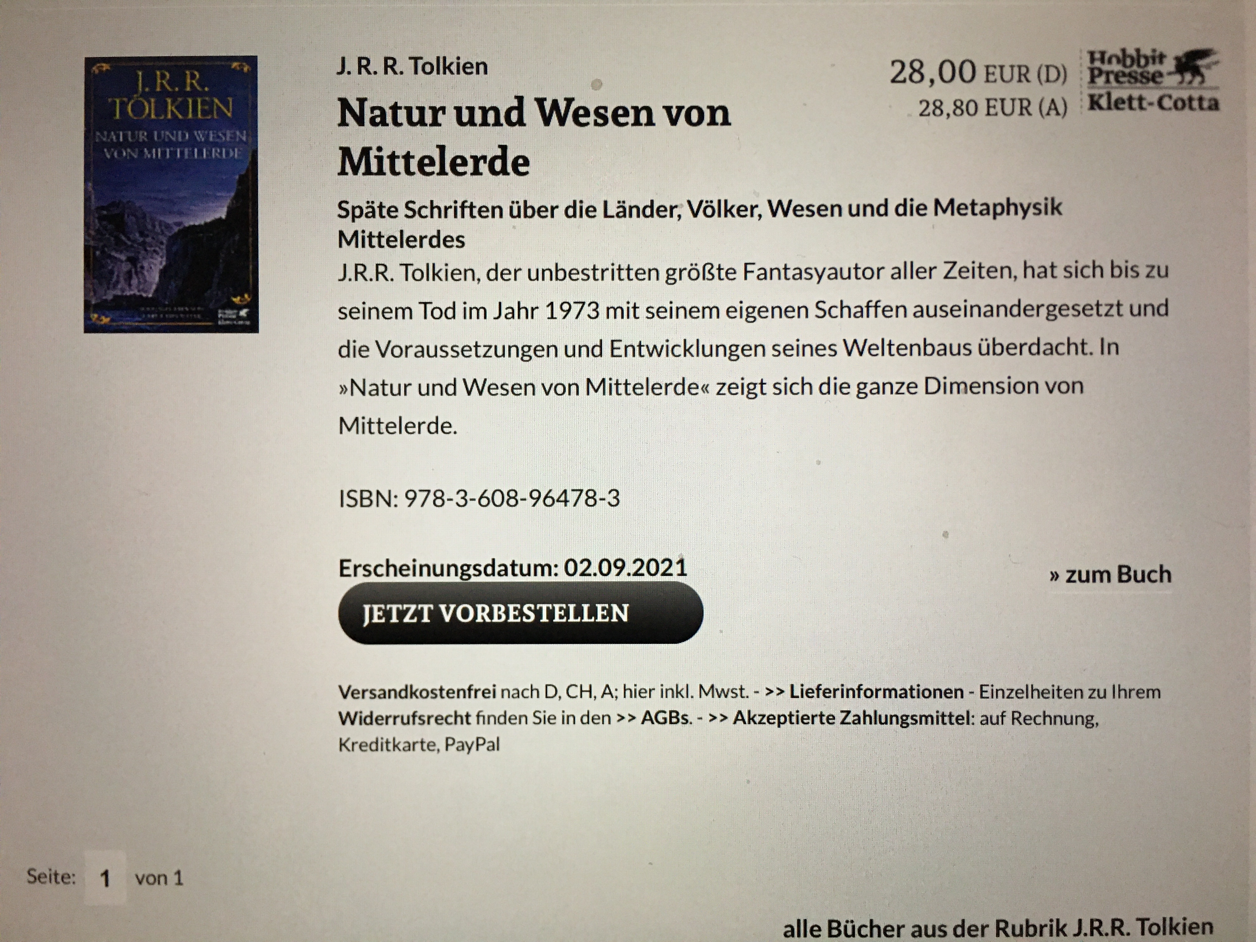
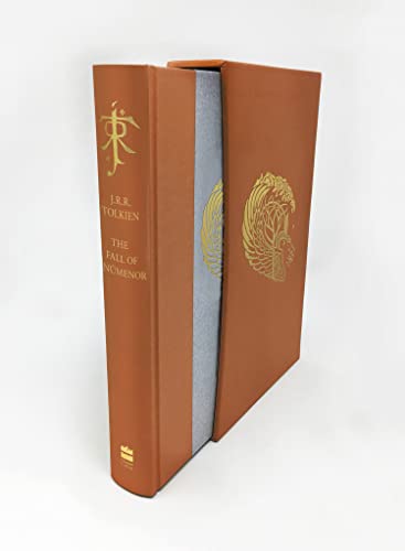
I found this image of the deluxe edition on Amazon Australia.
I’ve no idea where this motif comes from, but it’s rather quirky and seems apt. Also, it looks like the motif on the book cover itself is coloured. Quite lovely overall.
I’ve no idea where this motif comes from, but it’s rather quirky and seems apt. Also, it looks like the motif on the book cover itself is coloured. Quite lovely overall.
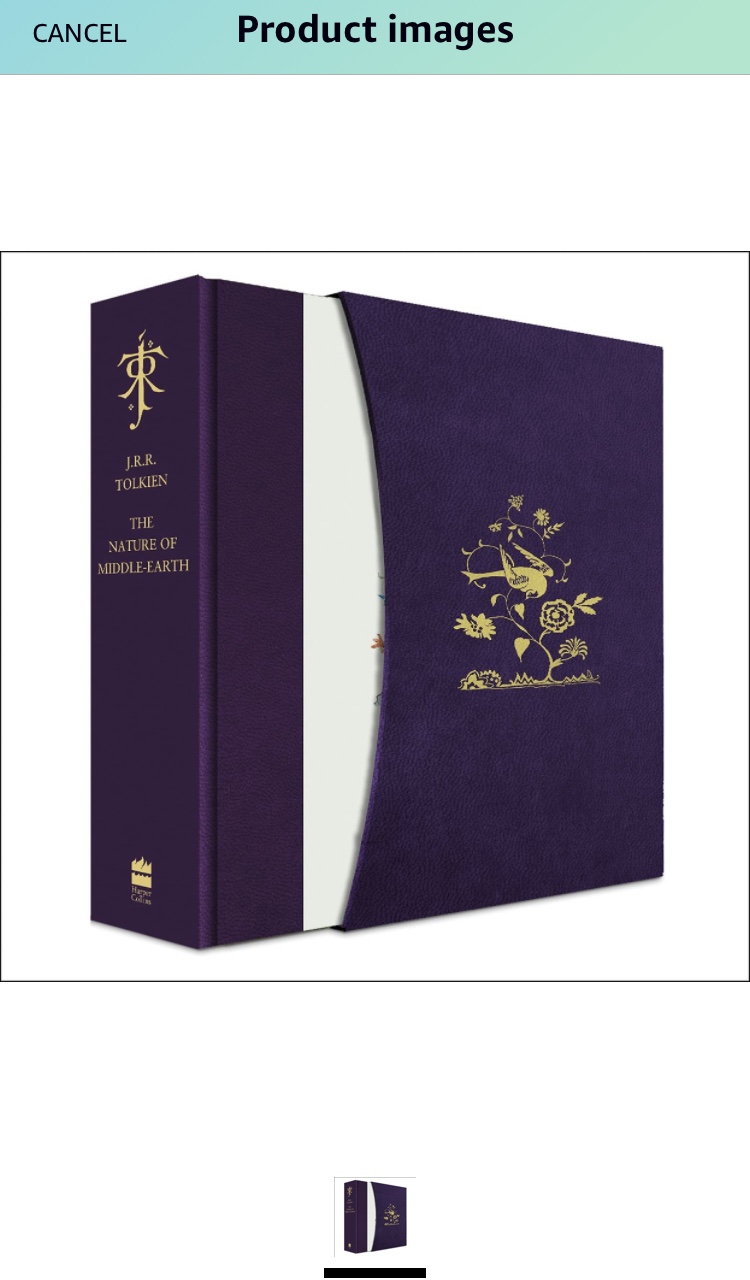
I am sure an official announcement will be forthcoming for the royal (purple) edition of NoMe. Looking forward to it!
Thanks for finding this in the wild, @eorl. The motif is Tolkien's art - I don't know if it has an official title other than "bird in flowering tree", but it has appeared on a US Silmarillion, and in Life & Legend, and Pictures.
https://tai.tolkienists.org/tai/114/
https://www.tolkienbooks.us/me/sil/the-silmarillion-1991
Oh my that’s a gorgeous image when seen in colour (your second link). I’m so excited if they’ve actually done the image in foil stamping true to colour on the front cover of this book. ?
Looks basically the same colour as Beowulf. I quite liked that colour.
From the image, I presume the image on the book cover is just printed (rather than foil), like the Father Christmas Letters cover. Multiple foils would be great, but the mockup doesn't look like that is what is being portrayed (and it would be an expensive break from the past). Colour printing = cheap
From the image, I presume the image on the book cover is just printed (rather than foil), like the Father Christmas Letters cover. Multiple foils would be great, but the mockup doesn't look like that is what is being portrayed (and it would be an expensive break from the past). Colour printing = cheap

It does look like it may be multiple coloured foils from the mock-up if you zoom in on the image, though hard to tell, as you say could just be printed.
https://www.amazon.com.au/Nature-Middl ... J-R-Tolkien/dp/0008440573
https://www.amazon.com.au/Nature-Middl ... J-R-Tolkien/dp/0008440573
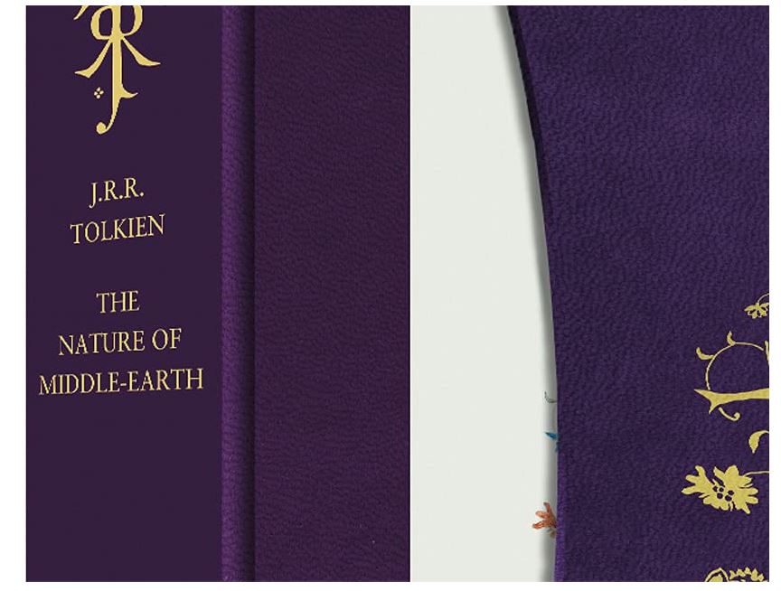
Oh indeed Stu. The Father Christmas Letters is not all foil - only the silver snow is done with some sort of foil stamping, the rest is just colour printing.
As for the purple colour, yes it is very close to Beowulf. I love that purple. I thought they would use some shade of green for this “nature” themed book, but I suppose they wanted to maybe match the tone of the Ted Nasmith illustration being used the hardback and paperback.
As for the purple colour, yes it is very close to Beowulf. I love that purple. I thought they would use some shade of green for this “nature” themed book, but I suppose they wanted to maybe match the tone of the Ted Nasmith illustration being used the hardback and paperback.




 4331
4331 1.96M
1.96M