
29 Apr, 2022
(edited)
2022-4-29 6:43:52 AM UTC
Edited by Stu on 2022-4-29 7:30:10 AM UTC
Edited by Stu on 2022-4-29 7:31:26 AM UTC
Edited by Stu on 2022-4-29 7:37:52 AM UTC
Edited by Stu on 2022-4-29 7:40:34 AM UTC
Edited by Stu on 2022-4-29 7:44:46 AM UTC
Edited by Stu on 2022-4-29 7:48:51 AM UTC
Edited by Stu on 2022-4-29 7:31:26 AM UTC
Edited by Stu on 2022-4-29 7:37:52 AM UTC
Edited by Stu on 2022-4-29 7:40:34 AM UTC
Edited by Stu on 2022-4-29 7:44:46 AM UTC
Edited by Stu on 2022-4-29 7:48:51 AM UTC
2022-4-29 6:43:52 AM UTC
Khamûl wrote:
It's interesting just how low the bar has been set here that we're now comparing a £1000 edition to standard HBs by HC from the 1990's. This is from a publisher that published its Shakespeare by letterpress priced at ~£300. Those editions can still be had for under £500 on secondary markets. Something like that for Tolkien would have been impressive.
Indeed, though worth noting I'm comparing HC '92 to HC '20, as I don't have the new Folio to compare against. That said, I will be surprised (pleasantly) if the Folio is *really* that much better than the '92, as the '92 is really good (unlike any of the recent HC stuff, which objectively isn't).
Can someone who has the Folio post up the actual dimensions of the tipped-in images. I'm curious as to how much bigger they really are, given the loss through the whitespace and borders, etc.
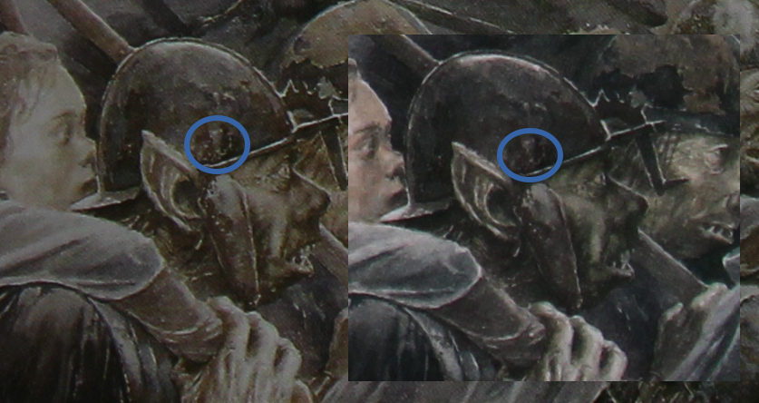
Comparison of a specific image is interesting, but bear in mind I'm comparing a photo of the '92 book with a zoomed video of Folio. To my eye it looks like there is definitely less halftoning on the Folio, but there might also be some detail loss (look at the axe head). I'm going to go out on a limb and say that the Folio is better overall, but it isn't THAT much better in every aspect (though prepared to revise that opinion should I get to photograph both close up).
For scale reference, Eowyn's head is exactly 2.3cm measuring horizontally from the tip of the nose to the back of the head in the '92.
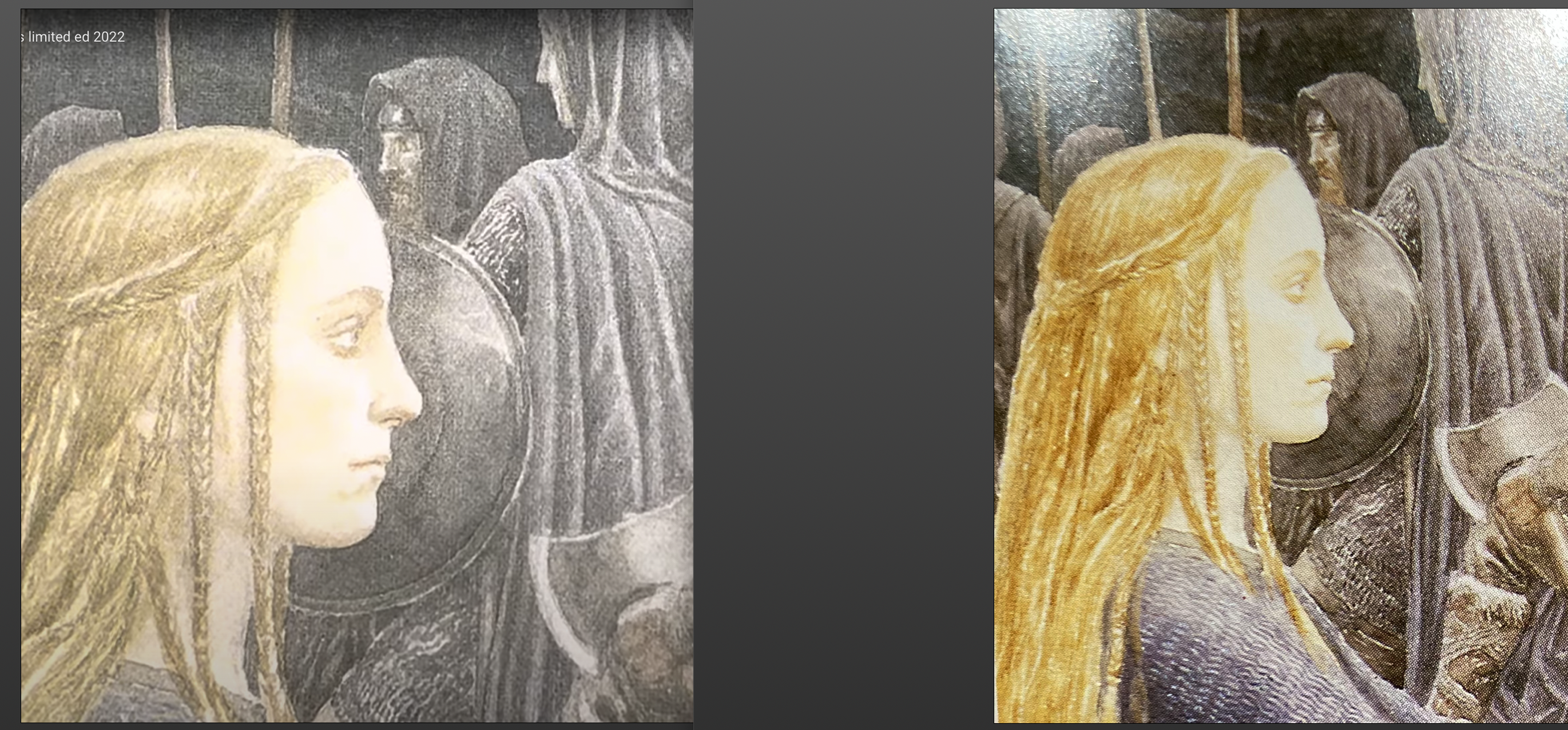
The tipped in illustrations are the same size as the HarperCollins 1992 edition as they have a small blank border around them.
Folio Society 2022 : 21cmx13.5cm
Folio Society 2022 : 21cmx13.5cm
Trotter wrote:
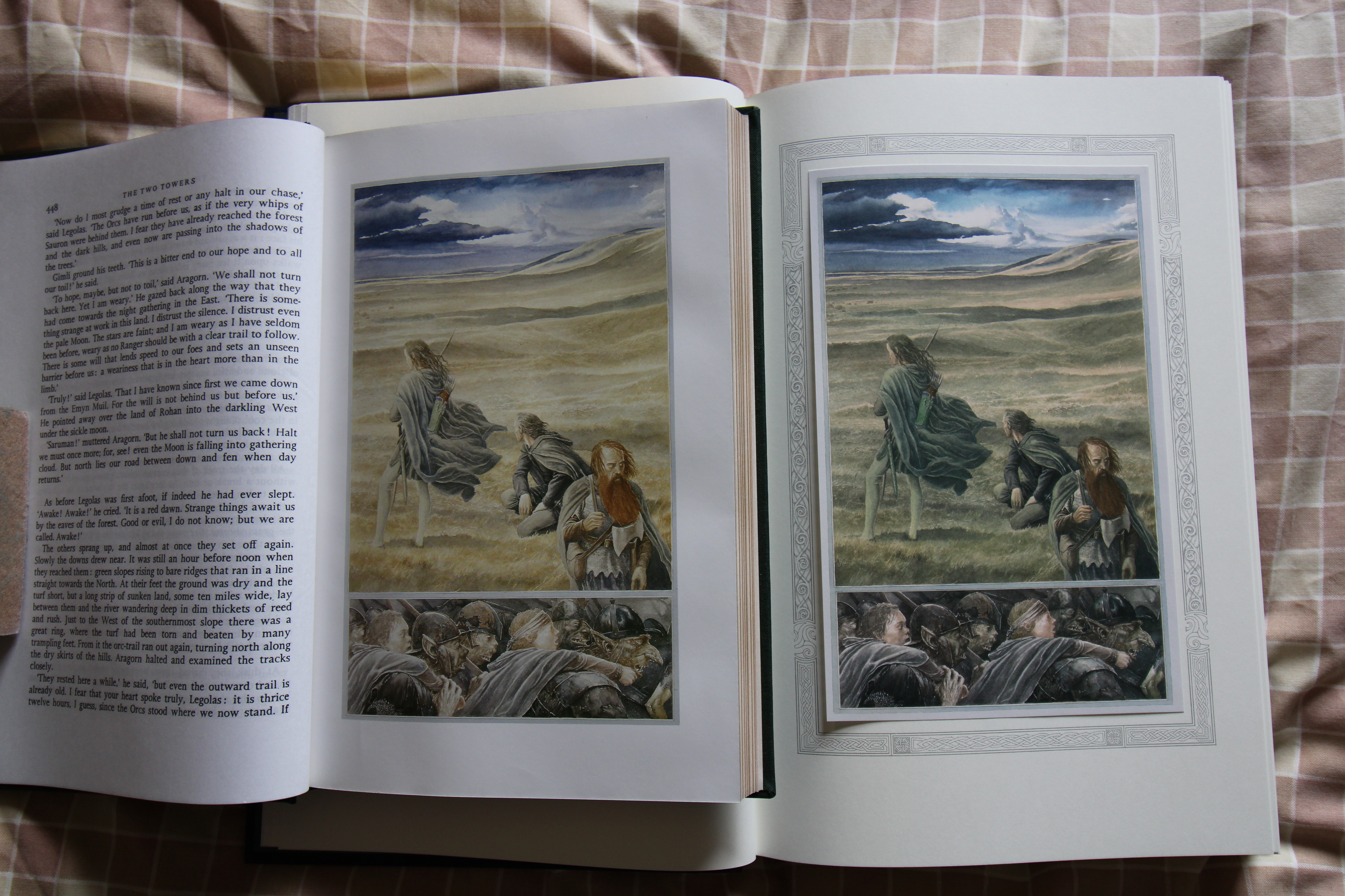
The tipped in illustrations are the same size as the HarperCollins 1992 edition as they have a small blank border around them.
Folio Society 2022 : 21cmx13.5cm
Thanks - I thought as much. Seems kind of crazy that this large format was somewhat wasted for the images.
I suspect the colours are truer on the Folio (and definitely less halftoning - quite obvious on your photo), but I still can't help but see wasted opportunity here (the Folio image is actually a fraction smaller than the '92). That is totally unexpected; I didn't expect it to be much bigger, but from the online discussion I didn't expect it to be smaller
Trotter wrote:
Here is a picture of the same illustration from both editions, HC left FS right.
Was comparing the Folio deluxe with my 1992 and 2002 sets last night. FS has done a great job here. In terms of size I didnt expect them to be larger, but was hoping for the colours to come closer to the original artwork and they really did deliver.
I do question the point of a larger book, given the images aren’t larger, though. Doesn’t that just make it big for the sake of big? I guess I am finding this edition more confusing than anything else. Seems nicely made (which is great), but also just an oddity.
Stu wrote:
I do question the point of a larger book, given the images aren’t larger, though. Doesn’t that just make it big for the sake of big? I guess I am finding this edition more confusing than anything else. Seems nicely made (which is great), but also just an oddity.
Thanks to Trotter for posting the comparison.
Looking at the comparison I wonder if the FS wanted to showcase the images as if they were in a 'gallery', so to speak? The bordering with white space around gives them a more framed in an 'art gallery' feel than taking up as much of the page as possible just because it's there. Totally get your point about why have slightly smaller images in a larger book, it does seem a waste but I wonder of they went for that with viewing in mind.
Maybe Trotter has some thoughts on that? Does the white space around the images help you engage better with the images than previous illustrated editions?
I think Alan Lee was asked to produce the images in 1992 for a fixed size in the books, and the Folio Society used the size that the images were commissioned to be. They have been printed at larger sizes as posters and in calendars but as far as I am aware not in books.
Stu mentioned they are smaller in the Folio Society edition, I can't see that and if they are it is by a very small amount.
Stu mentioned they are smaller in the Folio Society edition, I can't see that and if they are it is by a very small amount.
Trotter wrote:
I think Alan Lee was asked to produce the images in 1992 for a fixed size in the books, and the Folio Society used the size that the images were commissioned to be. They have been printed at larger sizes as posters and in calendars but as far as I am aware not in books.
Stu mentioned they are smaller in the Folio Society edition, I can't see that and if they are it is by a very small amount.
They look smaller in your photo, but that could just be a perspective thing with the HC edition being a little closer to the camera.
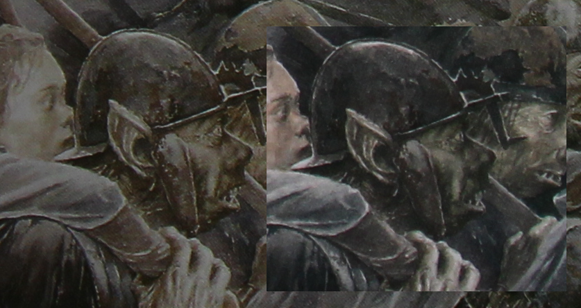
I just laid a bit of HC next to Folio from your images for comparison. I find the differences odd and by no means clear-cut that Folio is massively superior to HC. Really feels like swings and roundabouts from the images with Folio being a nudge ahead (but with loss of some detail in Folio in some parts of the image)
For avoidance if doubt, the image below is cut from Trotters side-by-side photo, just with the two image pieces cut next to each other for ease of comparison. They come from one photo source.







 146
146 16.79K