I'm also (always) curious about people referring to this or that version being a superior rendering of the original in respect to colour. Has anyone seen any of this original artwork? Ultimately, what matters, is where FS produced their images from. From originals would be what we would be looking for. Again, the detail is important.
Khamûl wrote:
I'm also (always) curious about people referring to this or that version being a superior rendering of the original in respect to colour. Has anyone seen any of this original artwork? Ultimately, what matters, is where FS produced their images from. From originals would be what we would be looking for. Again, the detail is important.
I think it is more complex even than that. The original art might not meet Alan Lee’s intent. He might want the colour rendering to be adjusted in a particular way. It is very hard to know what is ‘right’ vs what you find most pleasing.
Indeed. And Alan's close involvement (if reported accurately) is enough to suggest the images look as he wants them to look, in 2022.
Khamûl wrote:
Indeed. And Alan's close involvement (if reported accurately) is enough to suggest the images look as he wants them to look, in 2022.
That was my thought. He also rectified some issues in the paintings, which I think we can assume he did digitally (he did finishing work on the CoH images digitally, so we know this has been his process since at least 2007). I would not be surprised if he adjusted/harmonised the colours on a calibrated monitor to fit best with his current vision (which may have changed in 30 years). Would be an interesting question for Alan.
I would have preferred the book to have been designed so the images didn't need to be tipped in (but could be on the better paper). Obviously this limits image numbers and placement. Nevertheless, I couldn't help but notice the way the bottom of the tipped in image sits away from the page when opened (as it is glued along the top and the page block curves). I wonder how/why they made the choice to glue along the top rather than the edge closest to the spine? My botanical books (of which I don't have many) are tipped in with the glue along the vertical edge, and the result looks more acceptable to my eye.
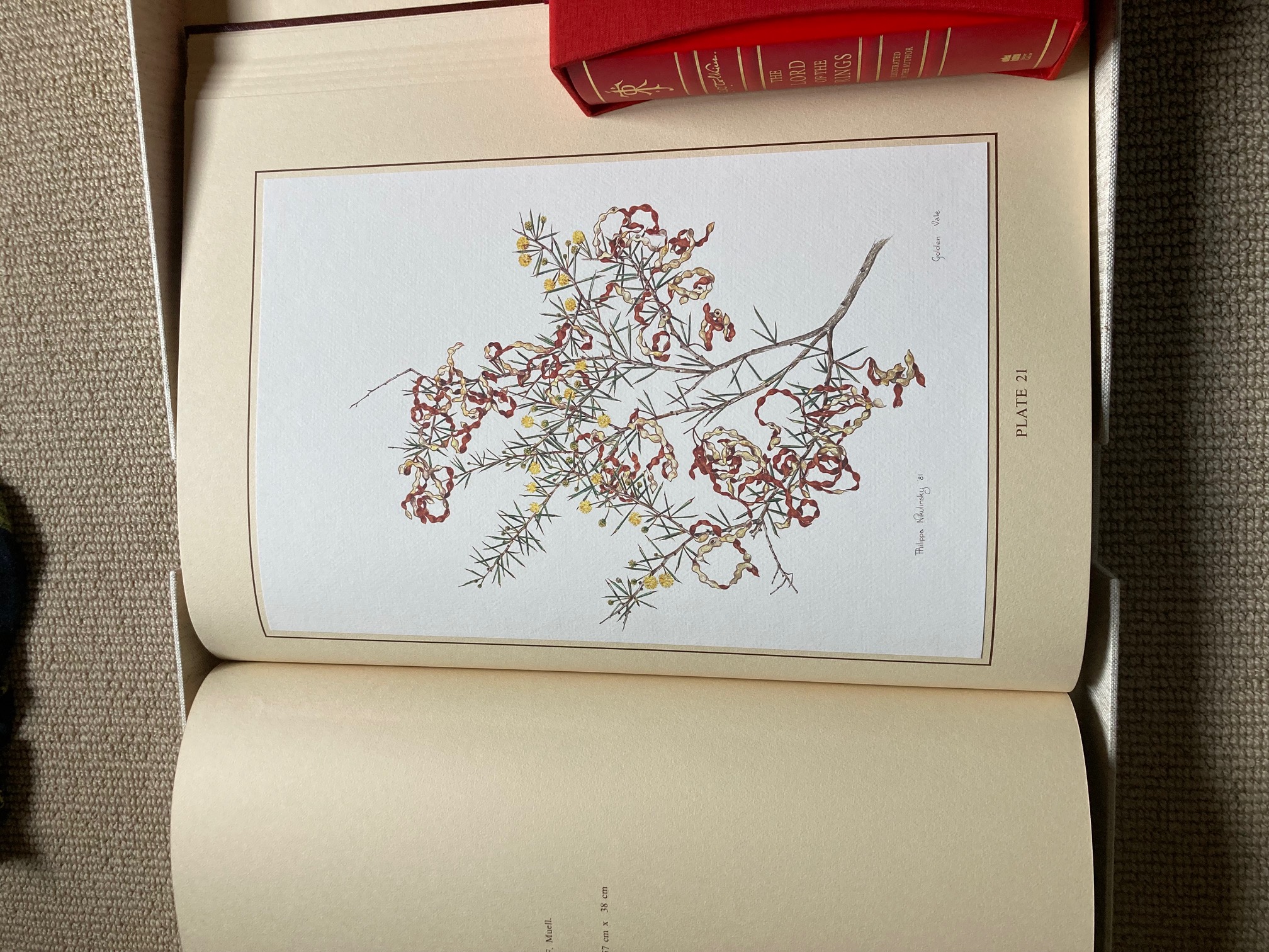
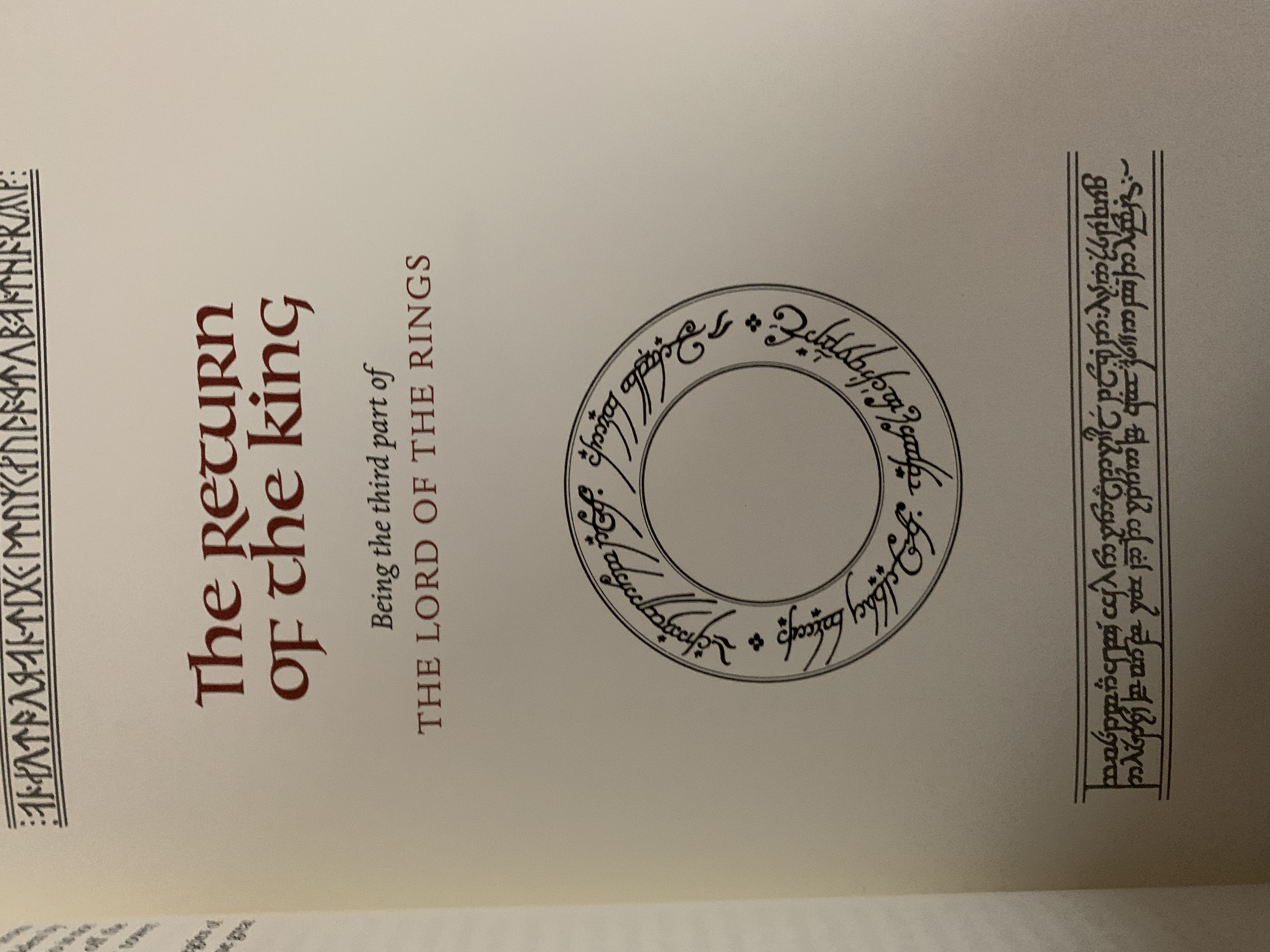
Set arrived today. Overall a quality set with a few exceptions.
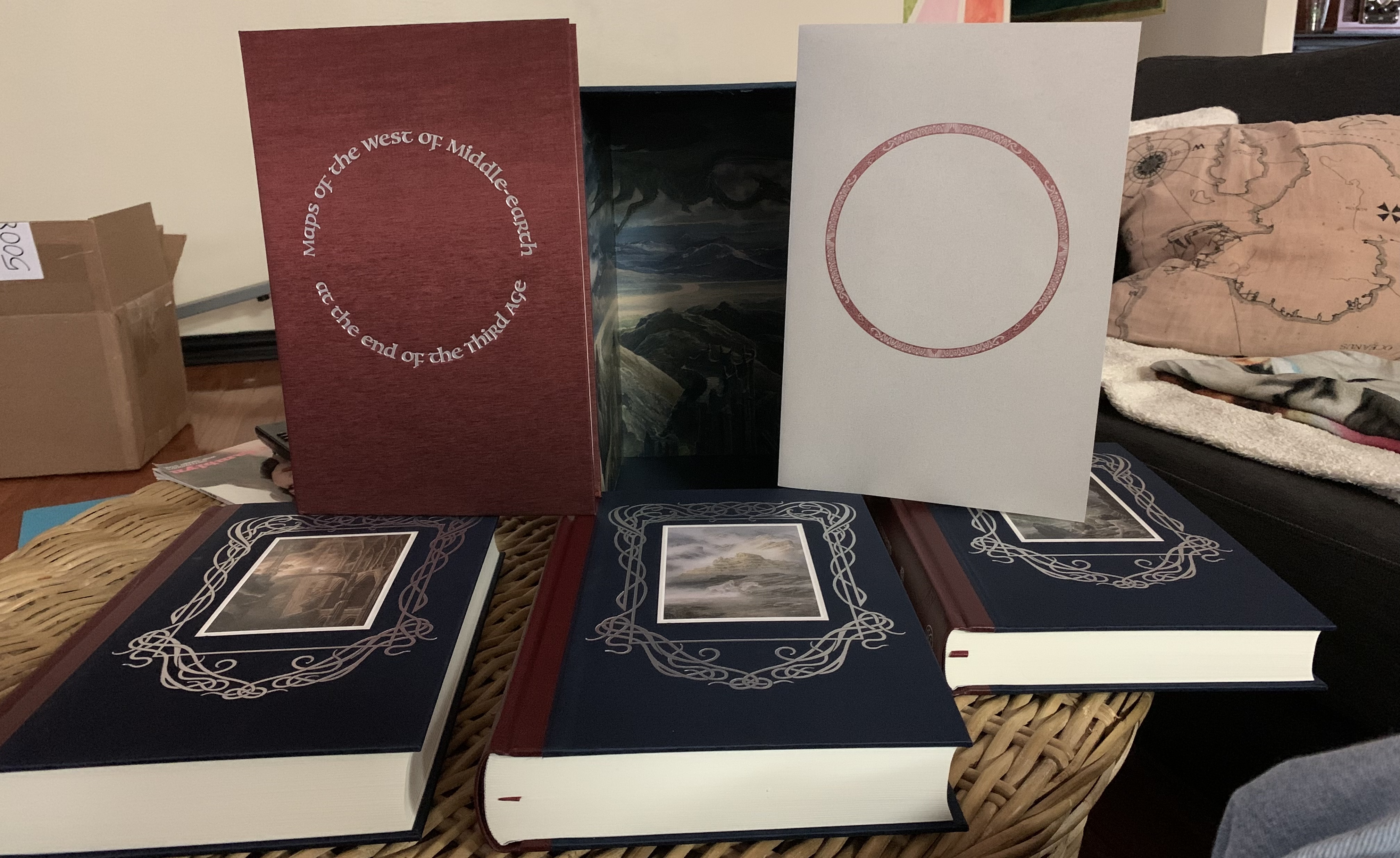
Pluses: The blue outer cloth on the boards is fantastic to the touch, the image quality is light years ahead of what HC did with their release last year. Triptych and hidden image in slipcase are wonderful. Paper quality of the actual pages is second to none. Having seen the color scheme in person now, I take back some of the things I said in the video about it. Use of the centenary logo is a plus, a nice look back to those Lee volumes. Book of the two maps is probably my favorite part, love how they are presented here.
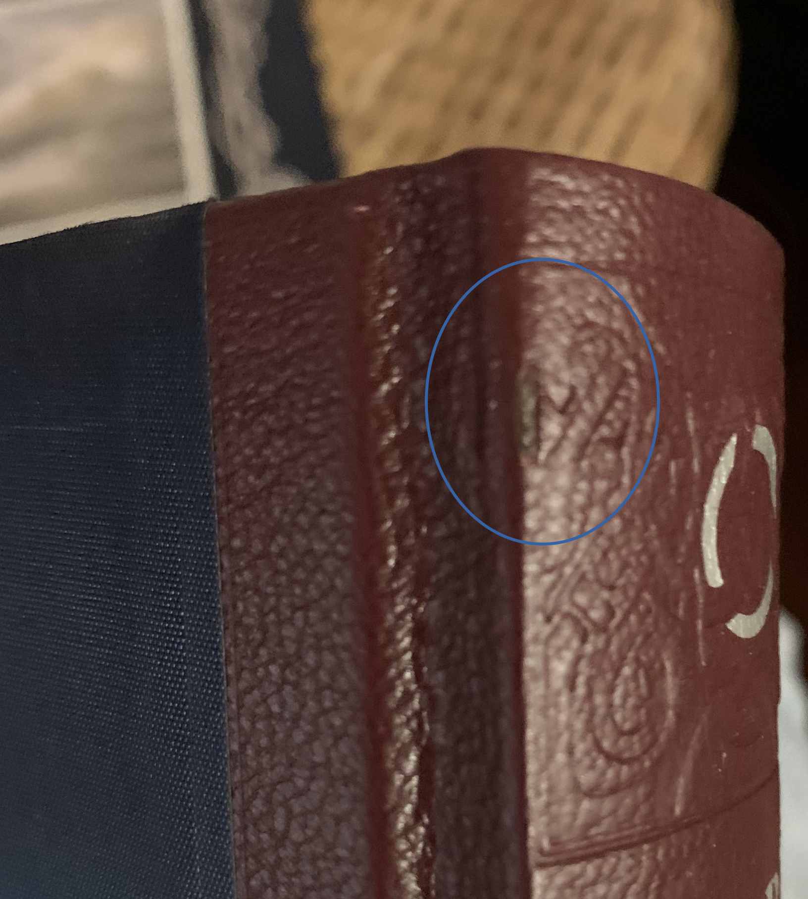
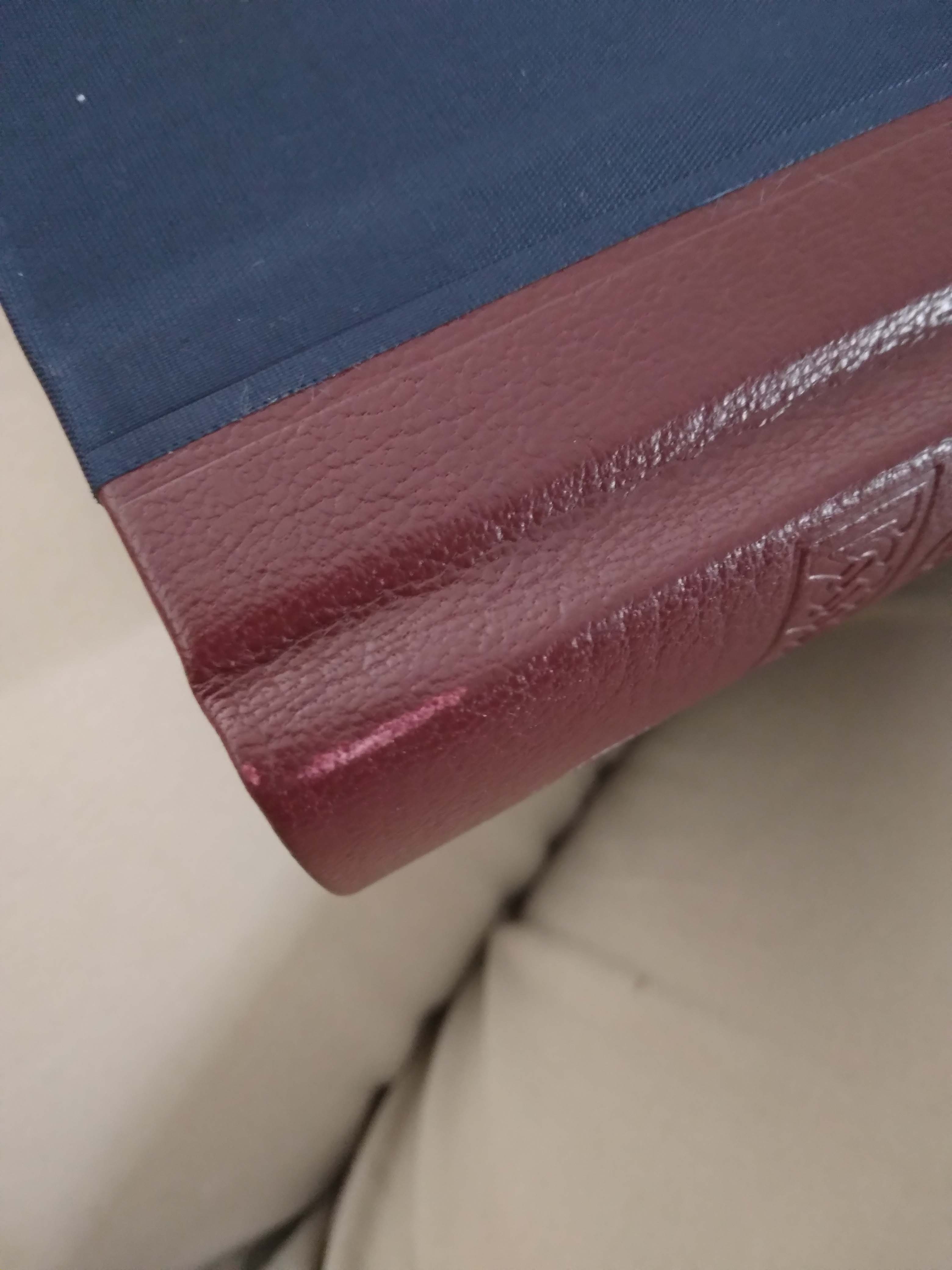
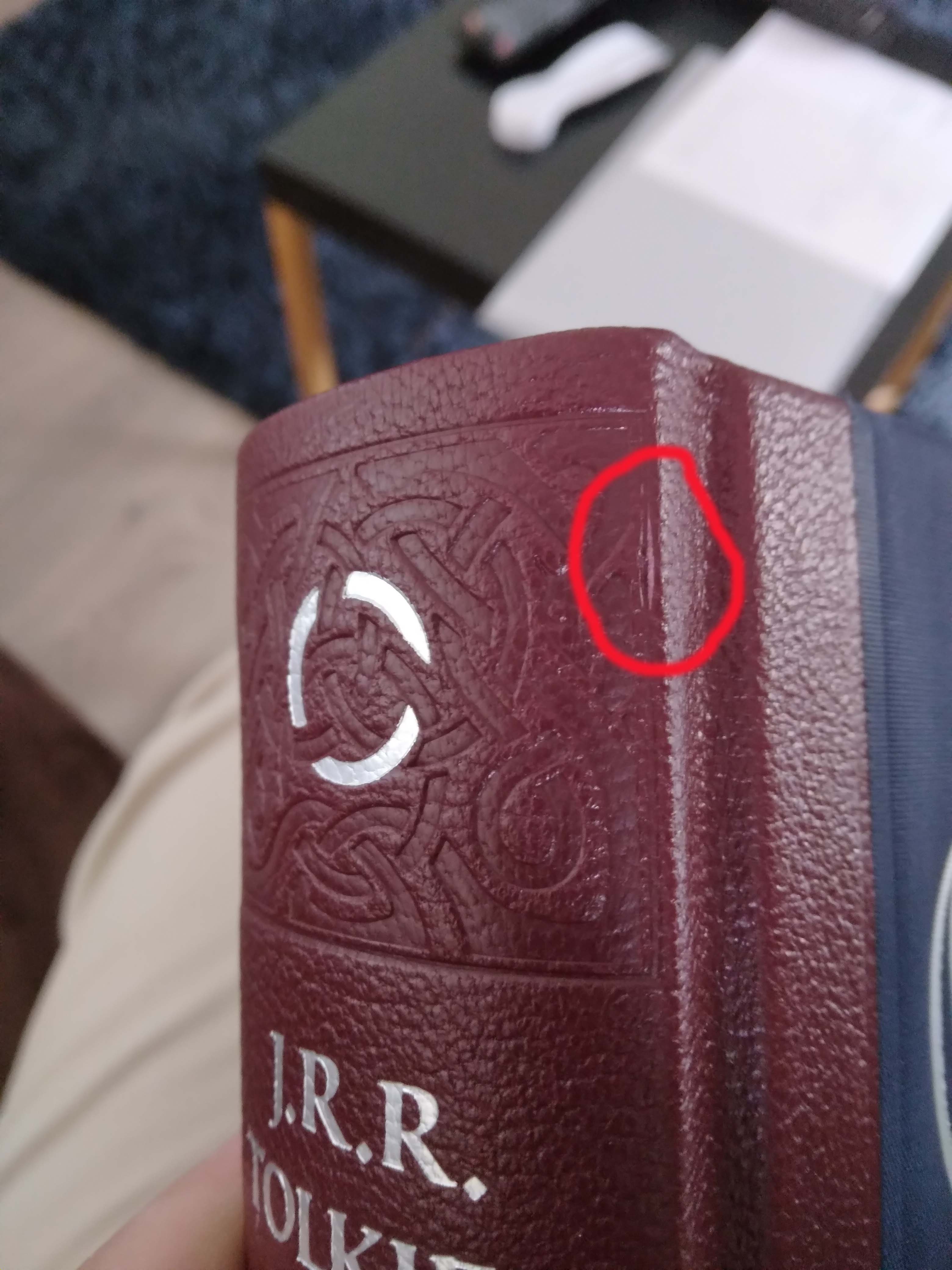
Drawbacks: The leather quality on the spine, while good, is not great. As you can see there is one small spilt and slight rubbing on Two Towers. Also not really quarter bound, more like 1/6 bound. Tipped in images are okay, and they are very vivid and life like, but having seen them now, would prefer them to be part of the page. The slipcase itself feels a little flimsy, and there isn’t a pull ribbon to get the books out easily. The image on the end papers while great was a missed opportunity to have three separate ones in each volume.
Those are my initial thoughts. A very nice albeit, slightly overpriced set. But at the same time Im glad to have them. Still better than the 2002 couch set ?
Thanks to Trotter for the assist.


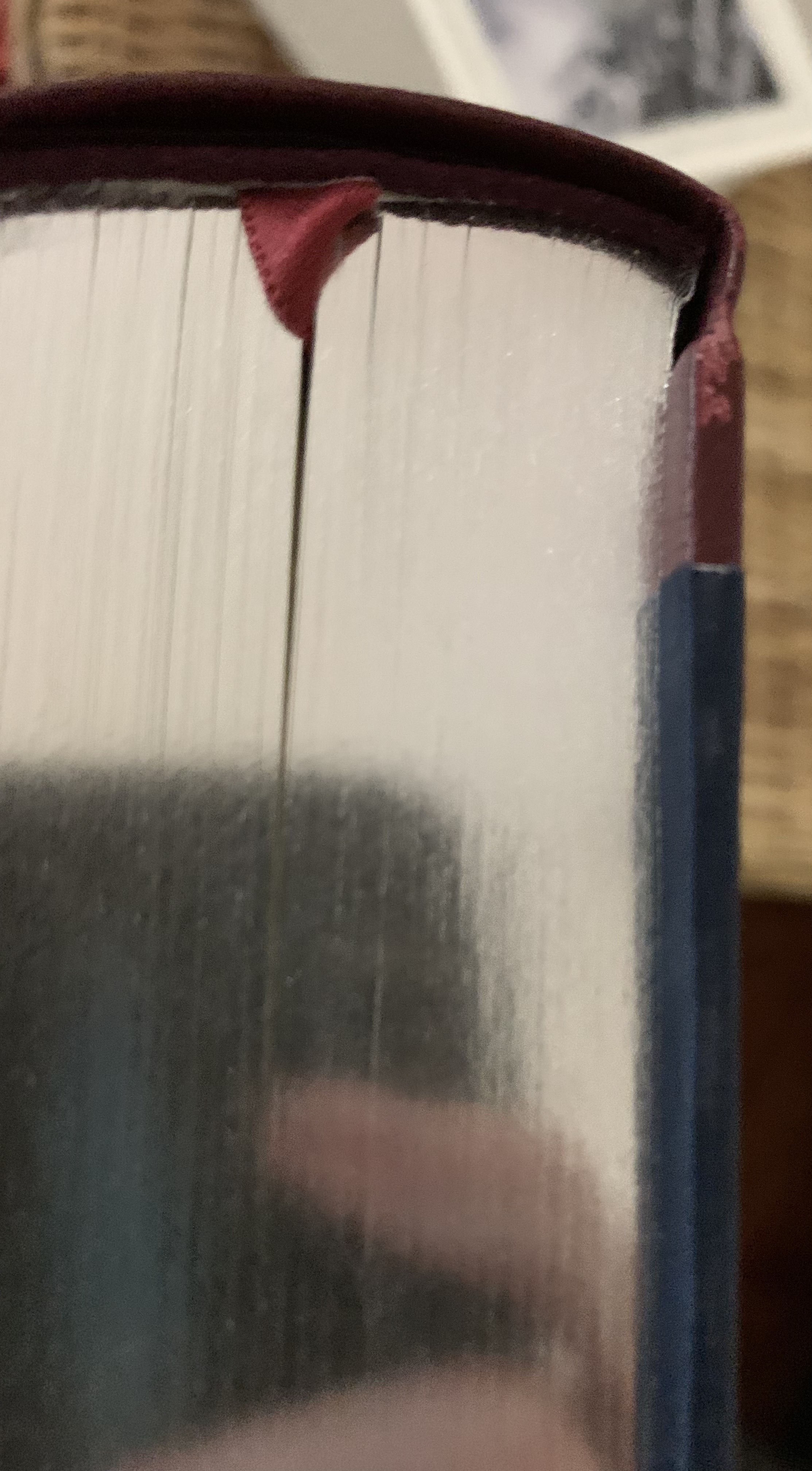
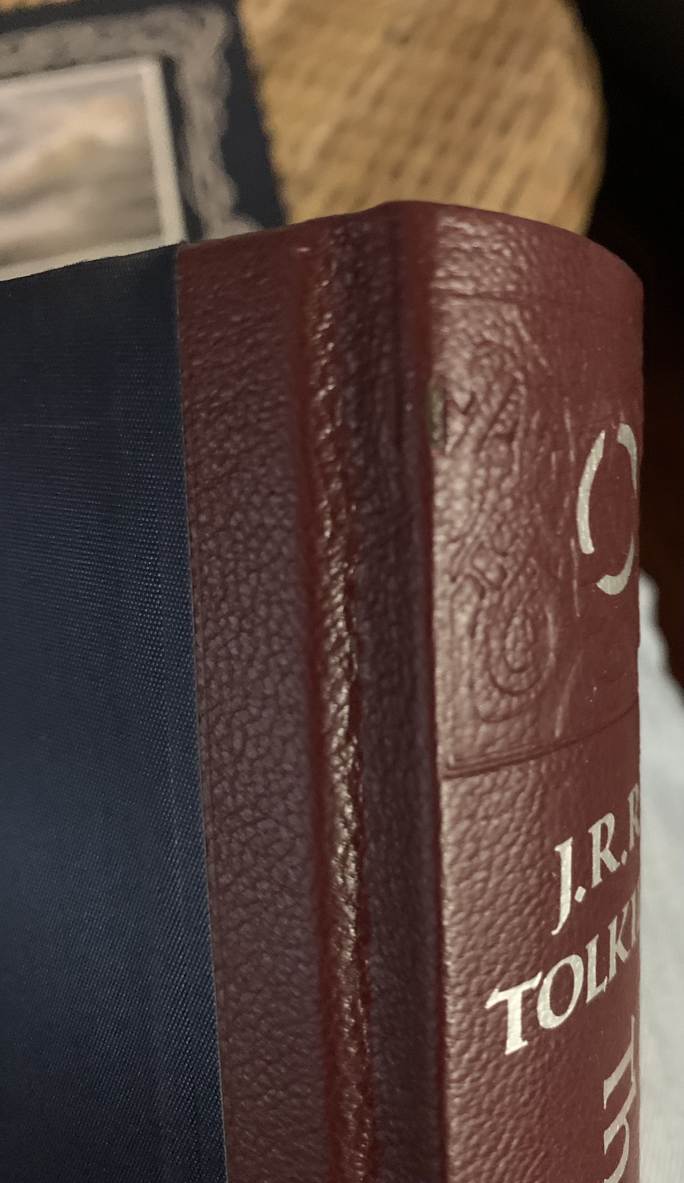
I'm struggling to see the detail of this split that various people are flagging. Are we saying the leather is physically split? Or is it just sitting oddly because the blind-stamp is (not just on the spine but also) right on (& maybe past) the shoulder? It's hard to see from the photos, but I'm assuming it's difficult to photograph.
Also, "quarter-bound" is a bookbinding reference that does not imply amount of spine coverage; it doesn't matter how little the spine covering comes on to the boards. Likewise, there is no requirement for anything more than spine + corners (or alt. fore-edge) to qualify as half-bound. It describes where the covering is, rather than how much.
Also, "quarter-bound" is a bookbinding reference that does not imply amount of spine coverage; it doesn't matter how little the spine covering comes on to the boards. Likewise, there is no requirement for anything more than spine + corners (or alt. fore-edge) to qualify as half-bound. It describes where the covering is, rather than how much.
Khamûl wrote:
I'm struggling to see the detail of this split that various people are flagging. Are we saying the leather is physically split? Or is it just sitting oddly because the blind-stamp is (not just on the spine but also) right on (& maybe past) the shoulder? It's hard to see from the photos, but I'm assuming it's difficult to photograph.
Also, "quarter-bound" is a bookbinding reference that does not imply amount of spine coverage; it doesn't matter how little the spine covering comes on to the boards. Likewise, there is no requirement for anything more than spine + corners (or alt. fore-edge) to qualify as half-bound. It describes where the covering is, rather than how much.
It is physically split, though I can't actually see it on Mr. Underhill's photos.
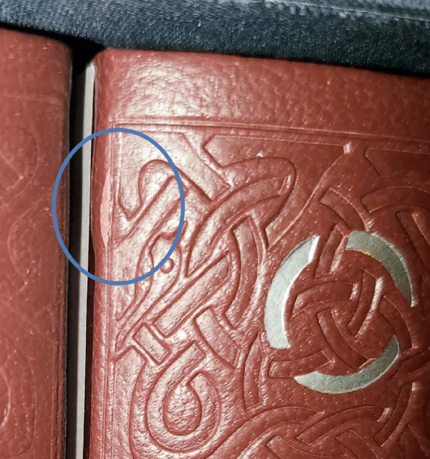
Actually, there it is on Mr. Underhill's image. Looks like they might have tried to fix it at the bindery, though might be a trick of the photo. Arbor's copy seems to have the fault in the exact same spot. I'm wondering if some tooling has caused this.






 9
9 2467
2467