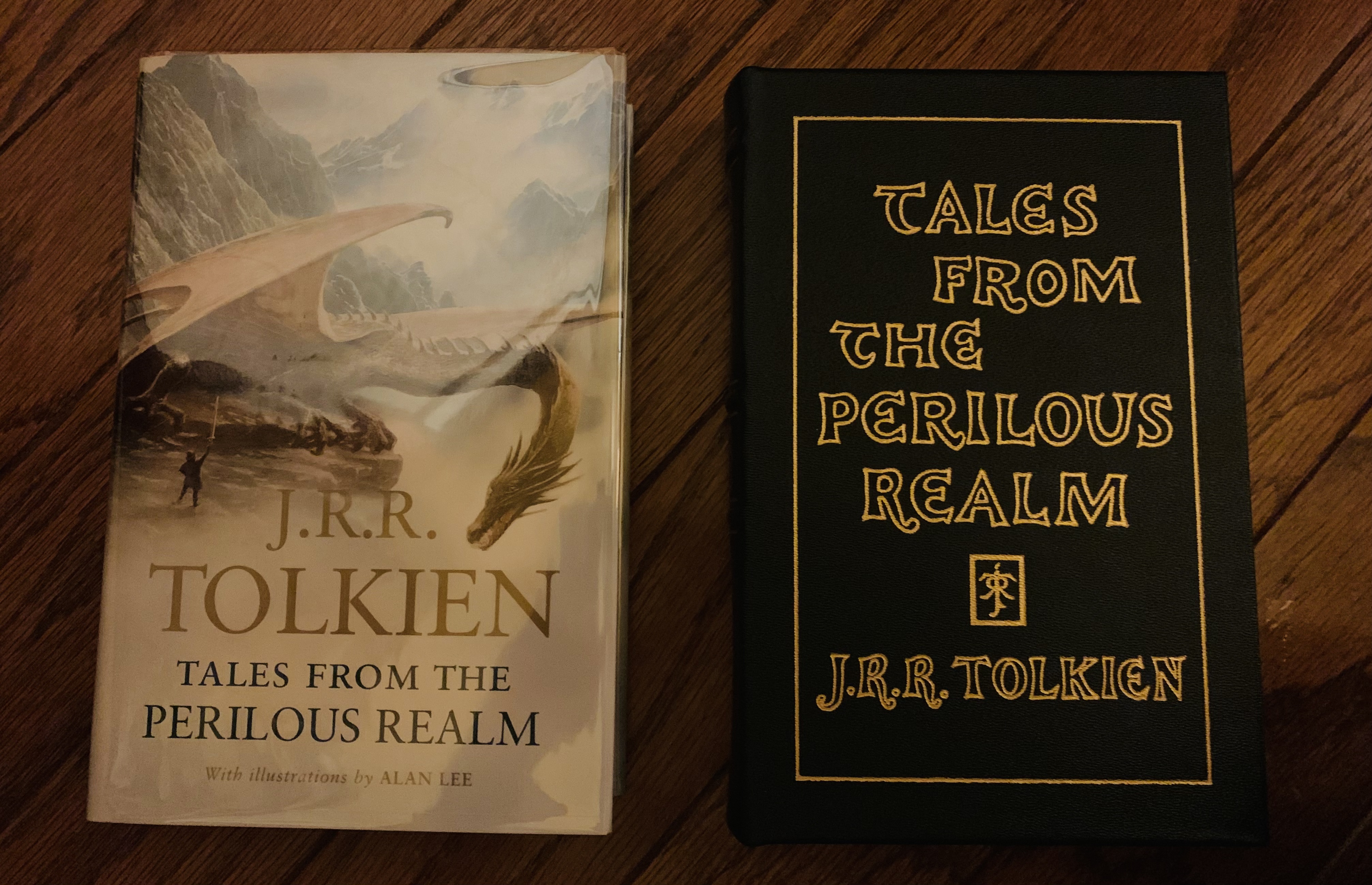
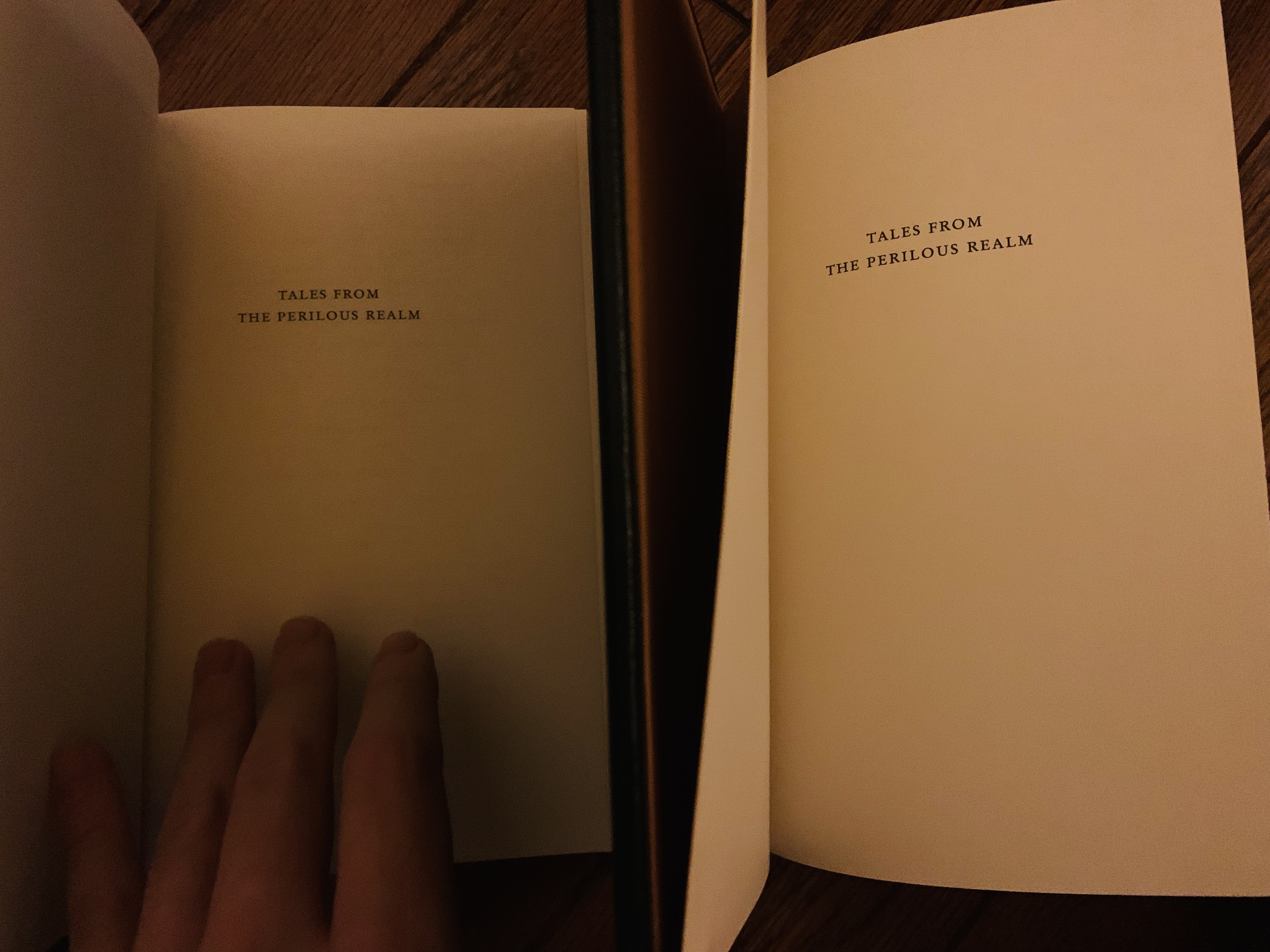
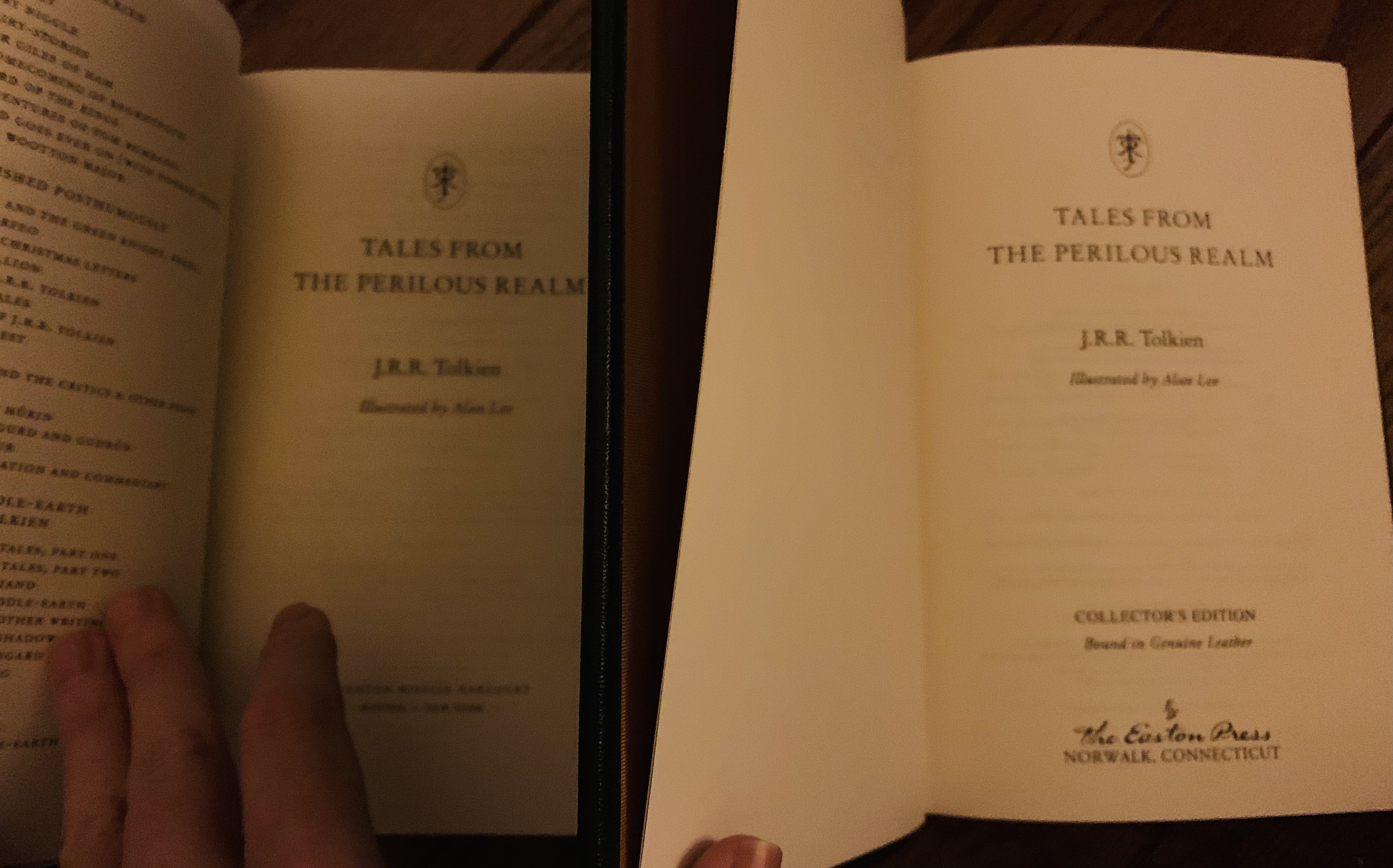
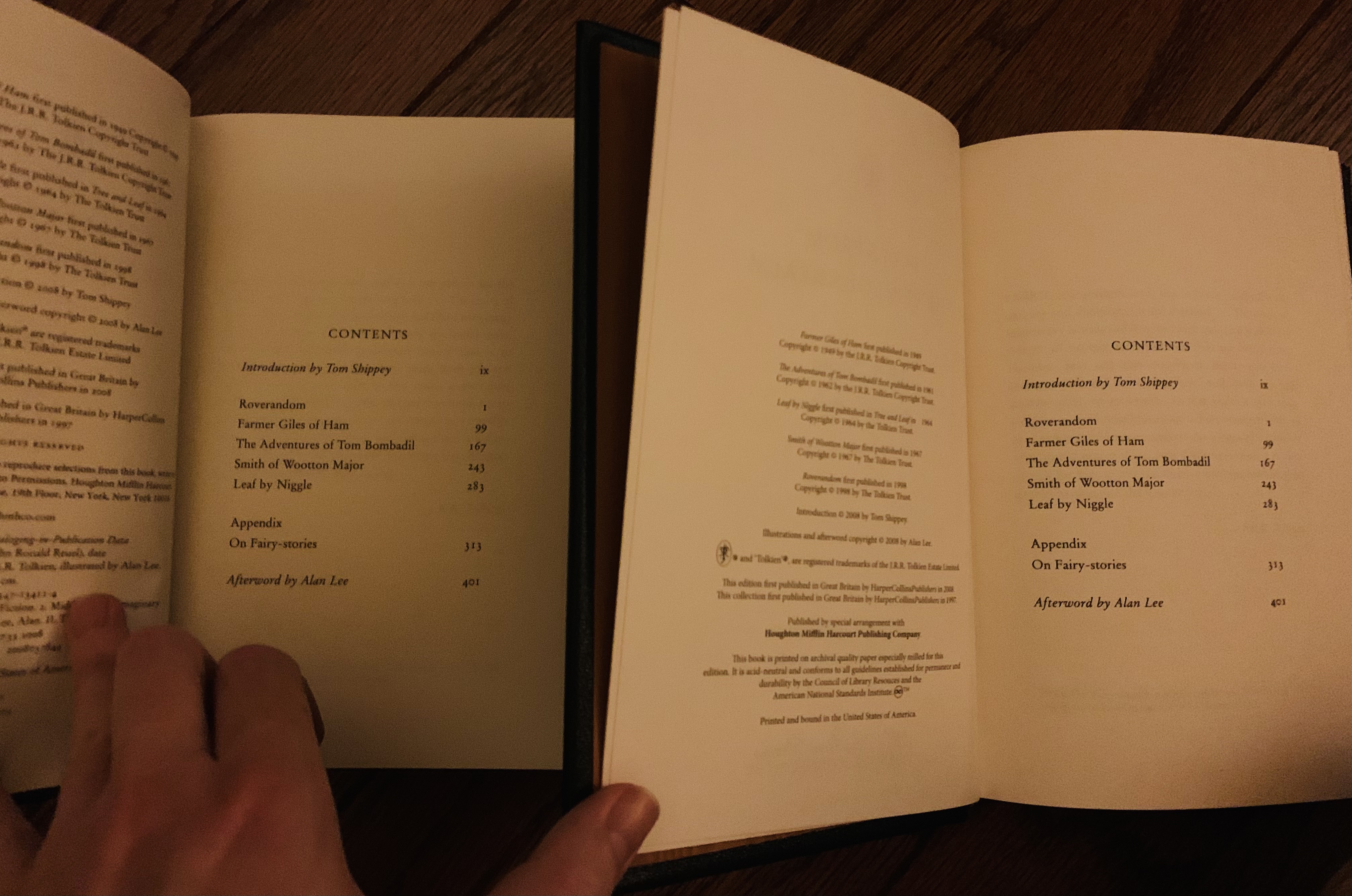
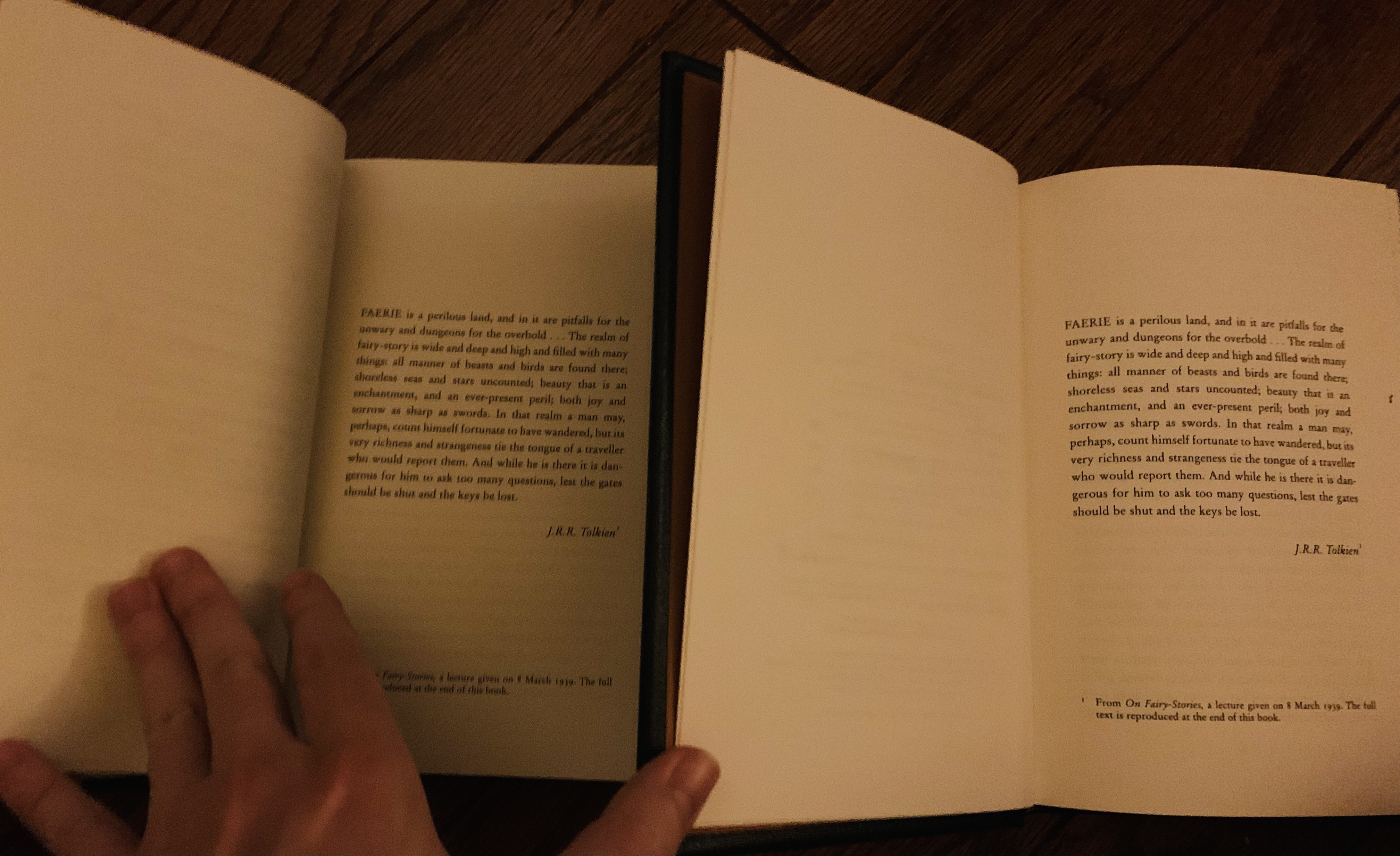
Thanks Stu and Mr. Underhill - looks like the TFPR and S&G are printed by Easton Press themselves (likely not typeset separately, I would think they used the digital files from Houghton Mifflin for printing and only changed the copyright page, but that remains to be confirmed).
My FCL (which I bought for my Letters from Father Christmas comparison matrix research, I don't have any other Easton Press editions) is definitely just the Houghton Mifflin sheets (and copyright page) with new endpapers, ribbon, and leather wrapped boards.
My FCL (which I bought for my Letters from Father Christmas comparison matrix research, I don't have any other Easton Press editions) is definitely just the Houghton Mifflin sheets (and copyright page) with new endpapers, ribbon, and leather wrapped boards.
Urulókë wrote:
Thanks Stu and Mr. Underhill - looks like the TFPR and S&G are printed by Easton Press themselves (likely not typeset separately, I would think they used the digital files from Houghton Mifflin for printing and only changed the copyright page, but that remains to be confirmed).
My FCL (which I bought for my Letters from Father Christmas comparison matrix research, I don't have any other Easton Press editions) is definitely just the Houghton Mifflin sheets (and copyright page) with new endpapers, ribbon, and leather wrapped boards.
I've got everything prior to and Including Beowulf (but nothing after). The only ones that were not Easton Press sheets (at the point I bought them - which is a good while back) were the 3 LoTR movie books, which were just pages from the trade paperback, I believe.
So that's The Hobbit, LoTR, Lost Tales 1&2, UT, S&G, CoH, FoA, Beowulf, Foster, tftPR and Fonstad - all were Easton Press sheets, at least originally.
Shot for shot remake of the HMH trade edition of TFPR. Easton Press is most certainly printing the digital files of the different HoughtonMifflin trades. With a different copyright page.
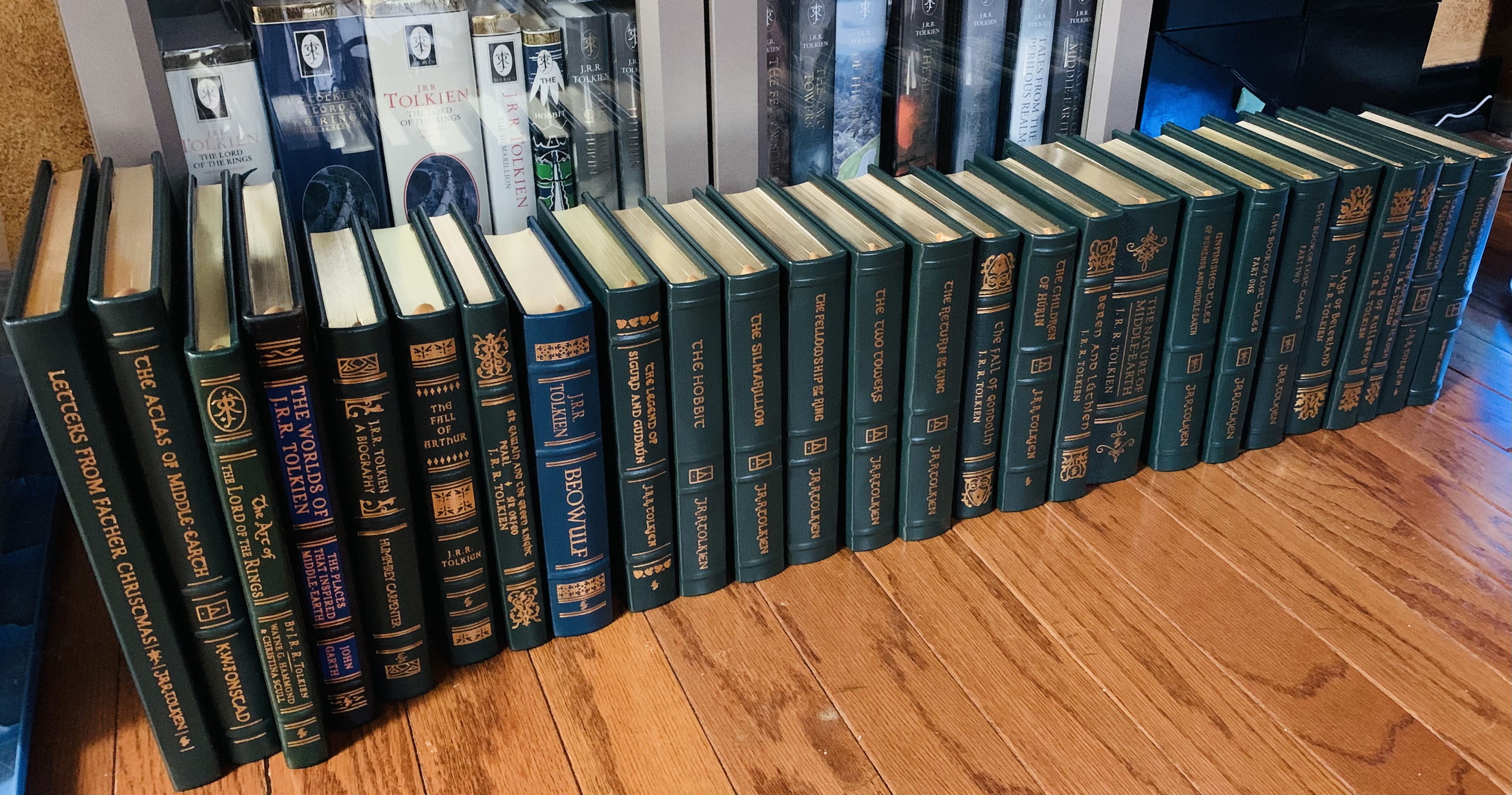
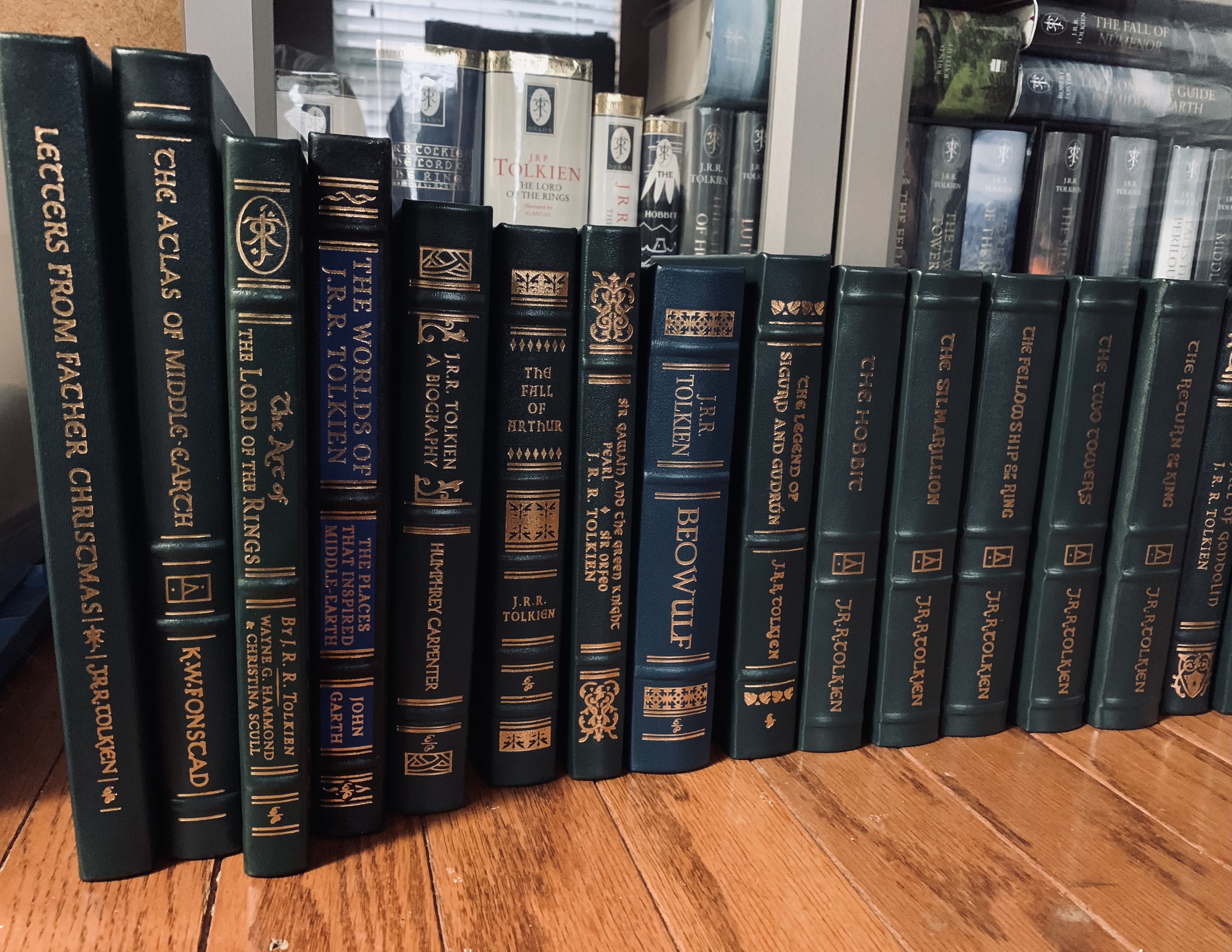
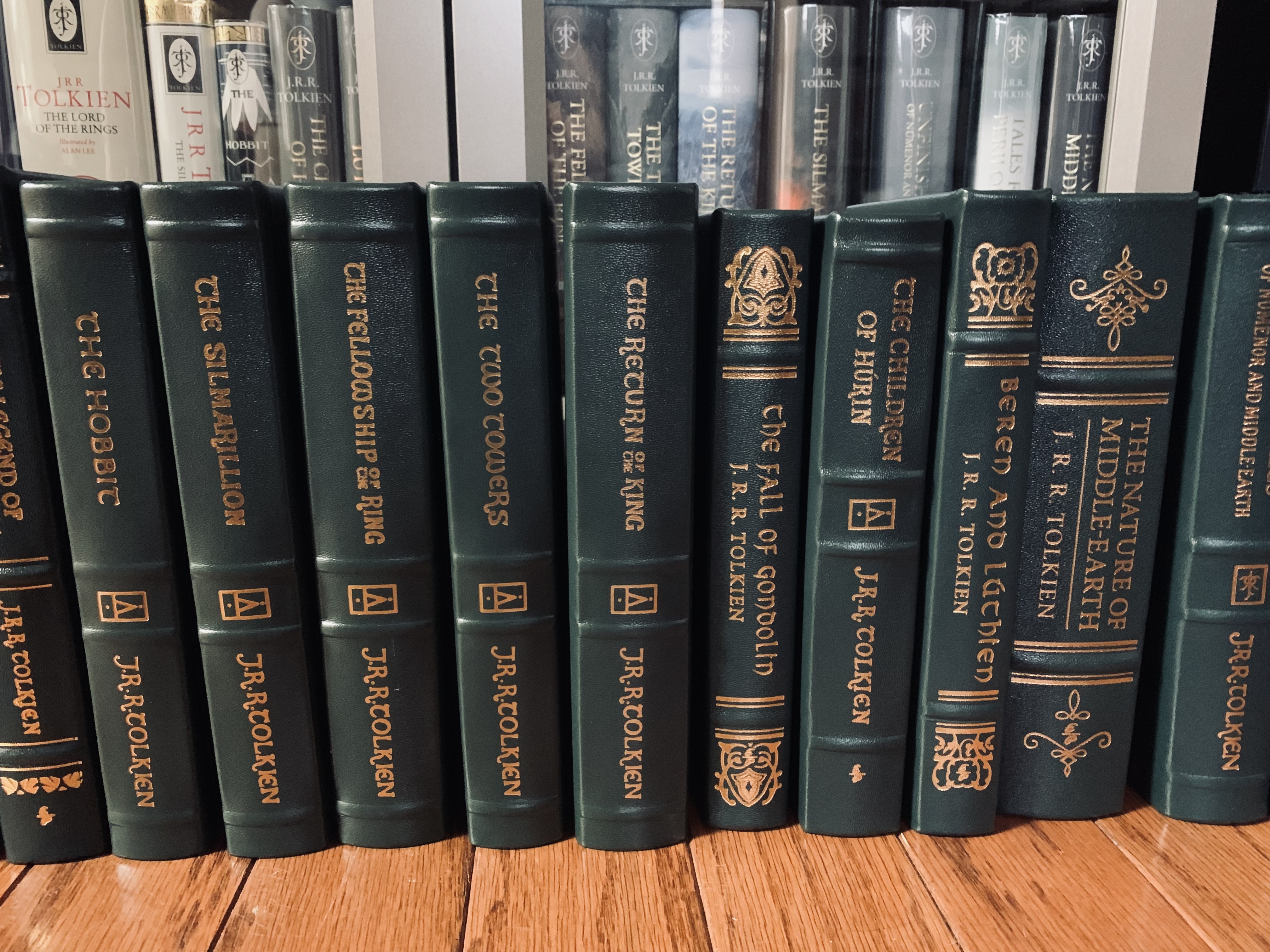
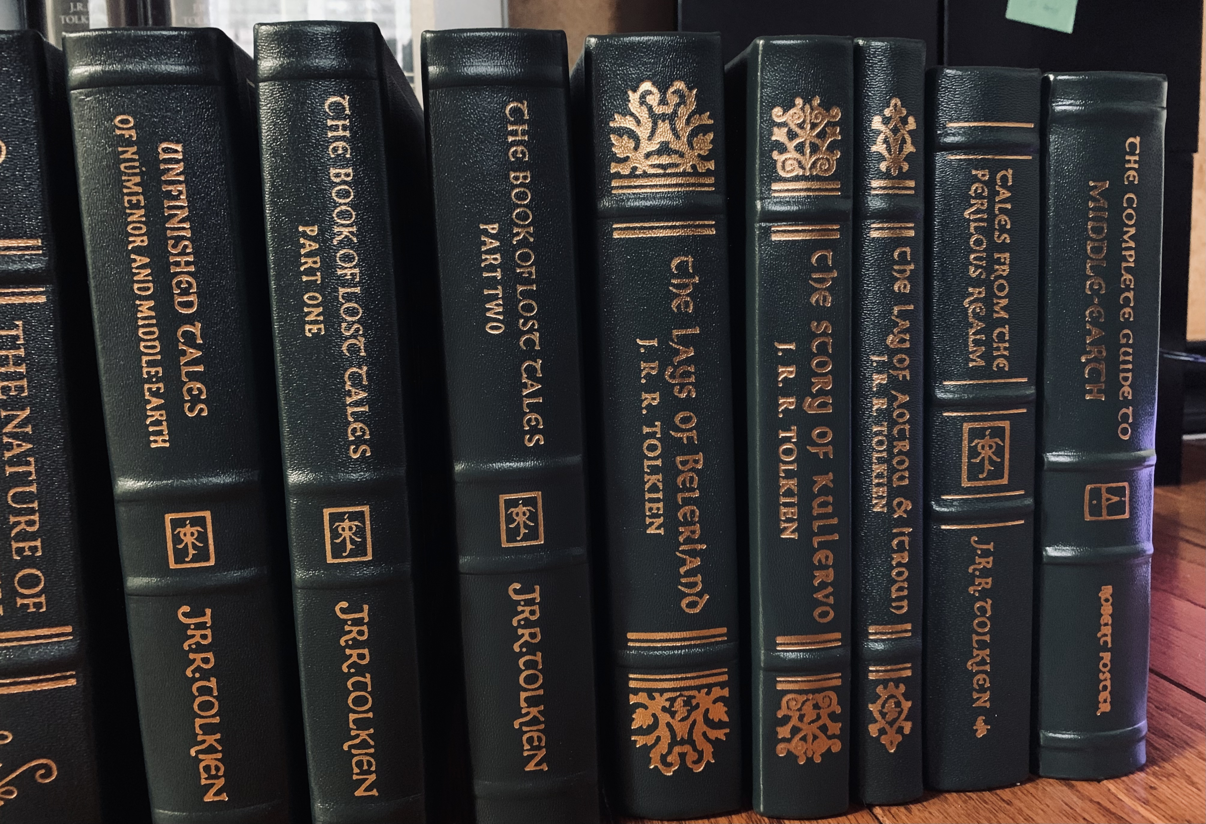
I really like their build, they seem well-made books. However, I can't get behind some of their artistic choices and fonts used in the covers and spines.
Also, why are they so mismatched? Is that supposed to be a feature? Why make books like this and not at least make them all the same height with matching fonts and styles?
Also, why are they so mismatched? Is that supposed to be a feature? Why make books like this and not at least make them all the same height with matching fonts and styles?
Morinehtar wrote:
I really like their build, they seem well-made books. However, I can't get behind some of their artistic choices and fonts used in the covers and spines.
Also, why are they so mismatched? Is that supposed to be a feature? Why make books like this and not at least make them all the same height with matching fonts and styles?
I think they just don't care. They print smallish batches that always sell out fairly quickly to their dedicated fans, even if they put absolutely zero effort into design. It is a shame, because they feel so well made compared to anything HarperCollins puts out and literally a couple of hours of well-informed design effort could make for some really attractive books.
Obligatory “I like my EP Atlas a lot”. The EP style actually kind of serves the Atlas better than most of the rest IMO. Ironic, though, that it’s one of the ones you can’t get new.
Caudimordax wrote:
Obligatory “I like my EP Atlas a lot”. The EP style actually kind of serves the Atlas better than most of the rest IMO. Ironic, though, that it’s one of the ones you can’t get new.
I agree - the Atlas works reasonably well in this format for some reason.
Recently grabbed four new Easton Press volumes.
Fonstad’s Atlas
Art of the Lord of the Rings
Nature of Middle-earth
Lay of Aotrou and Itroun
I’m up to 26 volumes now. I know they aren’t to everyone’s tastes but they do look good all lined up!
Fonstad’s Atlas
Art of the Lord of the Rings
Nature of Middle-earth
Lay of Aotrou and Itroun
I’m up to 26 volumes now. I know they aren’t to everyone’s tastes but they do look good all lined up!





 ).
).
 4307
4307 1.95M
1.95M