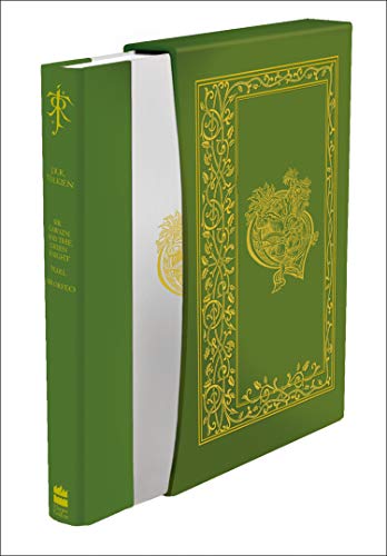
Its obviously a matt finish, pea green in colour, tastefully finished rather than a thing of spectacular beauty, smaug and Tolkien logos
The slip case feels quality to me, I like the snug fit now that I've had the book in and out a few times
The book boards are also matt, to me they felt a bit odd, not in a bad way but tactile, wasn't sure at first but after rubbing my hand on it a few times its very pleasant
seems nicely bound a nice headband top and bottom. There are 938 pages haven't read all of it but a skim through nothing jumps out.
For £74 I think its good value and I have no complaints other than the trade cover art isn't incorporated, the illustrations being historic
I have seen some printing issues with the Deluxe, if you have one of these, then inspect it carefully and send it back for a replacement if it has problems.
Hi everyone, first time posting here, I am very excited to join the community!
Trotter - do you know if the poor paper quality is an issue with the copy showcased in the video or if it is a feature to expect in all copies of this book?
Trotter - do you know if the poor paper quality is an issue with the copy showcased in the video or if it is a feature to expect in all copies of this book?
Penseur wrote:
Hi everyone, first time posting here, I am very excited to join the community!
Trotter - do you know if the poor paper quality is an issue with the copy showcased in the video or if it is a feature to expect in all copies of this book?
Welcome to the site, the paper seems to be the same paper that is used in the Trade edition, it is a very large single book and possibly paper choices were limited.
Thank you for your quick reply, this makes sense, it seems massive!
I will be looking for my copy in the mail which should arrive soon!
I will be looking for my copy in the mail which should arrive soon!
We used to have large books in the past (The Lord of the Rings A Reader's Companion; The Lord of the Rings deluxe edition 2004). These 2 books showed that a good quality and thin paper is possible. India paper might have been another solution.
Imho, I think the paper used for this deluxe edition of the History of the Hobbit is unworthy of a deluxe edition and I am really disappointed with it.
Imho, I think the paper used for this deluxe edition of the History of the Hobbit is unworthy of a deluxe edition and I am really disappointed with it.
Emilien wrote:
We used to have large books in the past (The Lord of the Rings A Reader's Companion; The Lord of the Rings deluxe edition 2004). These 2 books showed that a good quality and thin paper is possible. India paper might have been another solution.
Imho, I think the paper used for this deluxe edition of the History of the Hobbit is unworthy of a deluxe edition and I am really disappointed with it.
I don't yet have the deluxe, so I can't speak to it's paper quality. However I do have the reset 4th print trade and when I compare it to my 1st print trade from 2011, the paper, binding, board thickness, jacket quality are all better on the 1st print than the new reset 4th.
Mr. Underhill wrote:
Emilien wrote:
We used to have large books in the past (The Lord of the Rings A Reader's Companion; The Lord of the Rings deluxe edition 2004). These 2 books showed that a good quality and thin paper is possible. India paper might have been another solution.
Imho, I think the paper used for this deluxe edition of the History of the Hobbit is unworthy of a deluxe edition and I am really disappointed with it.
I don't yet have the deluxe, so I can't speak to it's paper quality. However I do have the reset 4th print trade and when I compare it to my 1st print trade from 2011, the paper, binding, board thickness, jacket quality are all better on the 1st print than the new reset 4th.
As Trotter said, the text block of the deluxe is identical to the trade's one.
Also, the weight of HotH deluxe seems lighter than my Fall of Arthur Deluxe edition. That says a lot about paper and overall quality.
Emilien wrote:
the text block of the deluxe is identical to the trade's one.
Yes, this is becoming a common feature of HC "deluxe" line.
There does come a point when collectors have to stop supporting a publisher who is not concerned with quality control. Some can say well we don't know that, but ultimately we all know it, and continuing to purchase their sub-par products only tells them that quality is not important.
I say quality control but HarperCollins are not only dismissive of quality control but also material quality itself. the paper is awful, the reproduction of art is awful, the build is often awful. HarperCollins have become known for awful quality Tolkien books.
Those of you who can, compare the most recent HarperCollins Alan Lee Rings, the expensive Folio Rings, and the artwork in high res. The difference is astonishing. If I had to mark them out of 100, 100 being the original quality, it would go:
High res: 100
Folio: 98
HarperCollins: 10
Or look at the recent Alan Lee art for The Fall of Numenor. Compare the high res files against the book. I printed one of them on standard A4 paper and my printout was ten (50?) times better than the HarperCollins hardcover. I then reduced the quality of the high res file (reducing the file size from 680MB to 10MB) simply to see how far degraded the art was in the book, printed it, and my printout matched the book version quite closely. Why would an illustrated book use a lesser quality art? To reduce production time. The DPI does not affect the cost, so it almost certainly must be time as that will affect production costs. Why ask Alan Lee to produce stunning art, only to reduce it down to a smudge compared to what he offered? The same applies for all of Alan Lee's artwork used in CoH, B&L, FoG, by the way.


 146
146 16.80K