A reply to our review over on Reddit reads "Got my copy today and the print quality is all over the place. A large number of the pages are really faded and difficult to read."
Worth checking your copies for any faded pages, especially which are hard to read.
Worth checking your copies for any faded pages, especially which are hard to read.
onthetrail wrote:
A reply to our review over on Reddit reads "Got my copy today and the print quality is all over the place. A large number of the pages are really faded and difficult to read."
Worth checking your copies for any faded pages, especially which are hard to read.
Rotolito stikes again! You can blame Hewlett-Packard that supplied them all their crappy digital printing hardware.
Yes I can't blame Rotolito here really. Harper Collins is to blame...they choose this printer and they should by now know what quality they are getting. There is a reason they can sell this slipcase hardback set quite cheap. The surface of the physical product is pretty though.

14 Sep, 2024
(edited)
2024-9-14 6:03:46 AM UTC
Edited by Emilien on 2024-9-14 6:10:29 AM UTC
Edited by Emilien on 2024-9-14 6:11:22 AM UTC
Edited by Emilien on 2024-9-14 6:11:22 AM UTC
2024-9-14 6:03:46 AM UTC
My copy also has some pages (not a lot) with some grey printed text. It's not exactly faded, it looks like it has been printed with a different colour (medium grey). They are still readable though, but of course, not the printed quality I would expect, especially for a such an eagerly awaited publication. But these are printed by Rotolito so.... What one would expect?
Not sure if I will return the box set, as I could get another which might be worse. It's a painfull job to check a new Rotolito release...
Not sure if I will return the box set, as I could get another which might be worse. It's a painfull job to check a new Rotolito release...
Emilien wrote:
My copy also has some pages (not a lot) with which some grey printed text. It's not exactly faded, it looks like it has been printed with a different colour (medium grey). They are still readable though, but of course, not the printed quality I would expect, especially for a such a eagerly awaited publication. But these are printed by Rotolito so.... What one would expect?
Not sure if I will return the box set, as I could get another which might be worse. It's a painfull job to check a new Rotolito release...
I do find it odd that HarperCollins keep using them. Must make economic sense despite all the bad feelings and returns, I guess.
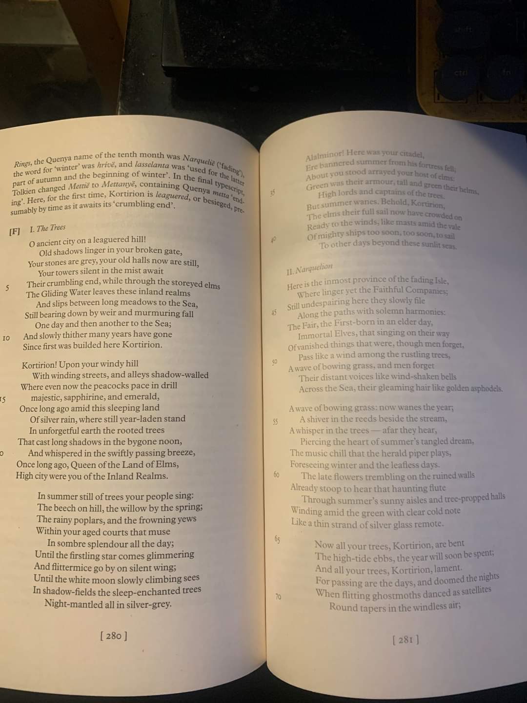
A post on Facebook has a photo of difference on one page.

I have asked the Reddit user if they will upload some images as they say some of the pages are unreadable. The above example while not great, is at least still readable but as can be seen, the text is a different shade.
My copy will arrive next week and I will check every page and report back here.

I have asked the Reddit user if they will upload some images as they say some of the pages are unreadable. The above example while not great, is at least still readable but as can be seen, the text is a different shade.
My copy will arrive next week and I will check every page and report back here.
I'm not at home ATM so can't photograph anything, but this is exactly what my books look like on some pages. Not unreadable, but grey.
onthetrail wrote:
A post on Facebook has a photo of difference on one page.
I have asked the Reddit user if they will upload some images as they say some of the pages are unreadable. The above example while not great, is at least still readable but as can be seen, the text is a different shade.
My copy will arrive next week and I will check every page and report back here.
That would absolutely not be OK in poor lighting or for anyone with visual impairment that needs normally-expected contrast levels on the text (i.e. pretty much all old people). I'd be sending that back and keep on sending them back until I got a decent, properly readable copy. I'm not bothered about the odd cosmetic fault, but the text needs to be pretty much perfect on a recent, £90 title. We aren't talking something scanned from an old source here (though even scanning issues aren't really acceptable in this day and age). It is a shame that HC continues to use Rotolito, given they have shown ad-nauseam that they can't print books with any degree of consistency.
The late Stu wrote:
onthetrail wrote:
A post on Facebook has a photo of difference on one page.
I have asked the Reddit user if they will upload some images as they say some of the pages are unreadable. The above example while not great, is at least still readable but as can be seen, the text is a different shade.
My copy will arrive next week and I will check every page and report back here.
That would absolutely not be OK in poor lighting or for anyone with visual impairment that needs normally-expected contrast levels on the text (i.e. pretty much all old people). I'd be sending that back and keep on sending them back until I got a decent, properly readable copy. I'm not bothered about the odd cosmetic fault, but the text needs to be pretty much perfect on a recent, £90 title. We aren't talking something scanned from an old source here (though even scanning issues aren't really acceptable in this day and age). It is a shame that HC continues to use Rotolito, given they have shown ad-nauseam that they can't print books with any degree of consistency.
I won't be able to read that over a full page. People don't see it on screen but I have poor eyesight so I'll be hoping my copy does not have those flaws or else I will need to return it.
I spoke with a friend today who said their copy is fine, so this is not across all copies it seems.


 9
9 2479
2479