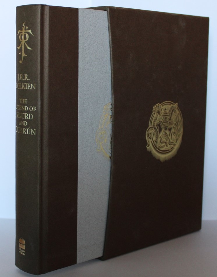
Thank you Urulókë, that sounds pretty :) Map looks amazing.
I'm just feeling bad for the book that stands only on the half of its thickness..
I'm just feeling bad for the book that stands only on the half of its thickness..
Didn't realize the slip case illustration was the two blue wizards. Pretty cool! Not entirely convinced to buy in yet, but it is nice to look at.
That segmentation in the curve of the slipcase is a bit odd, right? Did the illustrated LotR have the same?
Caudimordax wrote:
That segmentation in the curve of the slipcase is a bit odd, right? Did the illustrated LotR have the same?
All of the HarperCollins deluxe editions that have the "curve" are segments of straight lines (that's the only way to get the covering material to lay flat on the "curve". The LOTR deluxe has six segments rather than the UT four, so it is less noticeable, for example. A quick spot check (I did't do by any stretch) shows CoH, Hobbit and LOTR have six, then the others I checked all had four.
I wasn't so excited by this publication (I'm less and less interested in illustrated books without new materials) and unfortunately, even with the photos, I can't find an interest except for the map... so I just deleted my order, a map isn't worth this price :D
Urulókë wrote:
All of the HarperCollins deluxe editions that have the "curve" are segments of straight lines (that's the only way to get the covering material to lay flat on the "curve". The LOTR deluxe has six segments rather than the UT four, so it is less noticeable, for example. A quick spot check (I did't do by any stretch) shows CoH, Hobbit and LOTR have six, then the others I checked all had four.
I think in my B&L deluxe edition, the green paper was not segmented on the inside edge of the hardboard. Instead it was one continuous curve. I don’t have my book with me right now to confirm, but I seem to recall it was green, which is why B&L comes to mind. This is the segmentation you two are talking about right? ?
eorl wrote:
Urulókë wrote:
All of the HarperCollins deluxe editions that have the "curve" are segments of straight lines (that's the only way to get the covering material to lay flat on the "curve". The LOTR deluxe has six segments rather than the UT four, so it is less noticeable, for example. A quick spot check (I did't do by any stretch) shows CoH, Hobbit and LOTR have six, then the others I checked all had four.
I think in my B&L deluxe edition, the green paper was not segmented on the inside edge of the hardboard. Instead it was one continuous curve. I don’t have my book with me right now to confirm, but I seem to recall it was green, which is why B&L comes to mind. This is the segmentation you two are talking about right? ?
Confirming that FoG, B&L, and CoH all have smooth curves. But of course, it's been established ad nauseam that this book stands apart from the deluxe slipcase series, so it's possibly not a valid comparison.


 33
33 9015
9015