I've only had notice of shipping for the deluxe, even though I've ordered both; & both from the same place --Book Depository. Looks like I won't get either of them until next week, unless the deluxe turns up tomorrow morning.
BH
BH
My HarperCollins standard edition arrived today from Amazon. It includes the facsimile page.
- wellinghall
- wellinghall
Finally found a shop with a copy today. I can confirm that the Australians are just getting the same UK edition (no asia-pac printed version this time). Paper quality seemed quite poor, to be honest.
Seems like a very low key release compared to even S&G, which makes sense given the material and S&G didn't exactly whizz out of the stores here.
Seems like a very low key release compared to even S&G, which makes sense given the material and S&G didn't exactly whizz out of the stores here.
I finally picked up the AU S&G, so here is a picture comparison of the UK and AU Editions. Of note is that the AU edition is a couple of mm taller, and this is reflected by the top of the jacket not being cut as much as the UK edition. The other differences are fairly obvious.
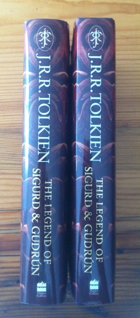
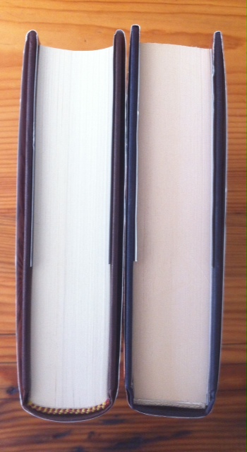
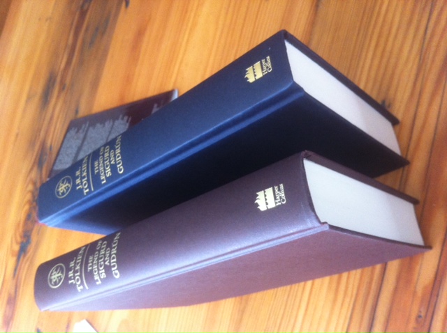
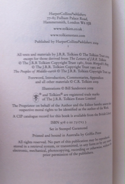
Thanks, wellinghall, for checking that your standard edition also included the manuscript facsimile. (I'll then skip the deluxe, since I don't have any of the other HC deluxe editions, and I've purchased some other a-bit-more-expensive-than-normal Tolkien publications this month.)
OK, Sorry to continue to bore people with the differences between Australian and UK editions, but my copy of the trade FoA arrived today, and I could swear that the paper quality is much better than the one I looked at in the bookstore here. So I am now going to have to swing by the store again to examine the paper to see of their is in fact a distinct export edition printed on lower quality paper (like the 1st of the Pocket Hobbit that we got out here before the UK, which was printed on recycled toilet paper).
Yes, I have too much time on my hands...
Yes, I have too much time on my hands...
Khamûl wrote:
You certainly do...
BH
Unfortunately, I resigned from my job in Australia to move to NZ and then had to defer the move by three months (because of my wife's work), so I now have a nice easy life of riding my bike (50-70ks a day), writing modern-technology ports of old 1980s video games (just to keep my hand in with software development) and trying to find "useful" activities to fill in the remaining hours of the day so I can justify not tidying the house or doing any actually useful activities. I even watched ALL the Inspector Morse episodes over the last couple of months. And they are about seventeen hours long each episode...
Stu,
Well done on how your are finding 'useful' activities.
By the way informing us on Tolkien books is very, very useful


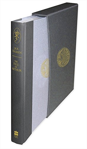
Has anyone else yet got the Deluxe Fall of Arthur, it is a noticeably thin book in comparison with the other Deluxe titles, and my copy seems to struggle with coming out of the slipcase.
It does include the facsimile page, please see Findegil's article on this.
http://wayneandchristina.wordpress.com/2013/05/29/tolkien-notes-7/
and thanks for the reference to this site


Well done on how your are finding 'useful' activities.
By the way informing us on Tolkien books is very, very useful


Has anyone else yet got the Deluxe Fall of Arthur, it is a noticeably thin book in comparison with the other Deluxe titles, and my copy seems to struggle with coming out of the slipcase.
It does include the facsimile page, please see Findegil's article on this.
http://wayneandchristina.wordpress.com/2013/05/29/tolkien-notes-7/
and thanks for the reference to this site


On the subject of the layout (I'm going interior this time) of The Fall of Arthur, I have an issue with the Appendix (just got my copy of the UK standard edition today):
In the HoMe volumes, J.R.R. Tolkien's texts are always rendered in a larger font, in order to easily distinguish it from editorial comments. However, in the Appendix of FoA, I can't notice any such distinction -- J.R.R. Tolkien's lecture is printed with the same font size as Christopher's comments. Is it only I who find this a bit confusing?
In the HoMe volumes, J.R.R. Tolkien's texts are always rendered in a larger font, in order to easily distinguish it from editorial comments. However, in the Appendix of FoA, I can't notice any such distinction -- J.R.R. Tolkien's lecture is printed with the same font size as Christopher's comments. Is it only I who find this a bit confusing?





 103
103 26.83K