Mark Terry will be recreating both the first and second facsimile Hobbit dust jackets to correct the problem with the runes that have been discovered.
It does appear to affect every copy that he has sold to date.
If you have a facsimile dust jacket and want to check them it is easy to do so, by looking at the lower right hand corner at the images below.
It does appear to affect every copy that he has sold to date.
If you have a facsimile dust jacket and want to check them it is easy to do so, by looking at the lower right hand corner at the images below.
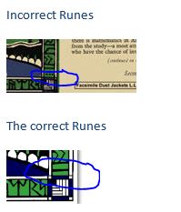
Probably worth mentioning as well that Mark is not the only supplier of jackets that are incorrect, as it seems that there may have been some re-scanning of the bad facsimiles in order to create new ones. If you are in the market for a jacket from *any supplier of jackets* you need to check the runes in the bottom right and/or directly above and below the spine. These will be completely different from that of a legit UK jacket.
There are several other faults on the jackets (such as the sizing of spine text, the cutoff point of the main image, noticeable on the clouds at the top right of the front, the cutoff point of the picture at the bottom), but these are the dead obvious* ones.
(* So dead obvious that I initially tried to copy them when creating my jacket! Thanks to Trotter for setting me straight as to what was right/wrong when I brought the differences to his attention).

10 Jul, 2014
(edited)
2014-7-10 3:19:07 AM UTC
Edited by Stu on 2014-7-10 3:40:55 AM UTC
Edited by Stu on 2014-7-10 3:56:54 AM UTC
Edited by Stu on 2014-7-12 1:38:07 AM UTC
Edited by Stu on 2014-7-10 3:56:54 AM UTC
Edited by Stu on 2014-7-12 1:38:07 AM UTC
2014-7-10 3:19:07 AM UTC
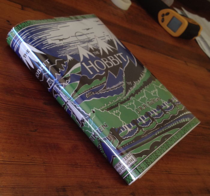
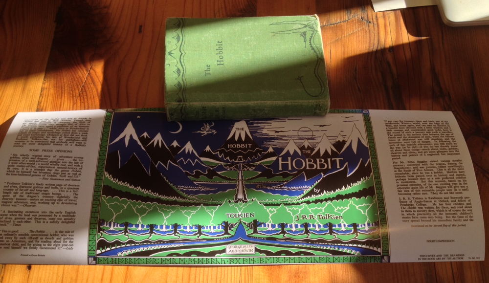
Well, 25+ hours of photoshopping and I ended up with something I was happy enough with. Anyone contemplating of converting a 4th Ed Jacket into a 1st, my advice would be -- don't!! Start with a 3rd Edition as there are an order of magnitude less changes required.
The local print place ran it off for me on semi-gloss paper on their wide printer for $15 and I'm very pleased with the result. $65 all in for a 1st/4th in a correct impression facsimile Dust jacket feels like decent enough value. If I was going to print it again, I'd probably enlarge it by 1.5mm vertically to lose the white bands top and bottom, which seem to be cut off on the original (as presumably the original jacket printing was a tiny bit too big for the book). I'd also adjust the blue a bit further and change to CYMK to get a bit more colour accuracy from the print place.
If anyone wants the 300dpi file for the jacket, it is a about 7Mb, so just drop me a PM with your email address.
Thanks to Trotter for his assistance with this little project.
(Note the pictures don't show the final version -- I did another 10 hours or so of editing after I printed it....)

11 Jul, 2014
(edited)
2014-7-11 5:19:45 PM UTC
Edited by Trotter on 2014-7-11 5:30:36 PM UTC
Edited by Trotter on 2014-7-11 5:31:44 PM UTC
Edited by Trotter on 2014-7-11 5:38:37 PM UTC
Edited by Trotter on 2014-7-11 5:31:44 PM UTC
Edited by Trotter on 2014-7-11 5:38:37 PM UTC
2014-7-11 5:19:45 PM UTC
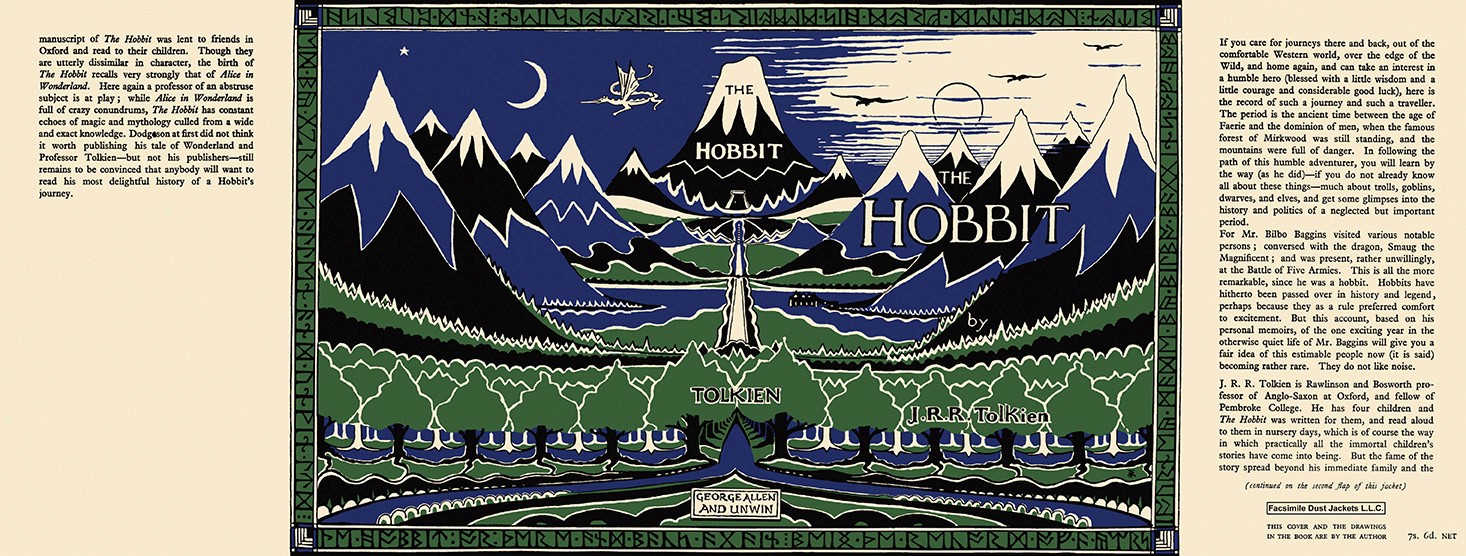
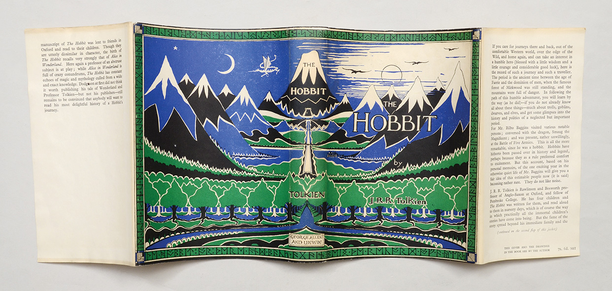
Mark Terry from Facsimile Dust Jackets L.L.C. (http://www.facsimiledustjackets.com/cgi-bin/fdj455/index.html) has updated his 1937 UK Hobbit facsimile dust jackets, but not the pictures on the website yet.
This is the new version, scanned from an original dust jacket, also shown below, for sale at a ridiculously stupid price from Peter Harrington (£100000).
http://www.peterharrington.co.uk/rare ... r-there-and-back-again-7/
The colour reproduction is not exactly the same, but I actually prefer the darker blue and green, as these are closer to Tolkien's original drawing for the dust jacket.

12 Jul, 2014
(edited)
2014-7-12 1:57:34 AM UTC
Edited by Stu on 2014-7-12 10:40:41 AM UTC
Edited by Stu on 2014-7-13 7:49:36 AM UTC
Edited by Stu on 2014-7-13 10:21:06 AM UTC
Edited by Stu on 2014-7-13 10:23:14 AM UTC
Edited by Stu on 2014-7-13 11:56:18 AM UTC
Edited by Stu on 2014-7-18 1:35:14 PM UTC
Edited by Stu on 2014-7-19 1:01:15 AM UTC
Edited by Stu on 2016-3-17 4:53:21 AM UTC
Edited by Stu on 2016-3-17 5:00:22 AM UTC
Edited by Stu on 2016-3-24 1:21:05 AM UTC
Edited by Stu on 2016-3-24 1:23:33 AM UTC
2014-7-12 1:57:34 AM UTC
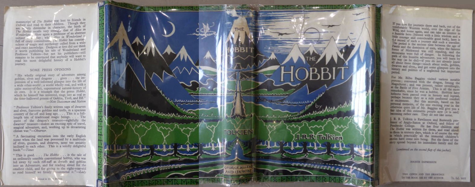
Here are the 4th Impression versions in low res. My final (which has been refined a lot since I printed my copy -- I might reprint on the correct type of paper stock at some point when I am in a decent sized city or I visit a first world country) and Trotter's genuine copy.
If you compare the originals between the 1st impression and the 4th, a LOT of differences (and I'm not just talking about the text on the flaps). I think most of the differences come out of the alignment of the plates when printing the three colours (with the white obviously being the paper showing through). The white layer between the feet of the front row of trees shows clearly the kinds of difference between the impressions, in case anyone is interested. I didn't get that layer quite thick enough on my version, but my journey into the heart of darkness is complete, so it will have to do!
[Edit 17/03/16. As an endless tinkerer, I reset the front flap yet again, adjusting the interline spacing, changing the uppercase "W" characters, fixing a missing "-", swapping an inverted comma to the correct type and increasing the boldness a tad]
[Edit 24/03/16. Image Removed to prevent illicit printing -- will replace with even lower-res version when I have time]
If you compare the originals between the 1st impression and the 4th, a LOT of differences (and I'm not just talking about the text on the flaps). I think most of the differences come out of the alignment of the plates when printing the three colours (with the white obviously being the paper showing through). The white layer between the feet of the front row of trees shows clearly the kinds of difference between the impressions, in case anyone is interested.
[Edit 17/03/16. As an endless tinkerer, I reset the front flap yet again, adjusting the interline spacing, changing the uppercase "W" characters, fixing a missing "-", swapping an inverted comma to the correct type and increasing the boldness a tad]
[Edit 24/03/16. Image Removed to prevent illicit printing -- will replace with even lower-res version when I have time]
The changes may be a result of the size of the dust jacket changing between the 1/1st, 1/2nd and later printings, but also the printer changed.
A company called FGS printed the first two impressions and then J. Howell for the later printings.
In Deagol's article, I cannot see anymore about FGS or what the initials mean?
Does anyone know?
http://www.tolkienbooks.net/php/earlyhobbits.php
A company called FGS printed the first two impressions and then J. Howell for the later printings.
In Deagol's article, I cannot see anymore about FGS or what the initials mean?
Does anyone know?
http://www.tolkienbooks.net/php/earlyhobbits.php
You may notice what looks like a mistake on Stu's facsimile dust jacket.
The word 'elves', on the front-flap of the dust wrapper, has two commas after it, instead of one.
This does appear on the 1946 dust jacket, it is not present on the 1942 or 1951 dust jackets, and indicates that the text for the 1946 dust jacket was probably reset, and this error occurred as part of the reset.
It was spotted and corrected for the second edition in 1951.
This is so far the only difference that I am aware of between the 1942 and 1946 Hobbits, the two differences mentioned in the Descriptive Bibliography (page 16), actually occur between the second and third impressions.
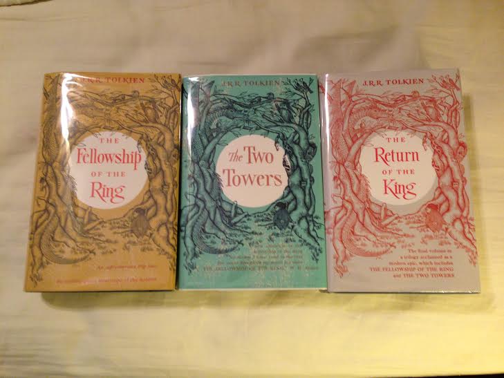
I used Mark Terry at Facsimile Dust Jackets L.L.C. for my US set of LOTR dust jackets and I could not be happier. I would recommend him.
Does anyone know where to buy nice cheap slipcases?
Does anyone know where to buy nice cheap slipcases?
You might try Tolkien Bookshelf. I have one. Good quality.

9 Dec, 2015
(edited)
2015-12-9 10:08:34 PM UTC
Edited by Stu on 2015-12-10 7:43:01 AM UTC
Edited by Stu on 2015-12-10 7:44:09 AM UTC
Edited by Stu on 2015-12-12 6:22:48 AM UTC
Edited by Stu on 2015-12-12 6:29:53 AM UTC
Edited by Stu on 2015-12-12 8:49:59 AM UTC
Edited by Stu on 2015-12-12 8:58:17 AM UTC
Edited by Stu on 2015-12-13 4:46:01 AM UTC
Edited by Stu on 2015-12-13 4:47:46 AM UTC
Edited by Stu on 2015-12-13 5:25:11 AM UTC
Edited by Stu on 2015-12-13 5:25:41 AM UTC
Edited by Stu on 2015-12-13 5:29:32 AM UTC
Edited by Stu on 2015-12-13 5:32:37 AM UTC
Edited by Stu on 2015-12-13 11:55:19 PM UTC
Edited by Stu on 2015-12-14 12:01:07 AM UTC
Edited by Stu on 2015-12-14 5:25:43 AM UTC
Edited by Stu on 2015-12-14 5:27:23 AM UTC
Edited by Stu on 2016-3-17 5:05:23 AM UTC
Edited by Stu on 2016-3-17 5:06:06 AM UTC
Edited by Stu on 2016-3-24 1:21:38 AM UTC
Edited by Stu on 2016-3-24 1:24:09 AM UTC
2015-12-9 10:08:34 PM UTC
Just in case anyone is interested in the contents of the 5th impression or 6th impression jackets, I knocked up reproductions (initially to waste time waiting for an MRI scan that I was very early for, followed by an evening wasted to finish 'em up). Low res-versions below (open in another tab to see at more readable size).
Note that the jacket text has been typeset in MS-Word from photographs (mostly), rather than being scanned. Useful to see the progressive changes in text from the 4th onward (in the 5th, Tolkien's job changes and mention of Dodgson is dropped), and then on the 6th, the LOTR preview information is added, and all the prior front-flap information is ditched.
The main font is Times New Roman, upper case "W" is Bodoni 72 Book, lower case italic "w" is Bell MT, upper Case "M" is Iowan Old Style. The characters '8', '9' and '6' are Athelas.
edit: Fixed error pointed out by Trotter
edit: 1st - 10th (except 3rd, which is essentially just like 4th)
[Edit 24/03/16. Images Removed to prevent illicit printing -- will replace with even lower-res versions when I have time]





 103
103 26.78K