Tolkien Collector's Guide
Sign In
Tolkien Collector's Guide
Important links:

Guide to Tolkien's Letters
-
Winner of the 2019 Tolkien Society award for Best Website

By Stu
Home away from home

1987 Unwin Hyman LOTR Boxed Set

14 Oct, 2015
2015-10-14 6:24:51 AM UTC

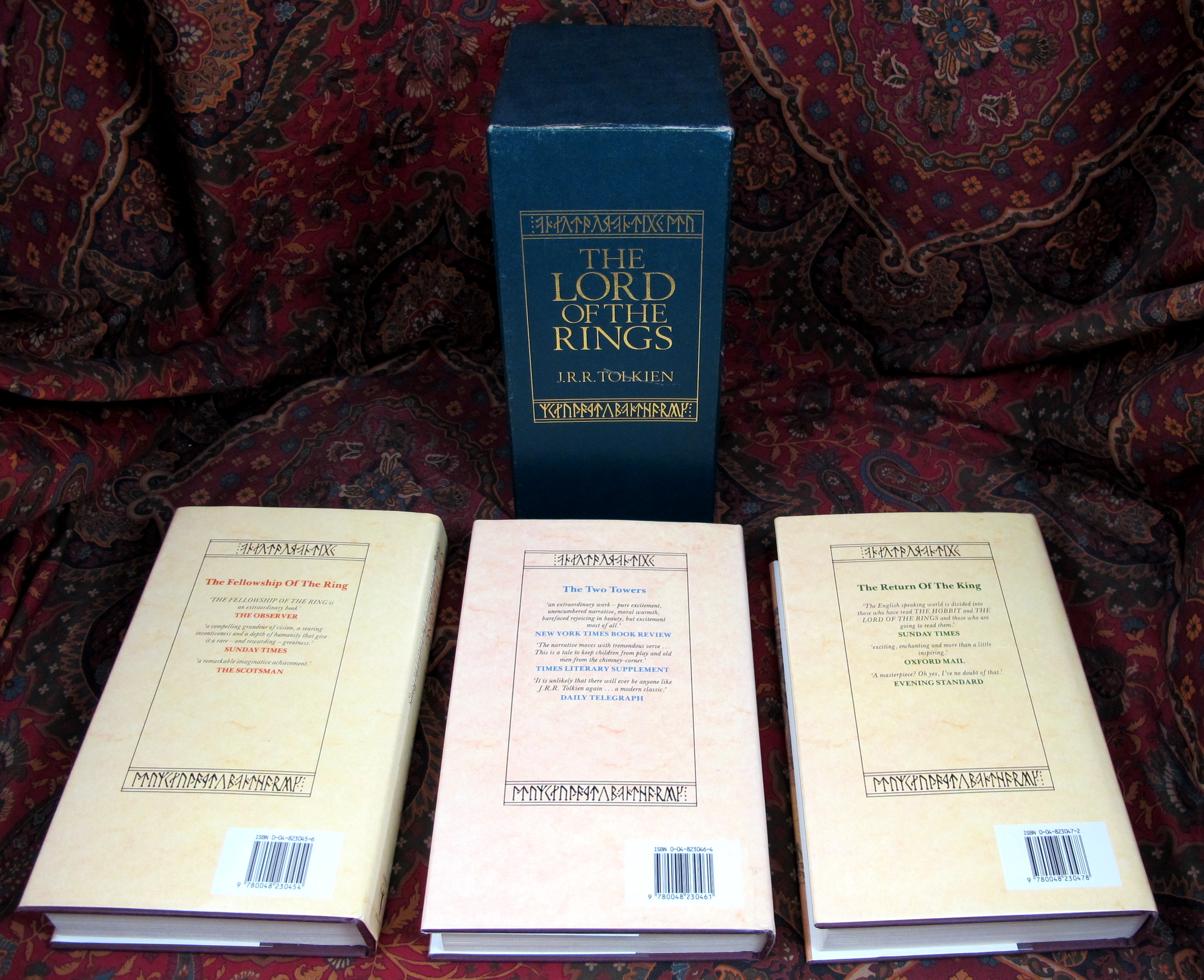
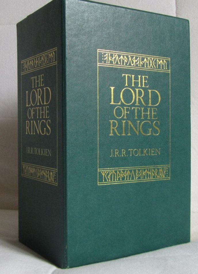
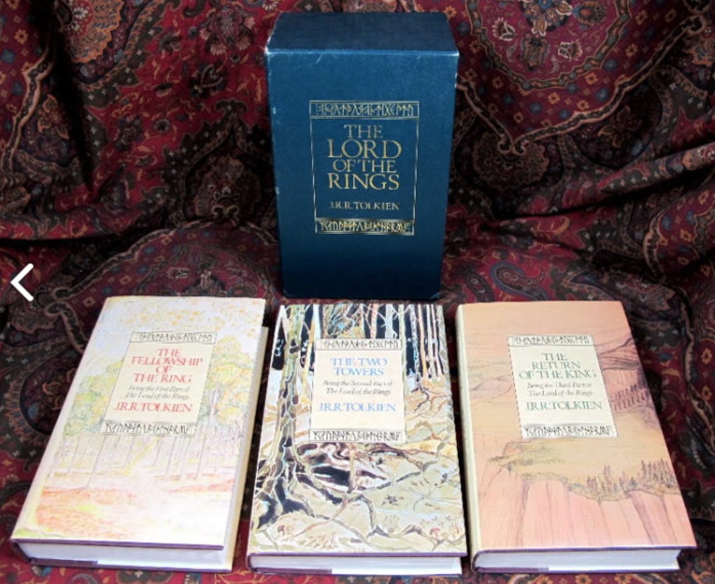
Is there something wrong with the colour on the "blue" photo, or did the 1987 UH LOTR Set come with two different slipcase variants? I've only previously seen the green one.

(No mention of there being two versions on tolkienbooks.net)

228_561df50deb278.jpg 689X955 px

228_561df51a02496.jpg 1395X1139 px
14 Oct, 2015
2015-10-14 7:00:43 AM UTC
It could be the photo (or fading??), as the dust jackets look very washed out.

- wellinghall
14 Oct, 2015 (edited)
2015-10-14 7:19:47 AM UTC

wellinghall wrote:
It could be the photo (or fading??), as the dust jackets look very washed out.

- wellinghall

That was my first thought, but there are three photos showing the box, and the green lettering on the ROTK spine still looks green, albeit the spines themselves, especially the TT are faded (it could just be the pictures exaggerating the colour difference excessively). I'm really tending to think the box is/was indeed blue.

http://www.tolkienlibrary.com/tolkien-book-store/000900.htm
14 Oct, 2015
2015-10-14 8:24:38 PM UTC
It has been 3 or 4 years since I sold this set, and I'm afraid I do not remember if it was blue or green. I have a couple of other photos, where the slipcase does appear even more blue than the photo you were looking at. I've not noticed any problems with the colors in the past, being totally different at least, but I'm afraid I cannot offer a definite answer for you. I will attach the extra photo, so you can compare.
609_561eb9ebd5bf2.jpg 3091X2516 px
14 Oct, 2015 (edited)
2015-10-14 9:48:17 PM UTC
Thanks for posting up the clearer picture. I think that shows it is indeed conclusively blue. The fact that the text on the back of ROTK remains green rules out it being an issue with the photography, I think.

Another mystery!

As an aside, the difference in DJ colour between the TT and the other two books shows a distinct lack of effort on behalf of the printers. The 14/14/16 impressions match perfectly. Something obviously went wrong when they switched to the little man in a circle on the spine.
Jump to Last
All original content ©2024 by the submitting authors. Terms of Use | Privacy Policy | Cookie Policy | Contact Us