Trotter wrote:
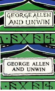
The fifth Impression should have a hand written George Allen & Unwin as on my avatar.
Thanks for that - I'll change it back! I didn't have a spine picture of the 5th, and for some reason I thought that was the first impression that switched over to the later version.
Lets have some theories, why was Tolkien's Dust-Jacket changed in the 1954 printing of the The Hobbit, UK George Allen & Unwin, to have a type-written George Allen and Unwin on the spine?
I am a huge fan of Tolkien's hand-written version on the first five UK hardback impressions :) but does anyone know why it was changed?
If not then am very open to why you think they changed it and do you think the typed version is an improvement?
I am a huge fan of Tolkien's hand-written version on the first five UK hardback impressions :) but does anyone know why it was changed?
If not then am very open to why you think they changed it and do you think the typed version is an improvement?
Trotter wrote:
Lets have some theories, why was Tolkien's Dust-Jacket changed in the 1954 printing of the The Hobbit, UK George Allen & Unwin, to have a type-written George Allen and Unwin on the spine?
I am a huge fan of Tolkien's hand-written version on the first five UK hardback impressions :) but does anyone know why it was changed?
If not then am very open to why you think they changed it and do you think the typed version is an improvement?
My only theory would be to do with corporate identity -- if perhaps they were moving towards a standard typeface for the spine logo on all their books. I can't see any evidence of this, doing a search on Abe and trying to look at some other spines from the era, though.
I think the earlier version has its charm, but the later version probably looks a bit neater. It's good that we have both -- it makes the earlier impressions that bit more unique.
Edit: I wonder if it was nothing more than to be more cohesive with the upcoming LOTR Dustjackets, given the 6th was the first to mention LOTR in preparation?
Stu wrote:
Edit: I wonder if it was nothing more than to be more cohesive with the upcoming LOTR Dustjackets, given the 6th was the first to mention LOTR in preparation?
That is the reason why I think they changed it, to match the Lord of the Rings Dust-jackets.
I've added 4th to 9th impressions in sequence to my earlier post (#20). Not being pure scans, they obviously aren't bibliographically valuable, but they show a reasonably accurate progression of changes to the jackets -- something I could not find anywhere on the interwebs.
I produced a restoration of the Pleasure In Reading Hobbit boards so I could jacket my copy (obviously this book didn't have a jacket originally). Restoring the dragon was a bit challenging. At 600dpi, the image is very clearly made of diagonal rows of dots, so replacing all the missing bits involves lots of cloning, coupled with dodging and burning. Came out OK, though -- and a by-product was the discovery that the first/second impressions differ in that the dragon image wraps around the board more on the 2nd (with the "n" of "Tolkien" pretty much reaching on the edge of the board), and the "s" is missing from Longmans on the spine on the 2nd. Otherwise, I couldn't see anything different.
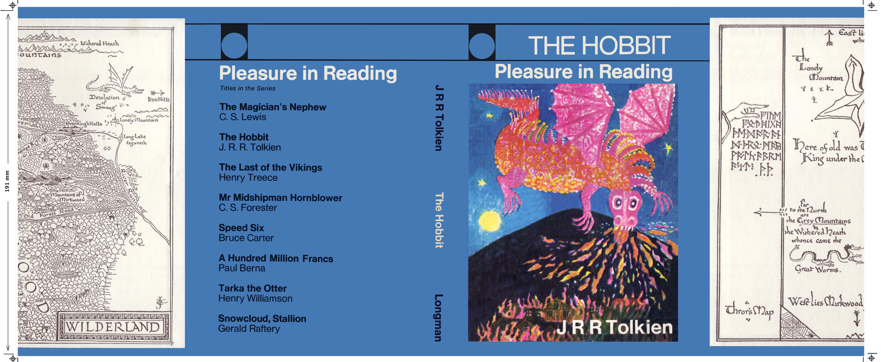
Printed version of the PIR jacket... Came out pretty well. Colours are always a bit tricky when you don't have a printer on-hand to test the colours against, so the blue is a bit lighter than the actual boards, but that's no great drama, and I'm pleased with the result.
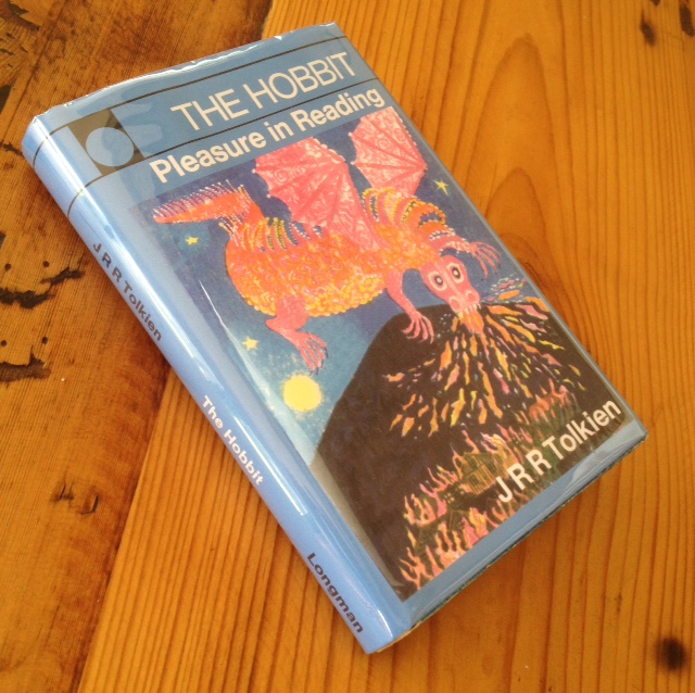
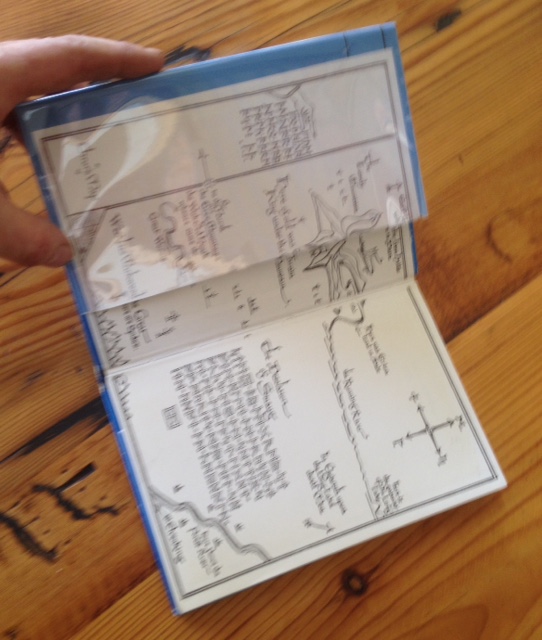
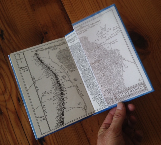
In case anyone wants one of the 3rd/4th jackets that I produced, you can get them from Mark Terry.
http://www.facsimiledustjackets.com/p ... /j-r-r-tolkien/hobbit-the
They are based off V23 of my reconstruction, but with the Facsimile Dustjackets LLC logo added and my facsimile logo removed. As I am endless tinkerer, and I've improved my graphics and font skills, I'm now up to V27, which is more accurate, and possibly final(!)), but the printed "V23s" from Mark do look great unless you are really obsessive-compulsive, have a keen eye and are going to compare the facsimile with photos of the real thing, playing a game of spot the difference.
If you do get one from him, just make sure to ask him to print it so that the black-bordered white bands top and bottom are removed, though (should be 189mm top to bottom *after* the bands are excised. By default, you will get the bands. I'm still kicking myself for not removing them and adding a bleed edge before giving him the file).
(Note that I have no commercial interest here. This is just a public service announcement!)
Also worth pointing out to any inexperienced collectors that adding a facsimile dust-jacket to a book adds absolutely no financial value to it (or at the most the cost of printing the jacket), so when buying, just imagine the book doesn't have one, rather than getting suckered in by a nice new shiny cover.





 39
39 10.08K