12
Question About Fonts
30 Mar, 2020
2020-3-30 3:28:35 AM UTC
2020-3-30 3:28:35 AM UTC
I have a first edition of The Silmarillion from 1998, HarperCollins, illustrated by Ted Nasmith, hardback. I'm fairly certain that it is my favourite edition of a Tolkien book - I really like everything about it: the cover image, the bind, the size dimensions, the mix of regular paper and glossy photo paper, the maps on the endpapers, and the font.
According to the copyright page, it reads "set in Imprint." My questions is, for those who know quite a bit about fonts, (if there are any here that do) : on a Windows PC, which font is closest to Imprint? It's tricky to determine if Times New Roman or Georgia would be closest.....thoughts?
Thanks, and sorry if this is 'spammy' - I'd love to replicate, or come as close as possible, to that font.

30 Mar, 2020
(edited)
2020-3-30 4:47:11 AM UTC
Edited by Stu on 2020-3-30 5:03:09 AM UTC
Edited by Stu on 2020-3-30 5:03:31 AM UTC
Edited by Stu on 2020-3-30 5:06:17 AM UTC
Edited by Stu on 2020-3-30 5:03:31 AM UTC
Edited by Stu on 2020-3-30 5:06:17 AM UTC
2020-3-30 4:47:11 AM UTC
insurrbution wrote:
I have a first edition of The Silmarillion from 1998, HarperCollins, illustrated by Ted Nasmith, hardback. I'm fairly certain that it is my favourite edition of a Tolkien book - I really like everything about it: the cover image, the bind, the size dimensions, the mix of regular paper and glossy photo paper, the maps on the endpapers, and the font.
According to the copyright page, it reads "set in Imprint." My questions is, for those who know quite a bit about fonts, (if there are any here that do) : on a Windows PC, which font is closest to Imprint? It's tricky to determine if Times New Roman or Georgia would be closest.....thoughts?
Thanks, and sorry if this is 'spammy' - I'd love to replicate, or come as close as possible, to that font.
TNR is somewhat similar to Imprint, as is Georgia. I'd probably choose TNR over Georgia, but there are aspects of each that are closer to Imprint and aspects of each that significantly differ. The reality is if you really want Imprint, you would need to buy it. I do quite a bit of messing around with typefaces and I have never found it possible to substitute one for another without messing around mixing them together (using a tool such as Fontforge).
Depending on what you are trying to do, just spending $100 or so to get std, italic and bold imprint might be the easiest.
Edit: If I was doing it, I'd look at the differences visually and then use FontForge to create a custom font based off times new roman. You can do obvious stuff like fix the descender on uppercase "J" and modify the uppercase Q pretty easily. The "G" would need a quick modification as well. I'd probably overlay each font on top of the other (take a snapshot from the webpage below) and just compare by using semi-transparent layers to figure out the bits you want to fix.
http://www.identifont.com/differences ... roman&second=Imprint&q=Go
I agree with Stu in regard to substituting. At the end of the day you could spend an awful lot of time & effort trying to match another typeface to the one you actually want. Easier to except that a perfect match is unlikely; buying the one you want is probably the better option.
Thanks for that, makes sense about the different fonts.
One thing that I've noticed, is that on a computer, Times New Roman is seen more commonly, and is sometimes the default. However, I've noticed Georgia to be in as much, if not more, platforms: Gmail, my Kobo ereader etc... I also quite like the look of it anyway, so I choose it when/where I can.
One thing that I've noticed, is that on a computer, Times New Roman is seen more commonly, and is sometimes the default. However, I've noticed Georgia to be in as much, if not more, platforms: Gmail, my Kobo ereader etc... I also quite like the look of it anyway, so I choose it when/where I can.
insurrbution wrote:
Thanks for that, makes sense about the different fonts.
One thing that I've noticed, is that on a computer, Times New Roman is seen more commonly, and is sometimes the default. However, I've noticed Georgia to be in as much, if not more, platforms: Gmail, my Kobo ereader etc... I also quite like the look of it anyway, so I choose it when/where I can.
Just comes down to the exact style the user wishes to portray. Apple, for instance, use Helvetica Neue across the Mac UI because they want to look more modern. I wouldn't personally use either in a web application - they are both excellent print fonts though (along with 5 or 6 others that I made a lot of use of, such as Book Antiqua, Bodoni Old Style, etc).
My two cents, as a practicing typographer. Imprint is an "old style" typeface, based on Caslon though more regular, less fussy (especially in the italic), and with more "color". It was designed mainly for normal text sizes. Times New Roman is also an old style face in its derivation, but was drawn originally for newspaper printing, bolder and larger in the lowercase, for legibility at smaller sizes. Times (and there are different varieties depending on the maker) is in the same family as Imprint but has less character -- Imprint has, for example, a distinctive "cup" at the top of the capital A -- and due to its ubiquity on computers Times can seem boring, though it's useful. Georgia was based on Scotch Roman, a transitional face with a quirky mix of old and modern characteristics, and was designed for the computer screen, for legibility at low resolution, rather than for print.
Times is closer than Georgia to Imprint; but in the end, if you have an eye for letterforms, only Imprint is Imprint.
Those of us of a certain age have read a lot of Tolkien set in Imprint. That was the face used for the original setting of The Lord of the Rings.
Wayne
Times is closer than Georgia to Imprint; but in the end, if you have an eye for letterforms, only Imprint is Imprint.
Those of us of a certain age have read a lot of Tolkien set in Imprint. That was the face used for the original setting of The Lord of the Rings.
Wayne
Findegil wrote:
My two cents, as a practicing typographer. Imprint is an "old style" typeface, based on Caslon though more regular, less fussy (especially in the italic), and with more "color". It was designed mainly for normal text sizes. Times New Roman is also an old style face in its derivation, but was drawn originally for newspaper printing, bolder and larger in the lowercase, for legibility at smaller sizes. Times (and there are different varieties depending on the maker) is in the same family as Imprint but has less character -- Imprint has, for example, a distinctive "cup" at the top of the capital A -- and due to its ubiquity on computers Times can seem boring, though it's useful. Georgia was based on Scotch Roman, a transitional face with a quirky mix of old and modern characteristics, and was designed for the computer screen, for legibility at low resolution, rather than for print.
Times is closer than Georgia to Imprint; but in the end, if you have an eye for letterforms, only Imprint is Imprint.
Those of us of a certain age have read a lot of Tolkien set in Imprint. That was the face used for the original setting of The Lord of the Rings.
Wayne
Many thanks for your input on this. I also wish to stay that I also quite like "Bookman Old Style" I think it's called, though it's not as common as say Times or Georgia. Basically, if I see it, I use it - otherwise I default to Times/Georgia.
Also, many thanks for previous, and continuous, efforts and work on Tolkien. the same to Christina.

1 Apr, 2020
(edited)
2020-4-1 4:28:00 AM UTC
Edited by Stu on 2020-4-1 4:40:20 AM UTC
Edited by Stu on 2020-4-1 4:43:16 AM UTC
Edited by Stu on 2020-4-1 4:43:16 AM UTC
2020-4-1 4:28:00 AM UTC
insurrbution wrote:
I also wish to stay that I also quite like "Bookman Old Style" I think it's called, though it's not as common as say Times or Georgia. Basically, if I see it, I use it - otherwise I default to Times/Georgia.
You might also consider Adobe Caslon Pro and Perpetua as useful typefaces in this kind of style that don't cost any money.
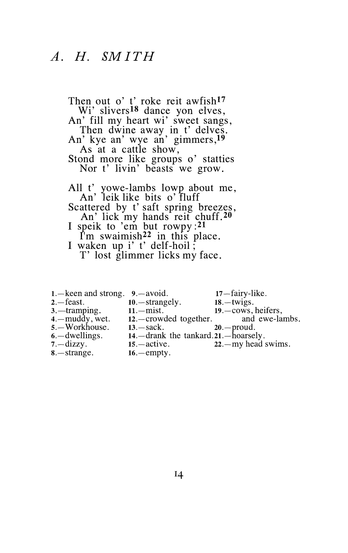
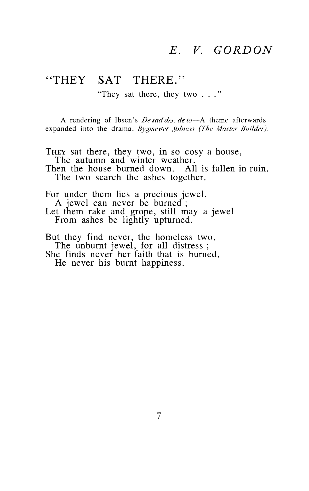
I'm currently re-typesetting "A Northern venture", and it is super frustrating not having the original typefaces or knowing what they were). It ends up being a lot of mucking around to create something near-enough-is-good-enough.


insurrbution wrote:
Interesting! Is that a project for fun, or are you assisting with a more official release??
Just for fun -- I can't afford the real thing

12


 4370
4370 1.98M
1.98M