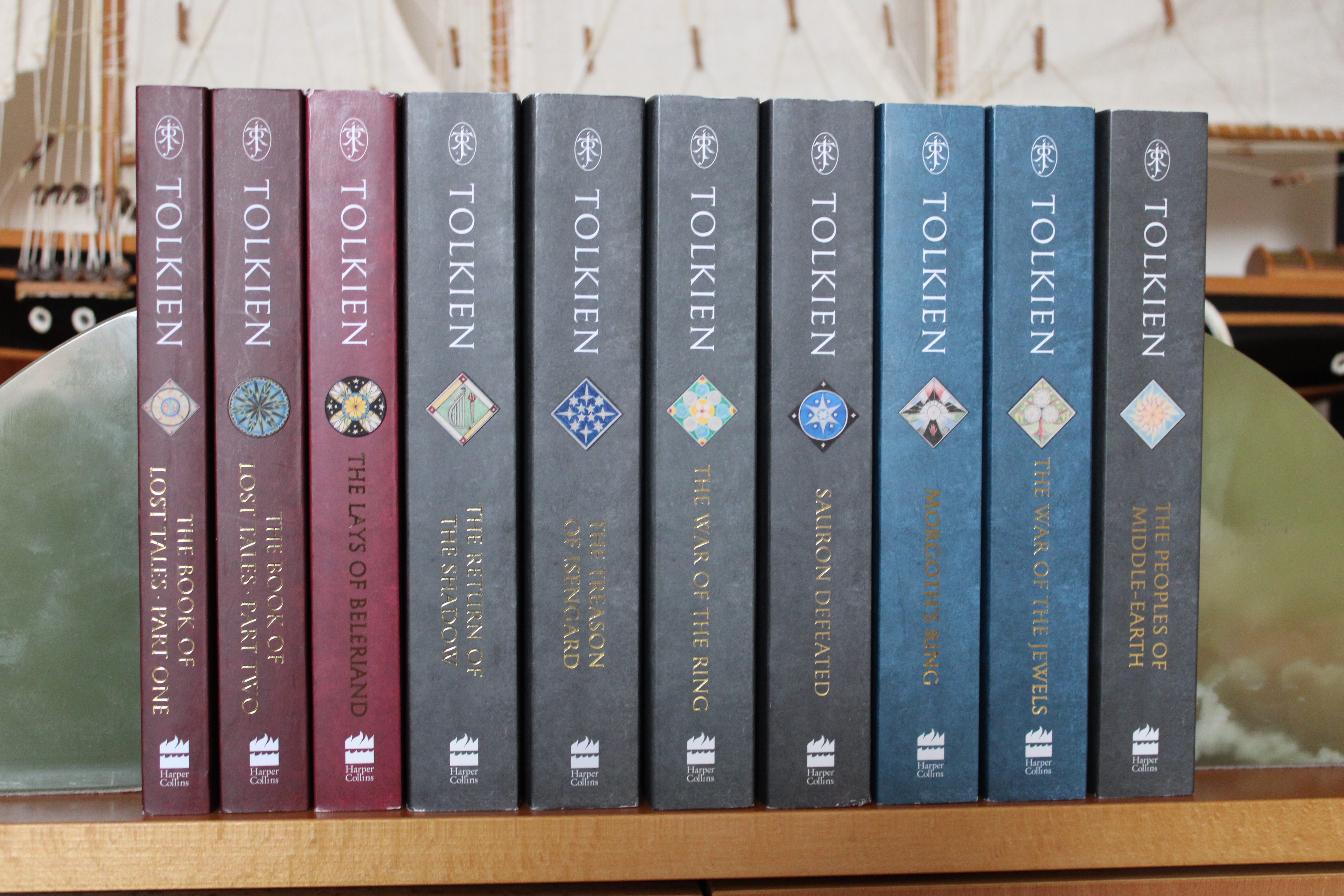
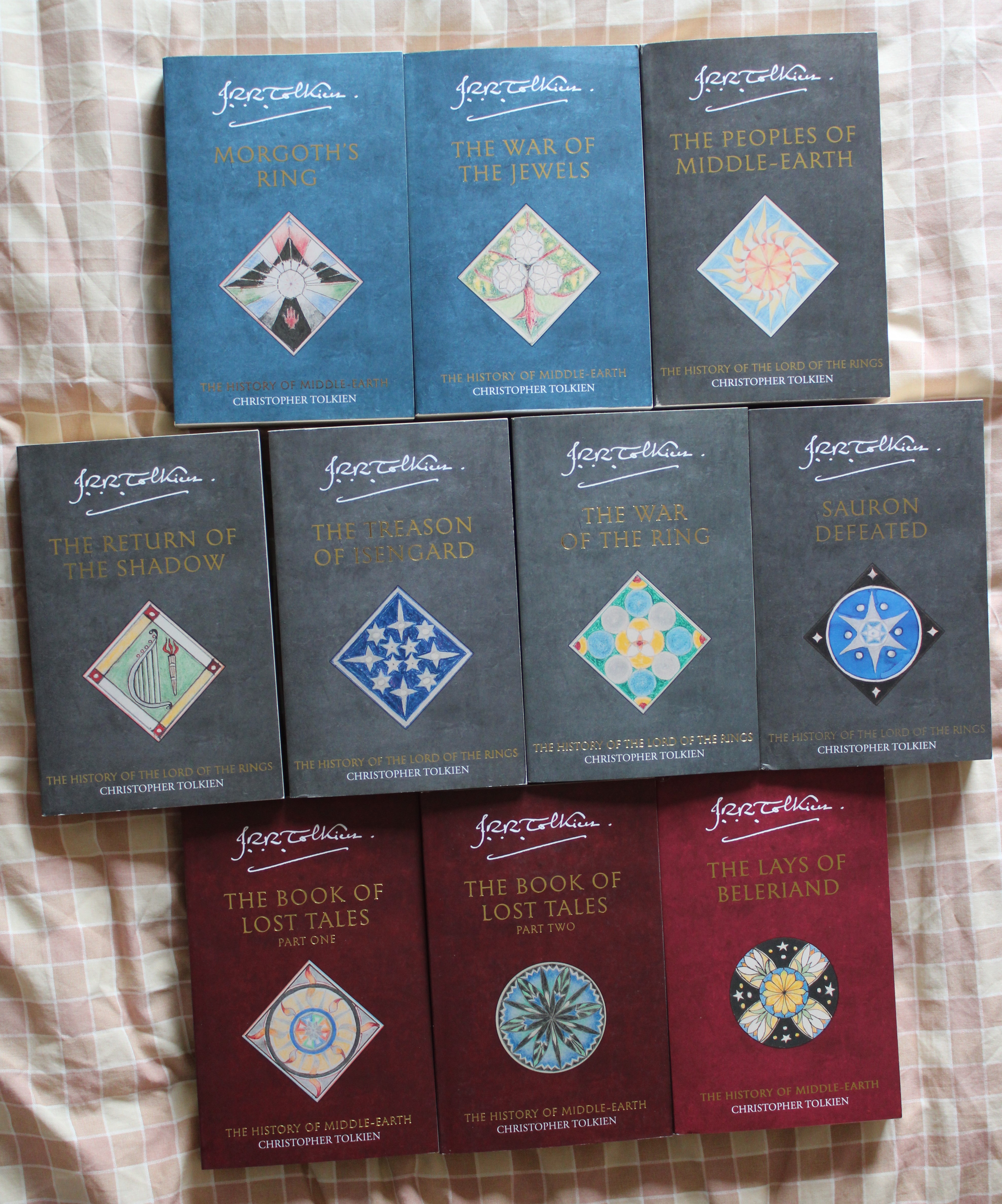
Looks like the final three editions have been printed, you may wish to wait a couple of months if you want to 100% make sure you don't get the old covers, though.
Three of the six paperbacks delivered were the old black style 😢
Will probably get the last three by visiting Waterstones so that I can make sure that they are the new designs.
Will probably get the last three by visiting Waterstones so that I can make sure that they are the new designs.


Trotter, I very much appreciate your continuing to update on this not only because I enjoy seeing them altogether, but mostly because the only one of these I really want is the Index, which I imagine will be the last one to be available so it is helpful to know the status and progression of things. I will keep waiting patiently to see when physical copies of the Index start arriving in stores.
These are cool but I would like them so much better if they were all the same color. And why the two different shades of red? Was it a production error or deliberate choice, and if the latter, why not just pick another color? It looks weird to me.
Kilmessë wrote:
These are cool but I would like them so much better if they were all the same color. And why the two different shades of red? Was it a production error or deliberate choice, and if the latter, why not just pick another color? It looks weird to me.
I for one, like the multicolor approach to these. Makes for good shelf display. My only issue (and it's a small one) are the devices they chose for the covers, as some don't really fit with the content of the book.
Mr. Underhill wrote:
I for one, like the multicolor approach to these. Makes for good shelf display.
I might like it better if the colors were a little more evenly distributed. Why is ‘Peoples’ just randomly gray, for instance? It’s going to be one gray book in between two blue and a purple one. Organizationally it just seems odd, my brain is displeased, lol.
Kilmessë wrote:
I might like it better if the colors were a little more evenly distributed. Why is ‘Peoples’ just randomly gray, for instance? It’s going to be one gray book in between two blue and a purple one. Organizationally it just seems odd, my brain is displeased, lol.
Color is based on the primary content within the book.
Gray is the color for LotR -- and all of the gray HoMe books are listed as "The History of the Lord of the Rings". I believe if Trotter lined the gray HoMe books up next to the matching LotR books the color would be the same or very similar.
I would prefer if the red's matched and I won't be surprised if eventually they do in later printings.
Velmeran wrote:
Color is based on the primary content within the book.
Gray is the color for LotR -- and all of the gray HoMe books are listed as "The History of the Lord of the Rings". I believe if Trotter lined the gray HoMe books up next to the matching LotR books the color would be the same or very similar.
I didn’t realize ‘Peoples’ was part of The History of LotR, I thought that was just the four. Why are the first three books red and ‘Shaping’ and ‘Lost Road’ blue? It’s been a very long time since I read HoME so I can’t recall what would set those apart. Do all the blue books go together too?
I still think color based on content is a weird design choice when it makes the set look so uneven and messy, but I guess that’s just me.
Kilmessë wrote:
I didn’t realize ‘Peoples’ was part of The History of LotR, I thought that was just the four.
There are not really any books that were designated The History of the Lord of the Rings by Christopher Tolkien, but five of the volumes contain information about the development of The Lord of the Rings and are often marked as such today.


 807
807 514K
514K